[Rubrics] Adapt Canvas Rubrics to Conventional Rubric Design

This idea suggests additional improvements to Canvas rubrics so they conform with conventional rubric design. Although the updated rubric features were improved from the original Canvas release, some fine tuning is still needed, namely, how the grading grid is displayed and adding descriptions in the Rating header. Scroll down to the current/proposed illustrations posted below for a quick view of this idea.


As an Instructional Designer for a large school district in Florida, I create rubrics alongside the assignments we create and curate — much of the time I'm working to convert the pedagogical content given to our team by teachers. Most of the rubrics I receive contain brief descriptions in the header row of the scoring column. Canvas doesn't provide that space in its rubrics.


As a work-around, I attempted to create a rating header containing these brief descriptions. Each had a zero-point score. To my surprise, Canvas then sorted the rating titles alphabetically resulting in misaligned ratings for the remaining body of the rubric. Just couldn't accomplish a full digital interactive copy of the rubrics I'd been provided.


Canvas rubrics would be so much easier to use if they followed a format standard in the teaching profession. The first digital rubrics were created with spreadsheets and then later with HTML tables, which mirrored what teachers had done with paper and ruler for decades. Following this standard format convention would be a fantastic improvement for Canvas over what is now available.


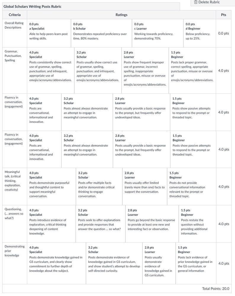
Here's the very best workaround I could produce using the Canvas rubric construction space.

  • Notice that the Rating Descriptions are ordered by placing alphabetical sorters in front of the rating labels.
  • Also, notice that what should be displayed as a evenly plotted grid has varying widths of columns for each criterion.
  • Finally, notice that Canvas requires a Rating Title for each rating of each criterion, resulting an even more text-heavy rubric with redundant text.


Current Canvas Rubric Format

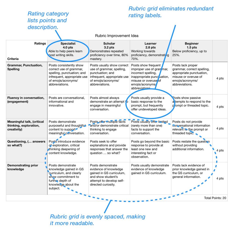
Here is the proposed Canvas rubric improvement.

Proposed Canvas Rubric Format

  • The improved rubric follows generally accepted format, making it more user friendly and more usable.
  • The proposed rubric allows for varying point ratings, but points and rating labels would not be required.
  • This rubric improvement idea also doesn't require point values in the Ratings Header, but presented as an option would go a long way to simplifying the look of the rubric by avoiding repetitious and redundant information.


This idea may not cover all aspects of optimal rubric creation and usage, but I strived to included the most used aspects that are currently missing (without awkward workarounds). I also groomed this idea to be easily implemented by Canvas s/w engineers. If this improved rubric would be useful to you as a teacher, and easy to implement as an engineer, please vote it UP.

Added to Theme

Improved rubric creation and usability Theme Status: In Development

35 Comments
Steven_S
Community Champion

I agree that a better grid is a no-brainer, and I think you will find the grid displayed in the speed grader of the new grade-book very effectively corrects that issue.  Applying that display every where would solve that problem, and it already accommodates rubrics that have 8 "proficiency levels" for one criteria and only 3 for another.  (The reasons for doing this are more evident when there is a significant difference in the total number of points for each row.)

My point was that putting all the points up in the header removes the function that allows me to set criteria like "attractiveness" and "requirements" to have different maximum point values, and that doing so is a normal part of my grading.  Also assigning a header that assigns "beginner" to the 10 point column for a row with a total of 50 points, is a problem when the next row has a maximum of 10 points.  Granted I can name the columns something else, if I am creative enough, but I'd prefer not to have any proficiency label. Regardless, I've just doubled the number of columns that I need by recording all the points in the header row. If your idea suggests that these column headers would only optionally override the settings we already use, then I must have missed it.

I suggested that a compromise method of putting the points in the header, would be entering percents for the proficiency level in the header of each column, and then also allowing a maximum point value to be set for each row. (I don't distribute points into my rubric backwards from a specific percent for any proficiency level, but I am not opposed to that.)  There would then be no need for the points displayed in individual cells, as you prefer, and my rubrics could still assign a maximum of 10 points to one criteria and 60 to another and 30 to the last one. 

Making the column header completely optional and leaving the rubric as it is if I skip the header, as you now suggest, is far better for me.  There is no duplicated information to move to the header in most of my rubrics.

ofelia_mangen
Community Explorer

All courses at my school are pass/fail, and it's an ongoing conversation with admins and faculty re: the opportunities to use various Canvas tools/features for formative assessments and providing students with corrective and explanatory feedback. Rubrics are great for this, but there are a number of aspects that derail adoption and make using these features unnecessarily complex.

More specifically...

  1. As noted in this idea and the comments, the alphanumeric sorting for ratings that have common point values (whether 0 or another #) essentially forces the use of point values when creating rubrics (even though they can be removed when adding to an assignment). As a workaround, I generally recommend using lowercase roman numerals (i, ii, iii...) ahead of the ratings titles in order to maintain the proper sequence in the rubric when not using point values. 
  2. It's natural for someone to infer a rating or grade scale (even with the lowercase roman numerals), even when one isn't intended. However inadvertently, this also has the potential to undermine efforts aimed at getting students to focus on the progression of their learning (instead of the grade, whether letter, point, or percentage). 
  3. When the tool essentially forces an implied or explicit rating or grade scale, it's extra difficult to encourage the use of the rubrics tool for instructors who want to provide the rubrics to students in the assignment, and also use the rubrics for providing corrective/explanatory feedback, but are adamant about not assigning grades. 

The rubrics tool adds great value, but these UI issues consistently create roadblocks to broad adoption and necessitate more direct support from ed techs/ learning designers for the rubric and assignment builds (many instructors get lost in the minutia of the workarounds required to make the tool work for their not-uncommon use case and, to my knowledge, existing support documentation doesn't address these issues). 

Making a no-point rubric a true option by allowing points to be turned off when creating the rubric and allowing for the ratings and criteria to be manually sorted seems like a straightforward fix that would be a great step toward accommodating assessments and feedback that don't use grades.  

Steven_S
Community Champion
As noted in this idea and the comments, the alphanumeric sorting for ratings that have common point values (whether 0 or another #) essentially forces the use of point values when creating rubrics (even though they can be removed when adding to an assignment). As a workaround, I generally recommend using lowercase roman numerals (i, ii, iii...) ahead of the ratings titles in order to maintain the proper sequence in the rubric when not using point values. 

I had that problem too.  It used to be possible to set a rubric column to negative one, which I did in certain circumstances.  When that went away, rubrics I edited reset the negative one to zero, and rearranged the zero and negative columns.  So that's why that happens!  Thank you for sharing that solution!  I agree that rubric columns should stay in the order we put them in.  I don't recall seeing an idea about that, so you might suggest that as a separate idea. (Nevermind I see this idea has been edited to include that!),

Steven_S
Community Champion

 @ronmarx I see you made points in the header an option, allowing others to use points in the criterion or even no points at all.   I've changed my vote.  I still think the look from the speed grader would fix most of the alignment problem, but that more organized look would improve the rubric design.  I assume that using a header would also be optional, and so criteria with varied numbers of achievement levels would still be possible.

jgraham3
Community Novice

I created my first assessment rubric today and was quite disappointed that the columns don't line up. I found this forum hoping that someone had a 'fix' but obviously not. 

pelhamr
Community Novice

It is disappointing. However, I have found that when you go to speed grader and use your rubric for grading assignments, the rubrics columns do show lined up at that time.

kdsouza822
Community Member

I would definitely prefer to use the suggested rubric type.  The current model is visually confusing.  As an instructor, I spent a great deal of time trying to figure out if I was doing something incorrect or if there was an option I didn't see in order to make the various criteria line up.  For students, it is confusing that they may have earned a "B" in two areas, yet visually, one appears to be higher than the other.  

Before Covid, I would have printed hard copies of my rubric because the visual design of the Canvas rubric is so confusing, but now I need to give my students feedback on Canvas.

marybowman
Community Novice

OMG please do this! Or provide a way for instructors to control the format of rubrics! It's beyond nonsensical to sort the ratings alphabetically! And the only other option is to assign points to each specific rating for each specific criterion. Please allow us to grade holisitically and still have rubrics ordered logically.


P.S. "Criterion" in singular. "Criteria" is plural. 

Adam88
Community Member

I just want my rubric to stop looking like it was made by a drunk bricklayer. Each of my criteria is a letter grade, so I just want them lined up. As others have said, absolute no-brainer.


Llama
Community Member

I support this feature!