The Instructure Product Team is working on implementing a better solution to collect your feedback. Read Shiren's blog for more information.
Turn on suggestions
Auto-suggest helps you quickly narrow down your search results by suggesting possible matches as you type.
- Community
- Canvas
- Canvas Ideas
- Canvas Ideas
- [SpeedGrader] Replace tiny asterisk with "DRAFT" f...
Options
- Subscribe to RSS Feed
- Mark as New
- Mark as Read
- Bookmark
- Subscribe
- Printer Friendly Page
- Report Inappropriate Content
[SpeedGrader] Replace tiny asterisk with "DRAFT" for draft comments in SpeedGrader
[SpeedGrader] Replace tiny asterisk with "DRAFT" for draft comments in SpeedGrader
Status:
Completed
Submitted by
adam_engel
on
12-14-2020
09:28 AM
| This idea has been developed and deployed to Canvas LMS |
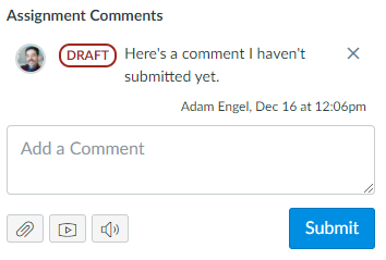
I'm an Instructional Designer who supports faculty using Canvas. In SpeedGrader, when an instructor enters a general comment but doesn't submit it, then navigates to a different student, the comment's text is auto-saved as a draft. When the instructor returns to the first student's submission, this draft status is indicated by a tiny red asterisk to the left of the comment. This is confusing, since it doesn't say "Draft" anywhere. This is also an accessibility issue, since users with color blindness or users with any level of visual impairment may not be able to see the tiny red asterisk. I propose replacing the asterisk with the bold word "DRAFT," which is clearer, more accessible, and more inclusive.
It would also be helpful to clarify that the grey "Submit" button is specific to the draft comment and works differently than the blue Submit button, which submits both comments and grades.
Screenshot of the asterisk to the left of a draft comment:
Mock-up of proposed replacement:
18 Comments
 Community help
To interact with Panda Bot, our automated chatbot, you need to sign up or log in:
Sign inView our top guides and resources:
Find My Canvas URL Help Logging into Canvas Generate a Pairing Code Canvas Browser and Computer Requirements Change Canvas Notification Settings Submit a Peer Review AssignmentTo interact with Panda Bot, our automated chatbot, you need to sign up or log in:
Sign in
