The Instructure Product Team is working on implementing a better solution to collect your feedback. Read Shiren's blog for more information.
Turn on suggestions
Auto-suggest helps you quickly narrow down your search results by suggesting possible matches as you type.
- Community
- Canvas
- Canvas Ideas
- Canvas Ideas
- Utilization of White Space on Assignments and Disc...
Options
- Subscribe to RSS Feed
- Mark as New
- Mark as Read
- Bookmark
- Subscribe
- Printer Friendly Page
- Report Inappropriate Content
Utilization of White Space on Assignments and Discussions
Utilization of White Space on Assignments and Discussions
Status:
Completed
Submitted by
 Chris_Hofer
on
08-05-2016
07:27 AM
| This idea has been developed and deployed to Canvas |
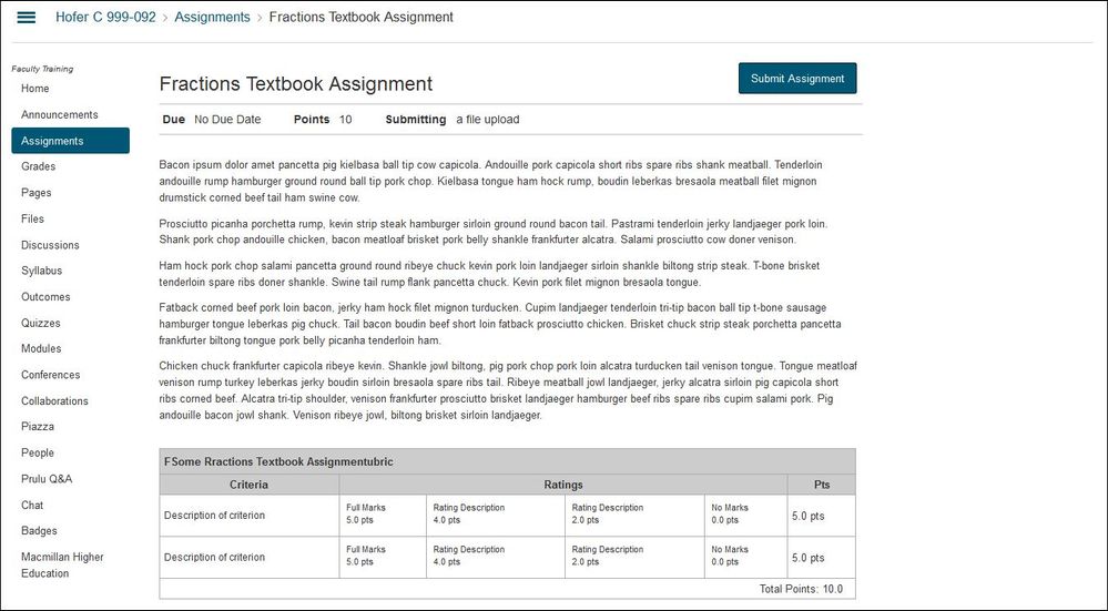
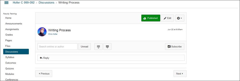
At work, I have two wide-screen monitors with resolutions set at 1920x1080. I'm not sure of the reasoning (maybe there is a valid reason that I'm not aware of), but when I view an Assignment (as a student) or a Discussion topic (any role), there is an area of white space that isn't used...as in these examples:
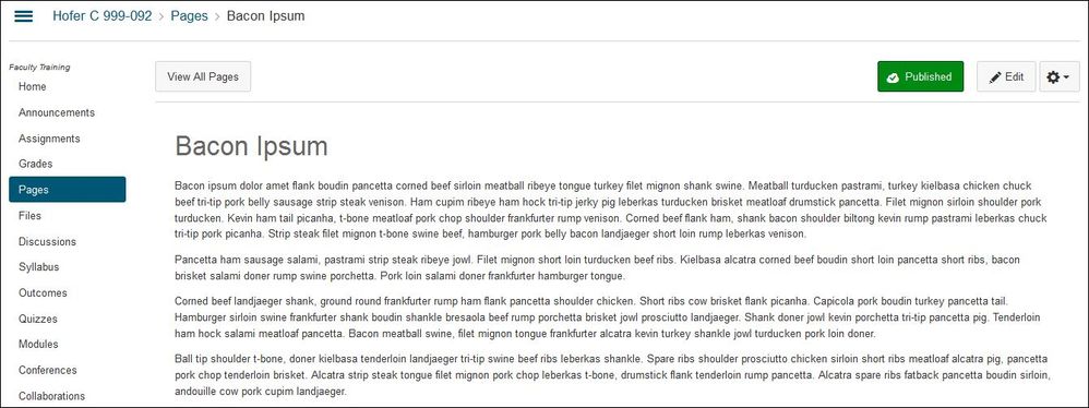
Notice the gray horizontal line across the top extends well beyond the actual content displayed below it for both the Assignments and the Discussions. However, if you look at content in Pages, this white space is actually used:
My suggestion would be to allow both the Assignments and Discussions content pages to utilize the white space along the right side of the page as it does with actual Pages content. (If there are reasons for the white space, I would be interested in knowing why.) The result would potentially create less scrolling for students for longer pages.
| Comments from Instructure |
This feature was announced in Canvas Beta Release Notes (2017-07-05) and was affected by the New User Tutorial feature, which was announced as being enabled by default for all institutions in the 2017-07-15 release.
The Canvas product team ultimately delayed enabling this feature and was not included in Canvas Production Release Notes (2017-07-15). However, this idea will still apply for users whose institutions have enabled the New User Tutorial feature.
The New User Tutorial feature will be enabled by default in a future Canvas release.
11 Comments
 Community help
To interact with Panda Bot, our automated chatbot, you need to sign up or log in:
Sign inView our top guides and resources:
Find My Canvas URL Help Logging into Canvas Generate a Pairing Code Canvas Browser and Computer Requirements Change Canvas Notification Settings Submit a Peer Review AssignmentTo interact with Panda Bot, our automated chatbot, you need to sign up or log in:
Sign in


