Design Tips for Pages in Canvas
Easily Upping Your Visual Design Game in Canvas
What’s Included in This Post?
• Accessibility Considerations
• Brainstorming and Planning
• Creating and Finding Visual Elements
• Saving Your Work
• Responsive Image Widths
• Floating Text Around Images
• Image Padding
Ever see a super inviting and well-thought-out page in Canvas and think, “OoooOoOo! I want to be able to do that!” but then wonder how? Or maybe you have even begun experimenting with visual design in your Canvas courses and just need some tips and tricks to up your game? Well, lucky for you, I just happen to have some pointers for you! Let’s begin...
Why Even Think About Visual Design?
A well-designed page will not only complement and enhance the content you’re delivering but also create an engaging learning space for your students.
Is Accessibility Really THAT Important?
 The answer to this question is always YES! Be sure to design with everyone in mind and always make your content accessible for ALL users. WebAIM has a great article, Introduction to Web Accessibility, that “should help you understand how people with disabilities use the web, the frustrations they feel when they cannot access the web, and what you can do to make your sites more accessible.” It’s always a good idea to run the Accessibility Checker after editing any content within the Rich Content Editor. This tool will call out accessibility issues, such as alt text with images, text size and styles, table properties, contrast issues, etc. I would also recommend checking out the General Accessibility Design Guidelines, which outline some general best practices when designing a course [in Canvas] for accessibility concerns, as well as the Course Evaluation Checklist v2.0 and Course Evaluation Checklist for Mobile App Design. It’s also important to design with mobile in mind because you never know if users are accessing the page from a desktop, laptop, tablet, or mobile device. The appearance of the page can look utterly different across different platforms.
Brainstorm a Plan First
 Before I even begin creating anything, I find it super helpful to take a step back and figure out how I will actually use my page, what information I plan on including on it, and how I want it to look. Sometimes I even sketch it out on a piece of paper to get a better visual. Think about things like: What resources do you need to incorporate? How are you going to lay it out? Do you want a banner at the top? Do you want to include buttons? If so, what type and how many? Do you need to use pictures and/or icons? etc...
Creating/Finding Visual Elements
Once you have your plan, it's time to add the fun stuff! Don't have a fancy graphic design program? Not a problem! Below are some of my favorite resources for visual elements. Some of them require you to sign up for an account, but are FREE to use!
- Canva is a really user-friendly web-based graphic design program you can use for creating buttons and banners and SO much more
- Undraw is one of my favorite resources that offers open-source illustrations for pretty much any idea you can imagine (Notice I've included some in this blog post!)
- Flaticon is an awesome source for icons and you can personalize them by changing the colors
- Icons8 is another good resource for icons
- Unsplash is a great resource for free high-resolution photos
- Pixabay has a ton of images that can be freely used, without attribution
- Google Draw allows users to collaborate and work together in real-time to create images, shapes, diagrams, charts, etc!
Save, Save, Save Your Work!
 Whenever you are working in Canvas, whether you are designing a page or creating a learning activity, be sure to save your work frequently! Although there is now an Auto Save feature that was released at the beginning of 2020 (which, let's be honest, has been a lifesaver on many occasions!), it's always better to play it safe! You never know if your browser or computer will decide to crash, and then you might be out of luck and be very sad that you just lost all that hard work. Another neato feature that I love is that Canvas keeps a record of each version of a page that you saved. This way, if you make a mistake while experimenting, but have already hit save, you can easily restore it to a previous version.
Responsive Image Widths
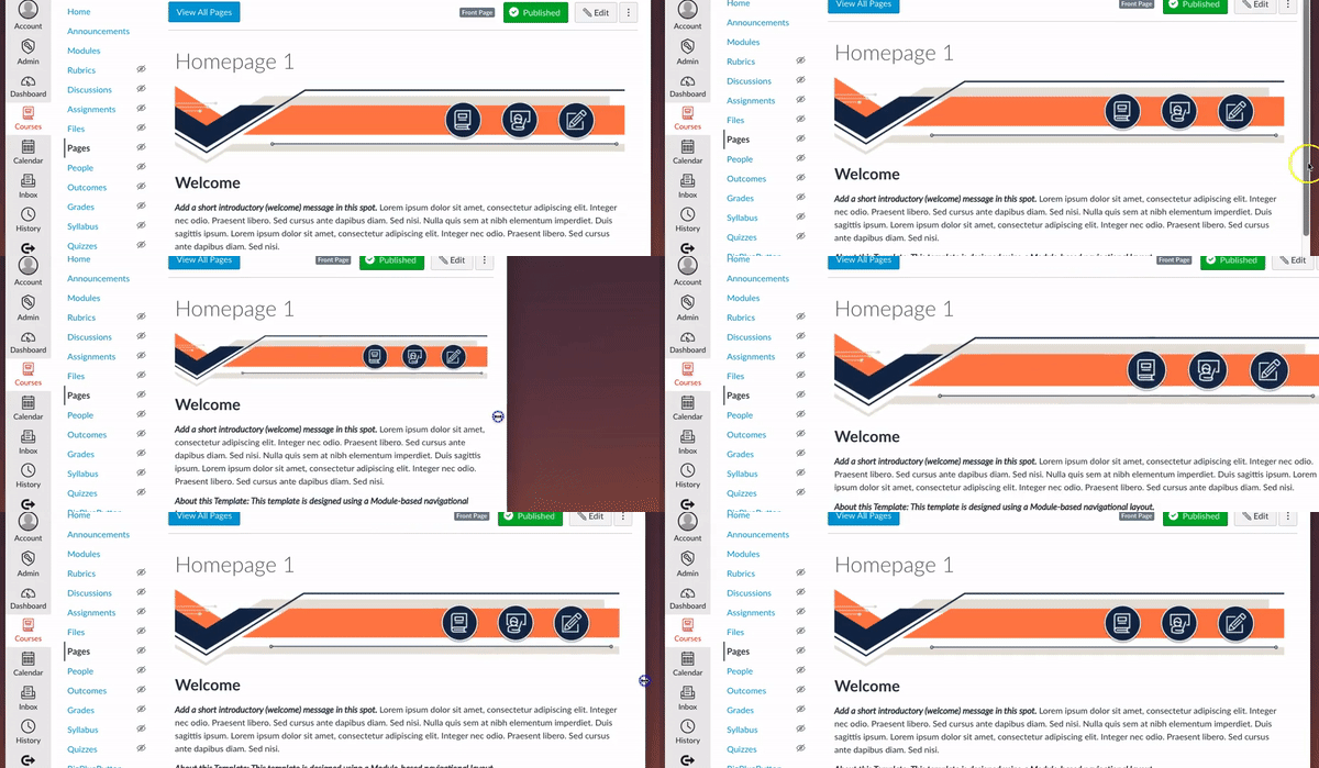
To make images responsive in Canvas, so that they will change size when the browser window is resized, you no longer have to switch over to the HTML Editor! WIN! As of late December 2022, when an image is added to the Rich Content Editor, the Image Options sidebar now includes pixels AND percentage options. By default, images are still displayed in pixels. However, the percentage radio button can be selected, and a percentage can be entered to resize the image. For example, the gif below shows a banner with the dimension type set to "percentage" at 100%.

PRO TIP: Sometimes you will notice that if you start with a small window and expand it, the image doesn't adjust to keep up. The solution for this is to use style="width:100%; min-width:100%;" instead of width="100%"
Easily Float Text Around Images (without going into the HTML... you're welcome)
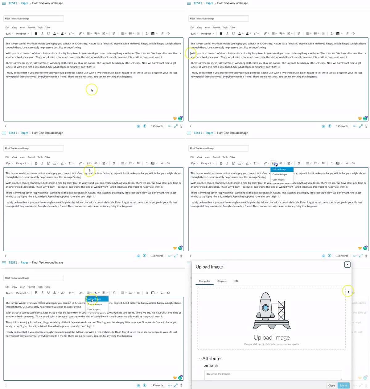
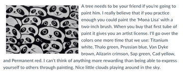
To float text around an image, start off by typing (or pasting) all of your text in the RCE. Place your cursor within your text where you would like your image to be located (preferably at the beginning of a paragraph or sentence, not randomly in the middle). Insert/embed the image from Canvas, click on the image, then simply click on the “Align left” (or “Align right”) icon at the top of the RCE, and viola!

FUN FACT: Text in the gif above courtesy of my favorite lorem ipsum generator, Bob Ross Lipsum***
Add Padding To Images
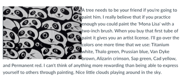
Adding padding to an image will create a little space between your image and the other content next to it so they aren’t jammed up against one another. An image without padding can be a bit of an eyesore, amiright? I mean, just look at the difference between the images below:
|
WITHOUT Padding

|
WITH Padding

|
To add padding to an image, you’ll want to switch over to the HTML Editor. Find the image tag and locate the image's style attribute (if the image doesn't have one, you can add one by typing style=" " after <img). Within the quotation marks after style=, add padding: 10px; (I used 10px for this example, but if you would like more or less white space around the image, simply adjust the number value). If there is another style attribute, separate them with semicolons (style="padding: 10px; float: right;"). Below is an example of what the code should look like:
BEFORE:
<img style="float: left;" src="https://testabc.instructure.com/courses/123/files/474228/preview " alt="panda art" width="300" height="202" />
AFTER:
<img style="padding: 10px; float: left;" src="https://testabc.instructure.com/courses/123/files/474228/preview " alt="panda art" width="300" height="202" />
Final Thoughts
 There are SO many more tips and tricks that I have stored away in my noggin that I would love to share out! What are some other design tips/tricks/features that you would like to see included in future posts and learn more about?
***Some of my other favorite lorem ipsum generators include Pirate Ipsum and Bacon Ipsum. They always give me a good laugh. What are your favorite lorem ipsum generators??? Check out the Text generators: Beyond Lorem Ipsum for a community-curated collection from @Stef_retired as well!
Please comment below. We’d love to hear from you!
Our Instructional Design team offers templates, consultation, badging services, course evaluations, workshops, and more. If you would like to learn more about our services, please contact your CSM or @deonne_johnson, Manager, Learning Services, via djohnson@instructure.com

