Using the Canvas Styleguide: Buttons

jperkins
Instructure
Instructure
26
64218

Update: The style guide has been deprecated and replaced by InstUI. For more details, please see InstUI: Instructure’s Style Guide 2.0

Introduction to this Series

This is the first document in a series that I will be writing in regards to using the Canvas Styleguide. If you are unaware, the Styleguide is a public tool used by our engineers to make Canvas look and feel consistent across the different parts of Canvas. What this means is that the Styleguide is NOT designed for using items within the Rich Text Editor. With that in mind, certain parts or elements of the Styleguide do work in the Rich Content Editor. It has taken me a year of experimenting and playing with Canvas and the Styleguide to identify exactly which elements work and which ones don't.

As I've browsed the community, I've seen a lot of people reference the Canvas Styleguide, but there is no clear explanation for non-technical users on how to use it. So I'm approaching this blog series from a non-technical approach. Be aware that you will be using the HTML Editor to accomplish certain tasks within Canvas. I will walk you through the different steps of using the Rich Content Editor, HTML Editor, and Styleguide to make cool things happen.

Canvas Styleguide - Buttons

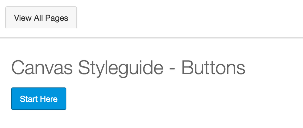
For this first document I want to walk you through how to create a "Start Here" button on a Canvas Page. (See photo below)

Screen Shot 2015-09-18 at 11.31.01 AM.png

To get started, I want you to:

When you've finished the above steps, your HTML Editor should look something like this:

Screen Shot 2015-09-18 at 10.32.41 AM.png

The next step is to edit the class of the link. You'll want to type the word 'Button' within the quotations. Your code should say class="Button".

Screen Shot 2015-09-18 at 10.39.24 AM.png

Next, we'll change the text of our link to say Start Here if it doesn't already. Look at the picture below for where you can adjust the text.

Screen Shot 2015-09-18 at 10.46.16 AM.png

When you hit save, you'll see that your link now should be a Button that says Start Here.
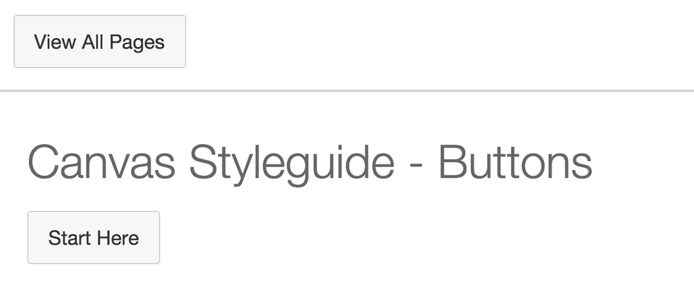
Screen Shot 2015-09-18 at 10.42.31 AM.pngEdit your page again and notice that the link in the Rich Text Editor doesn't show the Button. It doesn't show the Button. Things in the Styleguide will only be visible after you hit save. So be aware that you won't see if it works until after you hit save.

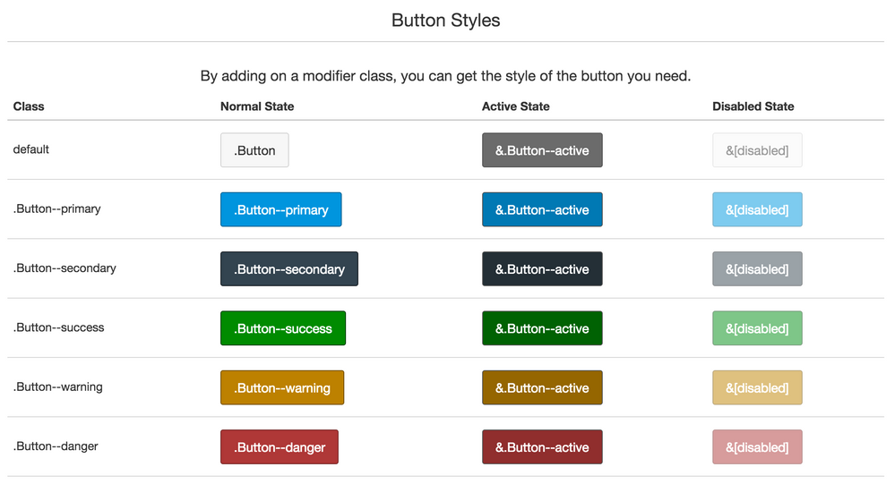
The next step is to add some color to your Button. We'll be using the Class column listed in the Styleguide.

Screen Shot 2015-09-18 at 11.25.10 AM.png

We'll go ahead and add the class 'Button--primary' to our class. Do not delete the first Button class. Just add on so it looks like class="Button Button--primary".

Screen Shot 2015-09-18 at 11.29.21 AM.png

Save the Page. Congratulations! You should now have a blue button! Note: Be aware that your institution may have chosen a different color for Button--primary and if that is the case, it will not be blue, but whatever color you're institution has chosen it to be.

Screen Shot 2015-09-18 at 11.31.01 AM.png

Congratulations on completing the first part of the Canvas Styleguide Tutorial!

Let me know in the comments if you have any trouble or any additional comments! Best of luck using Buttons in you classes!

26 Comments
apelt
Community Member

Excellent tutorial! I'm not a coding expert by any means, but now I have the shiny buttons I've always wanted.

lcahill
Community Explorer

Great! I did notice that my button only works with class=btn instead of class-button. Also, the code for colors isn't happening. Any more clues to add color to my button? 

lcahill
Community Explorer

Got it! class=btn btn-danger

a_eberhard
Community Novice

Do you know how to keep your buttons the same size?

a_eberhard
Community Novice

I figured it out.  There is a width tag.

eshumway
Community Explorer

Hi  @a_eberhard , I was wondering the same thing...Would you mind sharing where you found and placed the width tag?

Thanks!

cgaudreau
Community Contributor

Ah...super helpful! Thank you for posting this.

jperkins
Instructure
Instructure
Author

If you'd like to have styleguide buttons appear as buttons on the mobile app, include this code in the mobile css uploads via the theme editor.

.Button {

    background: #f7f7f7;

    color: #333;

    border: 1px solid #d1d1d1;

    border-radius: 3px;

    transition: background-color 0.2s ease-in-out;

    display: inline-block;

    position: relative;

    padding: 8px 14px;

    margin-bottom: 0;

    font-size: 14px;

    font-size: 0.875rem;

    line-height: 20px;

    text-align: center;

    vertical-align: middle;

    cursor: pointer;

    text-decoration: none;

    overflow: hidden;

    text-shadow: none;

    -webkit-user-select: none;

    -moz-user-select: none;

    -ms-user-select: none;

    user-select: none;

    font-weight: 300;

}

ronmarx
Community Contributor

Jeremy,

I'd love to see your discourse on TABS, particularly things like justified tabs (and justified buttons—if there's a way to do one, there might be a way to do the other).

As a designer I like pages that have combined/nested navigational devices like the col-xs div class nested inside of a tab panel.

Do you have any additional posts on design topics like this?

Thanks,

Ron

jperkins
Instructure
Instructure
Author

Ronald,

You should be able to manually add something like:

style="width="20%"

to the elements (tabs or buttons) and have them override the default widths. That'd mean you could have 5 tabs equally spaced instead of by character count. Is that what you mean by justified?

ronmarx
Community Contributor

Jeremy,

Do you mean an in-line style, as in: "style= "width:20%;" ?

As you know, syntax is everything!

Which reminds me, have you voted commenting with the Canvas HTML Editor? ——>

Thanks,

Ron

alg813
Community Novice

I figured out the code to make the buttons the same width, you need

style="width: 20%;"

the full button code I used looks like this

  • <p><a id="" class="btn btn-primary btn btn-large" style="width: 20%;" title="" href="link" target="">button name</a></p>
alg813
Community Novice

Can admins only access the Theme editor?

jperkins
Instructure
Instructure
Author

That is correct. An admin at your institution would need to add the above code.

Stef_retired
Instructure Alumni
Instructure Alumni

For anyone who wants to get more comfortable with using HTML and <iframes> and all that good stuff that helps you build beautiful pages, be sure to RSVP to the CanvasLIVE event Cracking the Code: HTML for Humans! which is coming up this Monday, November 7, 2016. If you're able to attend, RSVP "Yes"--and if you're interested but your schedule doesn’t allow you to attend in real time, RSVP "No" or "Maybe" to receive any post-event updates.

chris_pondy
Community Novice

This is GREAT!!! One question, my "start here" has an underline in it. Can I get rid of that somehow?

Thanks!

Chris Pondy

yahongx
Community Member

Jeremy:
Thanks for providing this mobile CSS, I have applied to our instance, it worked great, however, this code works for the general button in gray, do you have a CSS code for button--primary, button--seconardy which will work for the mobile app?

Thanks again.

jperkins
Instructure
Instructure
Author

You'd need to add the following code to the same file as the above button code. Just update the code for the colors to match the colors of your primary button theme. I didn't test this, but it should work. 

.btn-primary, .Button--primary {
   background: #123456; 
   color: #fff;
   border: 1px solid;
   border-color: #123456;
}

Hope that helps,

mtuten
Community Contributor

When Canvas changed the default colors of their buttons, the default color contrast levels between the text and background color became insufficient for many of the buttons. Because mobile devices do not have a high contrast mode, we used the following CSS for our mobile buttons. (We may also at a later date change the font size so that the letters appear a little thicker)

(.Button stays the same)

.btn-danger, .Button--danger {

    background: #D01A19;

    color: #ffffff;

    border: 1px solid #8C1111;

    border-radius: 3px;

    transition: background-color 0.2s ease-in-out;

    display: inline-block;

    position: relative;

    padding: 8px 14px;

    margin-bottom: 0;

    font-size: 14px;

    font-size: 0.875rem;

    line-height: 20px;

    text-align: center;

    vertical-align: middle;

    cursor: pointer;

    text-decoration: none;

    overflow: hidden;

    text-shadow: none;

    -webkit-user-select: none;

    -moz-user-select: none;

    -ms-user-select: none;

    user-select: none;

    font-weight: 300;

}

.btn-warning, .Button--warning {

    background: #D04700;

    color: #ffffff;

    border: 1px solid #7A2608;

    border-radius: 3px;

    transition: background-color 0.2s ease-in-out;

    display: inline-block;

    position: relative;

    padding: 8px 14px;

    margin-bottom: 0;

    font-size: 14px;

    font-size: 0.875rem;

    line-height: 20px;

    text-align: center;

    vertical-align: middle;

    cursor: pointer;

    text-decoration: none;

    overflow: hidden;

    text-shadow: none;

    -webkit-user-select: none;

    -moz-user-select: none;

    -ms-user-select: none;

    user-select: none;

    font-weight: 300;

}

.btn-success, .Button--success {

    background: #127A1B;

    color: #ffffff;

    border: 1px solid #00600D;

    border-radius: 3px;

    transition: background-color 0.2s ease-in-out;

    display: inline-block;

    position: relative;

    padding: 8px 14px;

    margin-bottom: 0;

    font-size: 14px;

    font-size: 0.875rem;

    line-height: 20px;

    text-align: center;

    vertical-align: middle;

    cursor: pointer;

    text-decoration: none;

    overflow: hidden;

    text-shadow: none;

    -webkit-user-select: none;

    -moz-user-select: none;

    -ms-user-select: none;

    user-select: none;

    font-weight: 300;

}

.Button--secondary {

    background: #2D3B45;

    color: #ffffff;

    border: 1px solid #0F1317;

    border-radius: 3px;

    transition: background-color 0.2s ease-in-out;

    display: inline-block;

    position: relative;

    padding: 8px 14px;

    margin-bottom: 0;

    font-size: 14px;

    font-size: 0.875rem;

    line-height: 20px;

    text-align: center;

    vertical-align: middle;

    cursor: pointer;

    text-decoration: none;

    overflow: hidden;

    text-shadow: none;

    -webkit-user-select: none;

    -moz-user-select: none;

    -ms-user-select: none;

    user-select: none;

    font-weight: 300;

}

.btn-primary, .Button--primary {

    background: #0770A3;

    color: #ffffff;

    border: 1px solid #043E5A;

    border-radius: 3px;

    transition: background-color 0.2s ease-in-out;

    display: inline-block;

    position: relative;

    padding: 8px 14px;

    margin-bottom: 0;

    font-size: 14px;

    font-size: 0.875rem;

    line-height: 20px;

    text-align: center;

    vertical-align: middle;

    cursor: pointer;

    text-decoration: none;

    overflow: hidden;

    text-shadow: none;

    -webkit-user-select: none;

    -moz-user-select: none;

    -ms-user-select: none;

    user-select: none;

    font-weight: 300;

}

ryan_corris
Community Coach
Community Coach

I was not aware of the style guide until reading this!  Can't wait to find a little time to play!

cdeville
Community Participant

Please correct me if I'm wrong, but doesn't changing a link to a button class break accessibility?

Using the button role - Accessibility | MDN

Warning: Be careful when marking up links with the button role. Buttons are expected to be triggered using the Space or Enterkey, while links are expected to be triggered using the Enter key. In other words, when links are used to behave like buttons, adding role="button" alone is not sufficient. It will also be necessary to add a key event handler that listens for the Space key in order to be consistent with native buttons.

mtuten
Community Contributor

Hey Christine,

That is an excellent question. I unfortunately do not have a good answer. Perhaps someone else in the https://community.canvaslms.com/groups/accessibility?sr=search&searchId=cda13364-9579-455b-ae73-798d...‌ Group has a clearer answer. I know that when I used NVDA and Firefox to read a course that had buttons, the buttons were verbally described as links but the button could be triggered with the spacebar. JAWS and IE reacted similarly.

anthony_sales1
Community Member

You can hide the underling of custom buttons by adding these lines of code to your custom.css file:

#content .user_content a { text-decoration:none; }
#content .user_content a:hover { text-decoration:none; }

However this will also remove the underling of an internal links as well - but not external links. I have never been able to successfully turn off the underlining of external links as they are a different class Smiley Sad but I would like to as I just don't think it is needed as the cursor changes to a pointer when you hover over it.

You can also hide the annoying external links icon by adding this line of code to the same file:

span.ui-icon {
    background-image: none;
    width:0;
}
Bobby2
Community Champion

This really helped me to dip my toe in the water again with html. Thanks  @jperkins 

moore_a
Community Member

Great conversation! I am looking for how to place padding between a series of buttons arranged horizontally on a page and then stacked in two rows. Does anyone have any tips for button arrangement with spaces on a page that will maintain integrity?

Thanks!

Ayla

DanielleBowers
Community Member

Yes, how do I get two buttons side by side? I am using them as popup flashcards, and having a vertical only list is a hassle. I am very new to this HTML coding, so I need to know exactly where to position the coding. Thanks to anyone who can help!