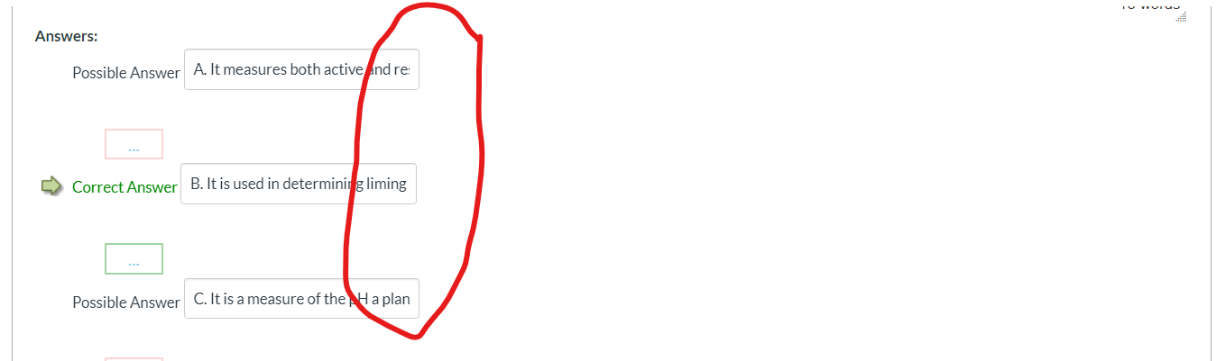
Can the designers please expand the boxes for constructing answer options (e.g., on multiple choice questions) so that one can see the entire answer written with having to click and scroll? (see image) Sometimes it seems like the Canvas developers have never been in the real world of making and grading exams. PLEASE make it more user friendly.
Solved! Go to Solution.
Hi @fuhrmann - While I cannot help with the "why" part of your question, I can tell you that the solution is clicking the pencil icon to the right of each multiple choice answer choice, which I don't see on your screen capture but which should be there, as illustrated here: How do I create a Multiple Choice quiz question? under the Create Answers with Rich Content Editor heading on that page. (It's right next to the trash can icon to remove a choice.) As that page mentions, clicking the pencil icon allows one to use the rich content editor and a much, much bigger screen so that you do not have to always scroll back and forth.
Also, just so you are aware, Canvas is no longer deploying fixes or improvements to the current quiz engine, placing all resources on further development of the new quiz engine, called New Quizzes. I do not have any experience with New Quizzes, though judging from the screen captures in the online lessons, it appears the default text box is a bit bigger, but here one can also use the rich content editor, as explained here: How do I create a Multiple Choice question in New Quizzes?
Hope this helps a bit, Jeff.
Yes, that helps somewhat. Thanks. However, it would be much more convenient for the boxes to be enlarged in size. Your suggestion helps primarily if there are one or two answers for which the box needs to be expanded. However, if there are four or five, it becomes easier to click on the answers are scroll. There is plenty of room to make the boxes wider, so why are we stuck with cramped little boxes? The current configuration makes no sense to me, other than no one thought things through. Canvas developers could make things easier if they just acknowledge that not all answers are one or two words in length and then program the interface accordingly. My two cents...
It sounds like the tiny boxes can't be expanded... which really sux. Tiny is fine if you're creating a quiz and, for example, have all your possible answers in another document to paste in. Trying to see what's all there when editing is pretty much impossible though. Very annoying design (hope this gets fixed, new or whatever!)