Hello! I reported this issue to Instructure Support already (Case 10734133) but sharing in case others notice it as well:
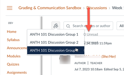
The recent deploy added unread counts for group discussions in the Discussion Redesign. However, if the group's name is longer, it can be difficult to read because the text doesn't appear in the drop down menu and is shifted over to the right (overlapping other text).
 Unread count in group discussions is difficult to read when the group's name is longer
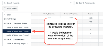
When this is fixed, it would be best if the entire name continues to be displayed (either extending the width of the menu or wrapping the text) rather than truncating the name like the gradebook filter:
 Similar menu with truncated student group names in the gradebook filter menu


