Canvas Release Notes (2020-03-21)
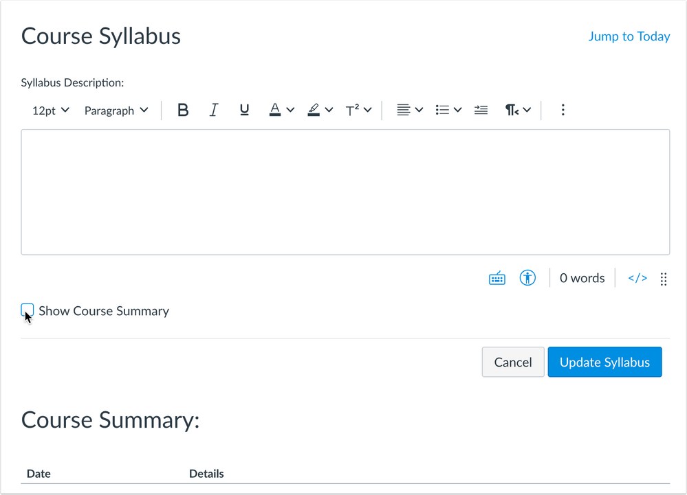
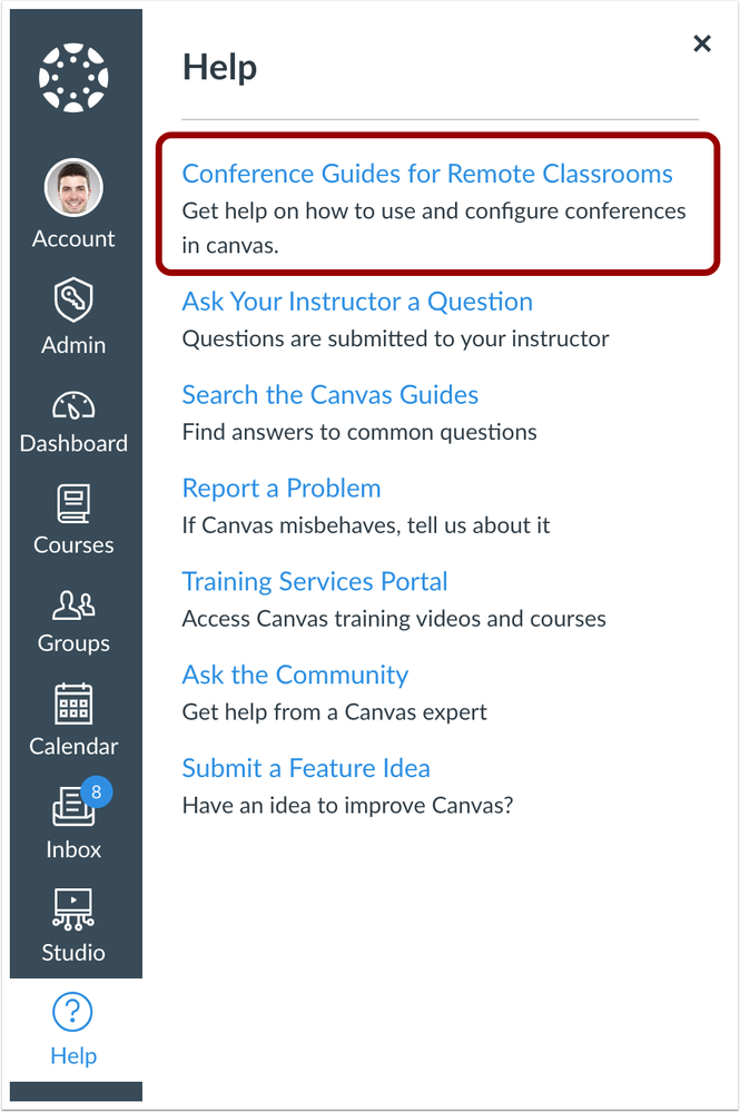
In this Canvas release (March 21), the Gradebook export CSV file matches the order of assignments. In assignments, the status of re-uploaded assignment files is managed in the background, no longer requiring the uploader to wait for the files confirmation page. Additionally, the Syllabus page includes an option to remove the Course Summary section. The Help Menu includes a new link to assist users with conferences.
Feature Options
- For institutions using the New Rich Content Editor, the editor autosaves any content that hasn’t yet been submitted for up to one hour.
Release notes describe upcoming Canvas functionality and are subject to change.
|
- UpdatedFeatures
- Account Settings
- Conferences Help Menu Link
- Assignments
- Re-Upload Submissions Status Page
- Gradebook
- Export Sort Order
- Plagiarism Icons
- PRODUCTION RELEASE DELAYED
- New Rich Content Editor
- Auto Save
- Keyboard Insert Menu Updates
- Syllabus
- Course Summary Visibility
Updated Features |
Account Settings
Conferences Help Menu Link
Production Feature Availability | 2020-03-13 |
Affected Canvas Areas | Account Settings |
Beta/Test Environment Support | Yes |
Permissions | Account-level settings - manage Feature Options - enable / disable |
Affects User Interface | Yes |
Affected User Roles | All Users |
Feature Enhancement Ideas | |
Specified Tag for Feature Ideas | Account Settings |
Summary
The Help Menu includes a new link to assist users with conferences: Conference Guides for Remote Classrooms.
Change Benefit
This change assists institutions looking for assistance with Canvas Conferences.
Affected User Roles & Behaviors
All Users
The Conference Guides for Remote Classrooms link displays by default in the Help Menu for all institutions with English locales. Any admin who wants to remove this option can customize the Help Menu in Account Settings.
Assignments
Re-Upload Submissions Status Page
Location to Enable Feature | Assignments |
Configuration Details | N/A |
Affected Canvas Areas | Assignments |
Beta/Test Environment Support | Yes |
Affects User Interface | Yes |
Affected User Roles | Instructors |
Feature Enhancement Ideas | |
Specified Tag for Feature Ideas | assignments |
Feature Video |
|
Summary
The status of re-uploaded assignment files is managed in the background, no longer requiring the uploader to wait for the files confirmation page. After downloaded files are re-uploaded to Canvas via a zip file, a status page notifies the user that the files are processing.
Change Benefit
This change moves file uploads from a front-end process to a backend process allowing instructors to leave the assignment page. Additionally, this change prevents large files from timing out during the upload.
Affected User Roles & Behaviors
Instructors
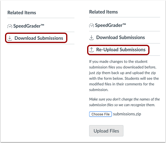
When instructors download all submissions for an assignment and then re-upload them as a zip file, clicking the Upload Files button displays a status page. This page indicates that the files are being processed, which may take a while depending on the file size. Instructors can navigate away from the assignment page if needed. Previously instructors had to wait for all files to be uploaded before they could leave the page.
The assignment sidebar displays a View Uploads Status button that can be used to view the status of the files as well. This button always displays in the sidebar, even after the upload is complete. In the case of multiple uploads, the page displays the results of the last upload.
Gradebook
Export Sort Order
Location to Enable Feature | Gradebook Export Link |
Configuration Details | N/A |
Affected Canvas Areas | Gradebook |
Affects User Interface | Yes |
Affected User Roles | Instructors |
Feature Enhancement Ideas | |
Specified Tag for Feature Ideas | gradebook_new |
Community Idea Contributions | |
Feature Video |
Summary
The Gradebook export CSV file matches the order of assignments displayed in the Assignments page.
Change Benefit
This change provides consistency in both the Assignments page and the CSV file.
Affected User Roles & Behaviors
Instructors
Instructors who export a Gradebook CSV file view the file in the same order as in the Assignments page. The file sorts by the position (ascending) of the assignment group for an assignment, then by the assignment’s position within the group. Previously the Gradebook export arranged assignment groups by ID, followed by the assignment’s position within the group.
Plagiarism Icons
PRODUCTION RELEASE DELAYED
Location to Enable Feature | N/A |
Configuration Details | Any Plagiarism LTI tool |
Affected Canvas Areas | Gradebook |
Affects User Interface | Yes |
Affected User Roles | Instructors, Students |
Feature Enhancement Ideas | |
Specified Tag for Feature Ideas | gradebook_new |
Feature Video |
|
Summary
For plagiarism tools, updated plagiarism icons display in the Gradebook, SpeedGrader, and the student Grades page.
Change Benefit
This change improves icon functionality previously introduced in the Gradebook and SpeedGrader.
Affected User Roles & Behaviors
Instructors, Students
When a plagiarism tool is enabled for a course, plagiarism reports display for each student submission. Updated icons more accurately portray the plagiarism result by shape. Previously, results were only indicated by color.
The plagiarism result displays directly in the Gradebook cell for each submission.
Report types are indicated by the following icons:
- Error icon: the submission could not be submitted to the plagiarism service; resubmit from SpeedGrader
- Clock icon: the submission is being processed by the plagiarism service
- Green certified checkmark icon: the similarity score is between 0% and 20%
- Red half-filled circle icon: the similarity score is between 20% and 60%
- Solid red circle icon: the similarity score is higher than 60%
Instructors
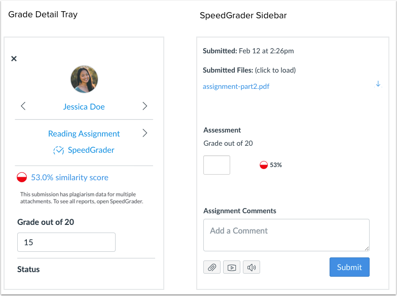
The plagiarism icons display when editing a Gradebook cell. Additionally, the Grade Detail Tray also includes the indicated plagiarism icon. For originality reports, the actual percentage can be viewed in the Grade Detail Tray.
The same data that displays in the Grade Detail Tray also displays in SpeedGrader.
Note: If an assignment includes multiple submission files, the Gradebook displays the highest originality score. The Grade Detail Tray indicates that the submission includes plagiarism data for multiple attachments, which can be viewed in SpeedGrader. SpeedGrader displays each individual file and the originality report for each file.
New Rich Content Editor
Auto Save
This feature is used in conjunction with an existing feature option in Canvas. Please view the content below for additional details. For more information about feature options, please see the Canvas Release Notes FAQ.
Location to Enable Feature | New Rich Content Editor |
Configuration Details | |
Feature Option Enforcement | 2020-06-20 |
Affected Canvas Areas | Rich Content Editor |
Affects User Interface | Yes |
Affected User Roles | All Users |
Feature Enhancement Ideas | |
Specified Tag for Feature Ideas | Rich Content Editor |
Community Idea Contributions | https://community.canvaslms.com/ideas/1300-auto-save-in-rich-content-editor |
Feature Video |
|
Summary
In pages with one Rich Content Editor, the editor autosaves any content that hasn’t yet been submitted for up to one hour.
Change Benefit
This feature helps users retain new or edited content that may otherwise be lost from inadvertent browser reloads, loss of internet connection, or navigating to another window.
Affected User Roles & Behaviors
All Users
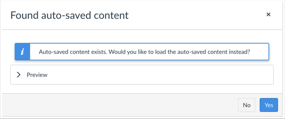
When a user enters content in a Rich Content Editor window, the editor automatically saves the content for up to one hour. If the user navigates away from the page or another situation occurs where the user revisits the page within one hour, Canvas will notify the user if any saved content is different from the existing content. The user can preview the autosaved content and select the Yes button to load the autosaved content. Selecting the No button will discard the autosaved content.
AutoSave Support
This autosave functionality only displays in pages that only include one Rich Content Editor window, such as pages and assignments. Saved content is matched with the page URL and the Rich Content Editor (RCE) ID. For instance, content that is autosaved for an assignment, but never submitted as part of saving an assignment may display as autosaved content when a user returns to the same assignment.
In discussions, autosave is supported when a user is only replying to one thread or comment at a time. Opening Rich Content Editors for multiple replies at the same time (and creating multiple RCE IDs) may not create autosave functionality.
Storage Details
Saved content is stored in each browser’s local storage, which means Canvas can only recover autosaved content using the same browser on the same computer an hour within the last edit.
Additionally, each browser includes a limit for how much information can be saved in local storage, which does not guarantee that the Rich Content Editor will always be able to save a user’s content.
In the same behavior of clearing a browser cache, users who are able to manage their local storage may want to check and clear their local storage space when using Canvas. Additionally, when manual save functionality is supported, such as in pages, users should frequently save their content; content that cannot be saved as a draft in Canvas, such as assignment and discussion replies, may need to be drafted outside of Canvas to ensure content is not lost.
Keyboard Insert Menu Updates
Production Feature Availability | 2020-03-13 |
Location to Enable Feature | New Rich Content Editor |
Configuration Details | |
Feature Option Enforcement | 2020-06-20 |
Affected Canvas Areas | Rich Content Editor |
Affects User Interface | Yes |
Affected User Roles | All Users |
Feature Enhancement Ideas | |
Specified Tag for Feature Ideas | Rich Content Editor |
Community Idea Contributions | https://community.canvaslms.com/ideas/14157-add-horizontal-rule-to-rich-text-editor |
Summary
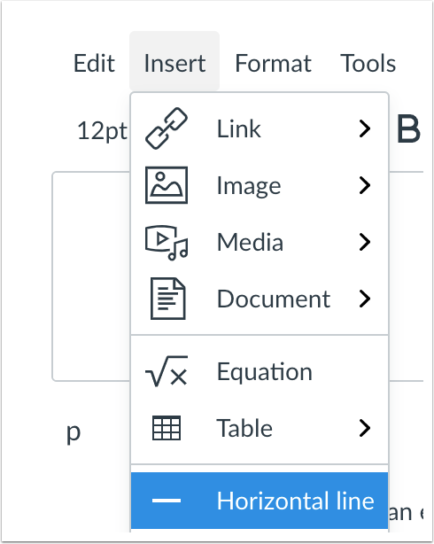
The Keyboard Insert Menu includes the option to add a Horizontal Line. Additionally, the Insert Menu has been updated to reflect the same options available in the New Rich Content Editor toolbar menus.
Change Benefit
This change helps with consistency in both the Keyboard and New Rich Content Editor toolbar menus.
Affected User Roles & Behaviors
All Users
All users can use the Keyboard shortcuts menu to open the keyboard menus. The Keyboard Insert menu includes the insert options also available in the Rich Content Editor toolbar menu:
- Link, Image, Media, and Document options
- Equation editor
- Horizontal line
Syllabus
Course Summary Visibility
Location to Enable Feature | Syllabus |
Configuration Details | N/A |
Affected Canvas Areas | Syllabus |
Beta/Test Environment Support | Yes |
Updated APIs | Courses API |
Affects User Interface | Yes |
Affected User Roles | Instructors, Students |
Feature Enhancement Ideas | |
Specified Tag for Feature Ideas | syllabus |
Feature Idea Contributions | |
Feature Video |
|
Summary
The Syllabus page includes an option to remove the Course Summary section.
Change Benefit
This change allows instructors to remove the auto-generated Course Summary section in the Syllabus.
Affected User Roles & Behaviors
Instructors
When instructors create a course summary, editing the syllabus displays a checkbox to make the course summary optional. This checkbox is selected by default.
If the Course Summary option is not selected, all other viewers in the course will also not be able to view the course summary.
The Syllabus is considered to be a course setting and is inherited in course copies. Additionally, any courses that are also a Blueprint Course must be synced for a Course Summary change to display in associated courses.
Date | |
---|---|
2020-03-18 | Added—Updated Features
Removed—Updated Features
|
2020-02-27 | Added available feature videos (from screencast) to feature sections |
2020-02-18 | Release Notes Published |
- Mark as Read
- Mark as New
- Bookmark
- Permalink
- Report Inappropriate Content
Loving the option to remove the Course Summary section under the Syllabus! Thank you!
- Mark as Read
- Mark as New
- Bookmark
- Permalink
- Report Inappropriate Content
Question about the "New Rich Content Editor" functionality. Is the saved data saved locally (to that specific web browser in its cache) or is it saved on Canvas servers?
It makes a difference because whatever happens to the user and their device, in their attempt to fix the problem, they may have had their local web browser data cleared.
- Mark as Read
- Mark as New
- Bookmark
- Permalink
- Report Inappropriate Content
I had the same question about how the auto-save works. It's saved in the user's browser using 'local storage', (see the "Storage Details" section).
- Mark as Read
- Mark as New
- Bookmark
- Permalink
- Report Inappropriate Content
Thank you for that, JEFHQ12951. I should have read more.
- Mark as Read
- Mark as New
- Bookmark
- Permalink
- Report Inappropriate Content
Curious: What happens with the content in an edited page if neither the yes or no button is pushed?
Scenario: I'm editing a page, I click away, the warning comes up. By the time I get back to the page, I've been signed out of Canvas. The changes would be discarded, correct?
- Mark as Read
- Mark as New
- Bookmark
- Permalink
- Report Inappropriate Content
I definitely understand the reasoning behind providing icons for the Plagiarism checker and applaud the efforts to make it accessible. However, I wonder if the check mark is misleading...if I saw a paper that scored 20% copied on TurnItIn, that would be pretty suspicious to me. But if I saw a green checkmark, I probably wouldn't worry about it. The checkmark conveys more of an implied "this one is OK" approval than simply green, in my opinion. Is there an icon option that rather than conveying approval, simply represented the range of originality score? I'm thinking of various degrees of a shaded in circle, maybe.
I would still prefer one of the red circles to not be red. Orange?
I might be overthinking it. Curious what other people have to say...
- Mark as Read
- Mark as New
- Bookmark
- Permalink
- Report Inappropriate Content
I like the option of the course summary button option with the condition of it being checked by default (which it is, so that's great). Just wanted to put that out there, that it becomes problematic for us as soon as the default is not to have the course summary included in the syllabus. In other words, thanks for making the summary on the default, and please don't change that.
- Mark as Read
- Mark as New
- Bookmark
- Permalink
- Report Inappropriate Content
I just tried the feature in a beta course while editing the syllabus page. There is no warning when you click away from unsaved content, the prompt comes up when you return to edit the content and asks if you want to use the auto-saved content. When I log out of my beta instance that prompt doesn't show up anymore so my changes were lost. I can only assume that if you've waited too long and you've been timed out of your session that it would destroy the auto-saved content.
We should emphasize that in the release notes it says in a round about way that this isn't a stop-gap measure for infrequent saves. Potentially long compositions should be done outside of Canvas as a rule of thumb (i.e. for students doing long discussion posts).
- Mark as Read
- Mark as New
- Bookmark
- Permalink
- Report Inappropriate Content
I really like the "Course Summary" area of the syllabus and am very happy that it is enabled by default, with the option of turning it off. I like the feature because it provides a table view of everything due in the course, when it is due, and that can be easier than using the calendar.
- Mark as Read
- Mark as New
- Bookmark
- Permalink
- Report Inappropriate Content
Thanks for testing that, JEFHQ12951! That answers my question.
- Mark as Read
- Mark as New
- Bookmark
- Permalink
- Report Inappropriate Content
Agreed...I've often sold the course summary to instructors as a time saver for users who traditionally use a paper schedule of course deadlines to be included with their syllabus document. The ("curmudgeonous?") holdouts who never liked the summary being there by default will definitely be appreciative that they can finally remove it.
- Mark as Read
- Mark as New
- Bookmark
- Permalink
- Report Inappropriate Content
On the plagiarism icons can you clarify this statement. How does an instructor/student resubmit via SpeedGrader? Would it be better to state that the student must resubmit the assignment in different format?
Error icon: the submission could not be submitted to the plagiarism service; resubmit from SpeedGrader
- Mark as Read
- Mark as New
- Bookmark
- Permalink
- Report Inappropriate Content
Agreed, the checkmark is a concern and the fact that the colours and proposed icons do not correspond to anything in Turnitin is a concern - Interpreting the Similarity Report
- Mark as Read
- Mark as New
- Bookmark
- Permalink
- Report Inappropriate Content
I wonder if that icon is even visible to students. With plagiarism framework, the instructor/TA has the option of pushing the student's assignment submission back to the plagiarism review engine. (Note the 'resubmit from SpeedGrader' text). Students don't have access to SpeedGrader.
It looks like this in SpeedGrader (we're a Turnitin institution):
- Mark as Read
- Mark as New
- Bookmark
- Permalink
- Report Inappropriate Content
Hi, Katie,
This feature was originally introduced last year and pulled back to revisit the icons. The icons have been through a few rounds of revision.
These icons are also based on using the Canvas plagiarism platform and may not match with specific plagiarism tools if they are not using the plagiarism LTI. The platform provider would need to incorporate these icons into their platform.
Thanks,
Erin
- Mark as Read
- Mark as New
- Bookmark
- Permalink
- Report Inappropriate Content
I also agree that 20% is a too high for a green checkmark indicator. I would bet my COM faculty are concerned with any match over 5%.
- Mark as Read
- Mark as New
- Bookmark
- Permalink
- Report Inappropriate Content
Is there a way we can prevent the new course summary checkbox from being enabled? The use of the course summary section is a required section for our institution. Providing the option to hide this section would go against everything we tell our instructors.
- Mark as Read
- Mark as New
- Bookmark
- Permalink
- Report Inappropriate Content
I would guess that it could be disabled through javascript. We use javascript to disable some of the checkmarks and remove buttons in the "Settings" area of a course if the user is not an admin. It would probably be based on code that is similar to what is available in the thread at https://community.canvaslms.com/ideas/3623" modifiedtitle="true" title="Disable Changing Course Star.... Ideally the option would exist as a setting at the account/sub-account level.
- Mark as Read
- Mark as New
- Bookmark
- Permalink
- Report Inappropriate Content
Erin Hallmark wrote:
Hi, Katie,
This feature was originally introduced last year and pulled back to revisit the icons. The icons have been through a few rounds of revision.
These icons are also based on using the Canvas plagiarism platform and may not match with specific plagiarism tools if they are not using the plagiarism LTI. The platform provider would need to incorporate these icons into their platform.
Thanks,
Erin
Thanks for the response, Erin. Could you expand on what you mean by "the platform provider would need to incorporate these icons into their platform"? Do you mean if we use TII and not Canvas, our icons in Gradebook would continue to be the colored flags and not these icons? Or do you just mean, if TII wanted to match what Canvas uses, then the onus is on TII to change their icons and colors? Just want to make sure I understand correctly.
I remember when these icons came up in the release notes a few months ago, and I appreciate the no-doubt extensive work that's already gone into them. I'm suggesting perhaps a few more rounds of revision are in order, with deeper consideration given to semiotics and what meaning the icons are conveying to overworked faculty who may not adequately understand the technology they are being forced to use by their departments/universities. But again, I might be overthinking it and would be interested in hearing what others think.
- Mark as Read
- Mark as New
- Bookmark
- Permalink
- Report Inappropriate Content
Hi @venitk
I shared this exact concern back during the first proposal of this change last year. That green checkmark icon seems to convey a "passing" similarity score, but 20% in many cases is way too high for that. The only thing I'd personally support using a green checkmark icon for would be a 0% score. 1%-20% really needs to be something other than a green checkmark. I'm sure a lot of conversations have been held internally about these icons, but hopefully we can request one more go-around on this to really get it right for everyone's use cases.
-Chris
- Mark as Read
- Mark as New
- Bookmark
- Permalink
- Report Inappropriate Content
Hi @tylerweldon ,
The following code placed in your custom JavaScript should disable the checkbox. If others have a better solution or better code to accomplish this, please let me know.
if (/^\/courses\/[0-9]+\/assignments\/syllabus$/.test(window.location.pathname)) {
document.getElementById('course_syllabus_course_summary').disabled=true;
}
P.S. I'd love if things like this were optional via feature options or settings. It's great that we can make some customizations with JavaScript, but it can be a pain to test and keep things up to date with new browser versions and monthly Canvas updates that could potentially break the JavaScript.
- Mark as Read
- Mark as New
- Bookmark
- Permalink
- Report Inappropriate Content
Thank you for posting that code, chriscas. I have not gotten a chance to try it, and I am not sure we will need it because do not mandate the use of the "Syllabus" tab or the "Course Summary", but I am sure it would be helpful. I still wish that there was more supported control for functionality such as this without relying on JS code.
- Mark as Read
- Mark as New
- Bookmark
- Permalink
- Report Inappropriate Content
Thanks Chris,
I was just about to sit down and figure out how to hide this box. Fingers crossed this can be bumped to a feature option.
- Mark as Read
- Mark as New
- Bookmark
- Permalink
- Report Inappropriate Content
Agreed. We've received many questions/complaints about the inability to hide or edit the Course Summary. Giving instructors a choice will help alleviate this pain point.
- Mark as Read
- Mark as New
- Bookmark
- Permalink
- Report Inappropriate Content
The option for the Syllabus summary to be hidden is fairly intuitive but to an instructor who is not in edit mode, there is no indication that the Course Summary is hidden. It would be helpful if there was an indicator in the instructor view that "Course Summary is hidden" for clarity. They understand publish/unpublish but digging into the Edit page option to find the hide/show course summary option could be more intuitive and consistent with other areas of Canvas.
Melanie
- Mark as Read
- Mark as New
- Bookmark
- Permalink
- Report Inappropriate Content
I agree with Melanie.
It would seem like this is serving the long-time Canvas user demographic who have been waiting for the time they can finally hide the course summary by editing their syllabus description. Maybe it would be nice to have the checkbox to hide the summary always present regardless of whether the syllabus is in edit mode, sort of like a toggle switch?
- Mark as Read
- Mark as New
- Bookmark
- Permalink
- Report Inappropriate Content
I've spoken with a colleague about the auto-save feature. We agree this has been a feature that people have asked for, it's better than nothing, and it will be helpful in the limited circumstances outlined in the release notes above. We also have a few thoughts:
- The way this works feels unnatural and confusing (exotic, even) compared to how auto-save normally works, within Canvas and outside of Canvas.
- When most things auto-save, they auto-save for a long period of time; if Word auto-saves my doc, it doesn't just save for an hour. It's unexpected for the user that the changes would only be saved for an hour.
- If I'm working in OneDrive and my Word doc auto-saves, those changes are accessible from any browser forever. It's unexpected for the user that the auto-save in Canvas would only be accessible from that particular browser/computer.
- Within Canvas, if I make a change in Quizzes and leave without saving, those changes seem to be saved in perpetuity. When I return to the quiz, I get a nice note at the top of telling me that my changes weren't saved, even months afterwards. It would be helpful (but perhaps not possible) for this feature to behave that way.
- We don't think many faculty will be able to keep track of the circumstances this feature would work in.
This comment feels like looking a gift horse in the mouth since any auto-saveablity is certainly better than none, but we're thinking of the utility of this feature weighed against faculty cognitive load when we try to explain this to them. Definitely a step in the right direction, though.
- Mark as Read
- Mark as New
- Bookmark
- Permalink
- Report Inappropriate Content
Yes I like the idea of a visible toggle!
Melanie
- Mark as Read
- Mark as New
- Bookmark
- Permalink
- Report Inappropriate Content
Agree with you. Check mark does imply 'this is okay', and not that the score is between 0% and 20%. Also, the full red circle and the half red circle will be very difficult to decipher in large courses, lots of scrolling etc.
- Mark as Read
- Mark as New
- Bookmark
- Permalink
- Report Inappropriate Content
To be clear, I don't think it would be a good idea for changes to Pages to auto-save in the way that OneDrive auto-saves (every time there's a change made). There are a lot of times I'm in a page and screw it up, and need to cancel my changes. A OneDrive-ish autosave would be scary! So that's definitely not the best option, and you've wisely not gone with that. But that is a extant model of how autosave works in a really popular software program.
- Mark as Read
- Mark as New
- Bookmark
- Permalink
- Report Inappropriate Content
I also agree that the "check-mark" icon implies that the percentage falls within an "approved" category. It is up to our teachers to decide what is acceptable for each assignment, and using this icon will suggest otherwise.
- Mark as Read
- Mark as New
- Bookmark
- Permalink
- Report Inappropriate Content
Same here!!! Love this new feature!
- Mark as Read
- Mark as New
- Bookmark
- Permalink
- Report Inappropriate Content
Agreed! The checkmark is an issue. The similarity level depends on the purpose of the assignment. There is no "magic number" that indicates absolute plagiarism. Getting instructors to check the report when there is a checkmark will be difficult.
- Mark as Read
- Mark as New
- Bookmark
- Permalink
- Report Inappropriate Content
For the plagiarism checker, what about something simple, like circles filled to varying degrees in different colors (red, orange, green). Three circles only: filled in all the way, half-way, and empty.
Obviously, not exactly like this, as we wouldn't need the arrows or anything, but just the circles. The problem, for people who can't see color, would be figuring out whether the filled in circle indicates a high or low plagiarism score--but honestly, I find that's a confusion inherent in plagiarism checkers (do the percentages indicate amount original or amount plagiarized?). Perhaps a high originality score could be augmented by a green scalloped edge or something, although my colleague did note that she could barely see the scalloped edge on her computer, so it didn't mean much.
Anyway, I'd prefer something like this that more neutrally conveys amount rather than approval.
- Mark as Read
- Mark as New
- Bookmark
- Permalink
- Report Inappropriate Content
Howdy,
I'm not sure what/who are all the vendor options for plagiarism detection, but from the TurnitIn and Unicheck, they both use 5 levels of color for the same ranges. I'd be in favor of an icon and color in Canvas.. but definitely showing more levels of similarity instead of just 3.
I have no good suggestions for icons because I'd just use smileys. :smileyplain: :smileyconfused:
:smileyangry:
Cheers - Shar
- Mark as Read
- Mark as New
- Bookmark
- Permalink
- Report Inappropriate Content
Hey, that almost matches the emoji grading scheme I made (I don't use this with students, I just use it to demonstrate that the grade that's displayed isn't an actual number in the 4.0 grade scale, but a symbol that represents math happening elsewhere).
- Mark as Read
- Mark as New
- Bookmark
- Permalink
- Report Inappropriate Content
I agree with the comments about the green checkmark icon. The checkmark indicates approval and in combination with the shape of the icon I would even interpret it as a sign of excellence.
- Mark as Read
- Mark as New
- Bookmark
- Permalink
- Report Inappropriate Content
I think the reason why it doesn't work this way is because the feature is happening client-side, not server-side. So it's using your local browser cache to keep the content. In Canvas, page edits aren't pushed up to the server until you hit the save button. Until then, you're just working on a local copy on your machine.
It would likely take a much bigger overhaul, and waaaaay more network traffic, to implement a more cloud-doc-like autosave.
- Mark as Read
- Mark as New
- Bookmark
- Permalink
- Report Inappropriate Content
That sounds about right, and I was thinking it was something like that. I just wanted to pass along my thoughts as someone who will be telling my instructors about this. We're still relatively new to Canvas, so cognitive load is absolutely one of my top concerns right now.
- Mark as Read
- Mark as New
- Bookmark
- Permalink
- Report Inappropriate Content
Got it, thanks!
Bridget
- Mark as Read
- Mark as New
- Bookmark
- Permalink
- Report Inappropriate Content
I second expanding the range to 5 with Blue/Green/Yellow/Orange/Red color coding, though I don't think smileys will go over well with our faculty. A generic filled circle or rectangle shape is fine. There's no need to bother with half-filled shapes if we're using colors to appropriately communicate ranges.
- Mark as Read
- Mark as New
- Bookmark
- Permalink
- Report Inappropriate Content
I believe the shapes--of some sort--are necessary for accessibility purposes (color blindness). I'm advocating for different shapes.
- Mark as Read
- Mark as New
- Bookmark
- Permalink
- Report Inappropriate Content
Absolutely shapes are necessary in addition to color! (What @venitk said about accessibility--there are all kinds of color vision that make color a tenuous (at best) communicator of meaning.)
Also, I don't think anyone was *seriously* advocating for emoji similarity indicators. Just having fun with it.
Actually, I have an idea: Aquatic animals! Otter, dolphin, salmon, flounder, hagfish. Fight me.
- Mark as Read
- Mark as New
- Bookmark
- Permalink
- Report Inappropriate Content
Colors do need to be differentiated for accessibility, but this can be done with a pattern overlay. Trello does a good job with this.
https://wearecolorblind.com/examples/trello-colorblind-friendly-mode/
I agree on the 5 (not 3) point scale, but I still feel that introducing shapes adds unnecessary complexity, however minor.
- Mark as Read
- Mark as New
- Bookmark
- Permalink
- Report Inappropriate Content
Seems like we're on the same page. I read those patterns as shapes, just bounded differently (inside vs. outside). Some scaling concerns, with patterns, generally. A single, larger shape is just easier to see than an internal pattern, at multiple standard resolutions.
- Mark as Read
- Mark as New
- Bookmark
- Permalink
- Report Inappropriate Content
There has been a lot of negative feedback about the plagiarism icons that will be released on 2020-03-21.
Does Instructure have any comments?
Will the icons still be released on 2020-03-21?
- Mark as Read
- Mark as New
- Bookmark
- Permalink
- Report Inappropriate Content
The main problems identified to date seem to be that the Canvas proposed similarity icons
- Do not correspond to the levels of similarity that are in Turnitin
- Provide confusing information (checkmark in the green icon), that is misleading to instructors and students
- Do not provide sufficient distinction of the different levels of similarity in terms of shape or colour
Given that we are just about to enter into a very busy period of assignment submissions (essays, mid-term papers and end-of-term papers), please delay this proposed change to allow for proper discussion and solution.
The numbers included in circles of different colours as proposed above, or different shapes that correspond to the colours in a Turnitin similarity report might work. A sample solution is below for consideration:
- Mark as Read
- Mark as New
- Bookmark
- Permalink
- Report Inappropriate Content
I agree with all the comments above about the proposed plagiarism icons. The three-level colour/shape scheme is insufficient, particularly in larger courses (700 students). It is very difficult to identify full vs half-circles, and we see a lot at 30% similarity that are okay because of regular content like headings, tables of contents, etc. The three-level scheme does not differentiate between, say 30%, which might be okay in some courses, and 50% which is obviously not okay at all. This provides a gaping, unidentified chasm between 20% and 60% that in some of our larger courses would see most Instructors actually ignoring the half circles due to many not being a problem, but missing potential issues, at, say, 40-50%.
I also agree that the green tickmark sends the wrong message to Instructors. We try to educate our staff that zero should actually ring alarm bells (for e.g., it might represent contract cheating), and a tick of any sort goes against this education process, and beyond, encouraging an 'it's okay, it's got a tick' response.
Turnitin is a powerful tool that teaching staff have come to rely on (perhaps a little too much), and I see these icon changes as a dramatic step back.
Can you please hold back this release and encourage further discussion, perhaps with the users who have already commented on this issue in Feb and also December comments?
- Mark as Read
- Mark as New
- Bookmark
- Permalink
- Report Inappropriate Content
Leonie, good point about the differences in assignments. I actually support a course with an assignment in which originality is a big flag, since they're working from a template--if they didn't follow the template (and so have a low originality score), it suggests they didn't follow directions, or copied their assignment from a student in another section that doesn't send assignments through TurnItIn.
- Mark as Read
- Mark as New
- Bookmark
- Permalink
- Report Inappropriate Content
I also agree with many of these comments regarding the Turnitin icons. A three point scale is not sufficient, and should match the five point scale indicated by ishar-uw. Would it not be much simpler to use colour, and the percentage match to indicate the level? Similar to the old icons, but maybe with an updated look or encompassed by a different shape? This would be much cleaner, effective and accessible? Instructors use the percentage match score to establish whether the submission needs further analysis, so it makes sense to have this available to save people clicking through to establish this?
As many of the comments here have already outlined, there's a huge difference between a 1% match and a 24% match. If a quarter of the work is plagiarised that's a big deal. So whilst the colour is a helpful indicator, the actual score is much more important.