[ARCHIVED] Will navigation get better between Canvas and Quizzes Next
- Mark as New
- Bookmark
- Subscribe
- Mute
- Subscribe to RSS Feed
- Permalink
- Report Inappropriate Content
Hi there. I am not sure if this has been dealt with before - but i could not find any comment about it. We have just started some testing with Quizzes Next and have found the integration between it and Canvas to be very disappointing as far as user navigation is concerned.
From what I can tell Quizzes next seems to assume that all users will enter and exit its use via the Assignments area.
We use Canvas to host professional development courses with self directed users. Typically we might have several pages of content with a Quiz in the middle of it. We expect users to work through content, test their knowledge, and move onto the next page or module of content.
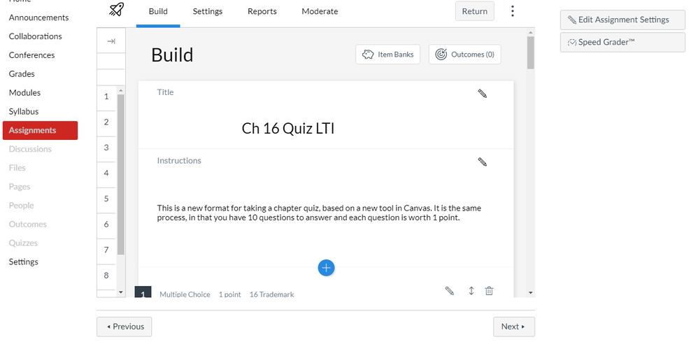
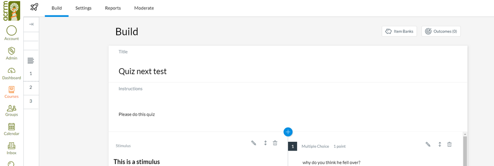
But it seems that in Quizzes Next - when you open a Quiz (as a user) you lose all of the navigation of the course (the left menu with Home, modules, marks etc) and get taken to what feels like an unconnected quiz experience. What is worse is that when you submit the course and get auto-graded and see your results - the user is then left hanging with no clue where to go next. When the user does spot the 'Return' button on the top right of screen (where they will have never seen a Canvas button before) it takes them back into the 'Assignments' page.
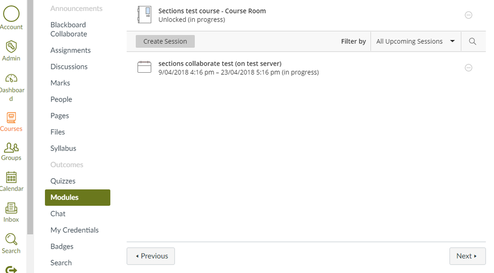
In our use of Canvas - we mostly have the assignment page hidden as we just present their assessment items to them on the module page - inline with the content it relates to.
So the current Quizzes Next experience would just leave our users completely confused and with no idea where to go next.
We were expecting that the Quizzes next experience would simply have a 'Next' button at the bottom of the 'results' or final page the assessment experience that would take them to whatever the educational designer/teacher wanted them to see next - or at least have the 'return' button actually return the user to where they came from.
Is this something that is on the roadmap?
We love the new functionality of the new quiz system - but its current form that forces everyone to funnel through the Assignments page to enter and exit any quizzes would - for our purpose - confuse users, cause unneeded cognitive load, and simply make the new quiz engine unusable for us.
I hope I have explained this clearly enough - let me know if you need further detail or examples.
I look forward to further details
Thanks
Lex


This discussion post is outdated and has been archived. Please use the Community question forums and official documentation for the most current and accurate information.