The Hubris of Contrast Ratio
- Subscribe to RSS Feed
- Mark as New
- Mark as Read
- Bookmark
- Subscribe
- Printer Friendly Page
- Report Inappropriate Content
If you spend any time thinking about the accessibility of your content you have probably thought about color contrast. I want to share a little bit on what I've learned about color contrast because it really opened my eyes. (See what I did there?)
When it comes to color contrast some of us probably have these numbers from the WCAG 2.x memorized:
WCAG 2.0 level AA requires a contrast ratio of at least 4.5:1 for normal text and 3:1 for large text. [...] WCAG Level AAA requires a contrast ratio of at least 7:1 for normal text and 4.5:1 for large text.
via WebAIM Contrast Checker
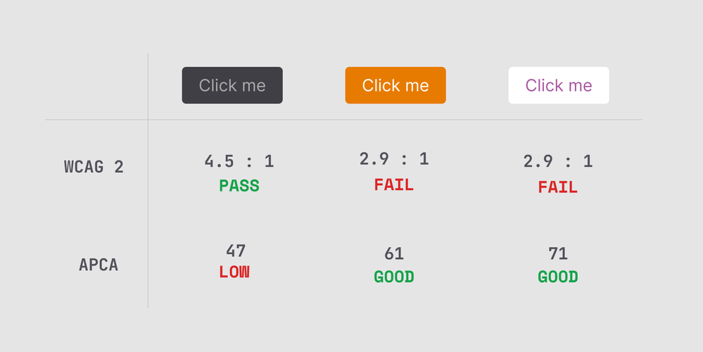
But have you ever thought about where those numbers come from? Well, they come from people, of course! I must admit, I had never questioned where those numbers came from or their fallibility. A picture is worth a thousand words though, so do your best to read the following:

As Dan shows, even though the contrast calculation generally works well, and a lot of early blogs used to look like the middle of the PASS column, the currently accepted calculation has some obvious flaws in actual usage. Perceived contrast is tremendously altered by the context it appears in, which the current calculation does not adequately account for.
Like all perceptions it is context sensitive, meaning what is around it and its purpose affects how you see it. Contrast is also substantially affected by "spatial frequency" which essentially means font size and weight, and is closely related to our brain's lightness perception (aka luminance contrast). When it comes to color contrast, as in hue/chroma/saturation, the effect is less relevant to readability. High lightness/darkness contrast is required for fluent readability at best speed and comprehension, especially small body text in columns or blocks.
via Why APCA as a New Contrast Method
The new Advanced Perceptual Contrast Algorithm (APCA) planned to be adopted in WCAG 3.0 aims to address these limitations, as Dan again shows.
As of this writing, the WCAG 3.0 guidelines are not finalized and could still change dramatically before they are, so nothing is changing in Canvas just yet! So why share this if we're not implementing it in Canvas soon? I share this as a reminder that accessibility and best providing accommodations for those with disabilities is an evolving field.
As a Canvas Product Manager, I strive to build an accessible platform with tools that make creating accessible content easy. As educators, we focus on the individual learner's needs and how we can best provide for them, how ever the guidelines change.
The content in this blog is over six months old, and the comments are closed. For the most recent product updates and discussions, you're encouraged to explore newer posts from Instructure's Product Managers.


The content in this blog is over six months old, and the comments are closed. For the most recent product updates and discussions, you're encouraged to explore newer posts from Instructure's Product Managers.