Hello,
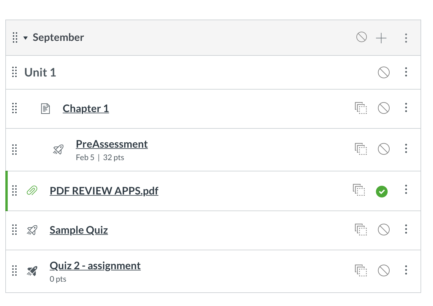
Is there away to remove some of this extra padding and white space around each level in the modules. Our students have to scroll for days to get to certain areas in a curriculum. Even when you collapse a module there is still so much space in between (see image 2).
For example, in Gmail, you can choose your view from comfortable to compact (see image 1). I was hoping there would be more customizations within canvas like this.
I would even take if you have the assignments/pages under each module heading a different size (see image 3) than the header so there can be some differentiation.
Same goes for the discussion boards. Each post takes up a lot of space (see image 4)
Overall, I wish there was an option to condense the space and make it look more compact.
Thank you for your time reading this.
