Your Community is getting an upgrade!
Read about our partnership with Higher Logic and how we will build the next generation of the Instructure Community.
After tinkering with several different designs, and watching how students respond, I settled on the following page template. The code is shared so that you may use it and modify it. For example, the layout uses tables and div tags would be a much better practice. Feel free to modify
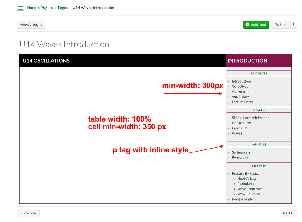
The main table is 100%, with the left column set to 80% and the right sidebar set to 20%.
The left column has a min-width so that the Canvas student app shows the left column in a full screen. The right sidebar is the "off screen" and a finger swipe shows it.
The right sidebar also has a min-width so that longer headings are not wrapped.
Here is the code:
<table style="width: 100%; border-collapse: collapse; border-right: 1px solid #000000; border-bottom: 1px solid #000000; border-left: 1px solid #000000; margin-left: auto; margin-right: auto;" border="0">
<tbody>
<tr>
<td style="width: 80%; padding-right: 15px; padding-left: 15px; min-width: 350px; background-color: #000000; vertical-align: middle;">
<p><strong><span style="color: #ffffff; font-size: 18pt;">U14 OSCILLATIONS</span></strong></p>
</td>
<td style="width: 20%; min-width: 300px; background-color: #85144b; vertical-align: middle;"><strong><span style="color: #ffffff; font-size: 18pt;"> INTRODUCTION</span></strong></td>
</tr>
<tr>
<td style="width: 80%; padding-right: 15px; padding-left: 15px; min-width: 350px; vertical-align: top;">
<p> </p>
</td>
<td style="width: 20%; min-width: 300px; background-color: #eeeeee; vertical-align: top;">
<p style="border-top: 1px solid #85144b; border-bottom: 1px solid #85144b; text-align: center;"><strong><span style="font-size: 10pt; color: #008000;">RESOURCES</span></strong></p>
<p><a title="U01 Lecture Slides" href="https://puhsd.instructure.com/courses/7465/pages/U01%20Lecture%20Slides" data-api-endpoint="https://puhsd.instructure.com/api/v1/courses/7465/pages/U01%2520Lecture%2520Slides" data-api-returntype="Page"></a></p>
<ul>
<li>Introduction</li>
<li>Objectives</li>
<li>Assignments</li>
<li>Vocabulary</li>
<li>Lecture Notes</li>
</ul>
<p style="border-top: 1px solid #85144b; border-bottom: 1px solid #85144b; text-align: center;"><strong><span style="font-size: 10pt; color: #008000;">LESSONS</span></strong></p>
<p><a title="U01 Lecture Slides" href="https://puhsd.instructure.com/courses/7465/pages/U01%20Lecture%20Slides" data-api-endpoint="https://puhsd.instructure.com/api/v1/courses/7465/pages/U01%2520Lecture%2520Slides" data-api-returntype="Page"></a></p>
<ul>
<li>Simple Harmonic Motion</li>
<li>Hooke's Law</li>
<li>Pendulums</li>
<li>Waves</li>
</ul>
<p style="border-top: 1px solid #85144b; border-bottom: 1px solid #85144b; text-align: center;"><strong><span style="font-size: 10pt; color: #008000;">LAB SKILLS</span></strong></p>
<p><a title="U01 Lecture Slides" href="https://puhsd.instructure.com/courses/7465/pages/U01%20Lecture%20Slides" data-api-endpoint="https://puhsd.instructure.com/api/v1/courses/7465/pages/U01%2520Lecture%2520Slides" data-api-returntype="Page"></a></p>
<ul>
<li>Spring-mass</li>
<li>Pendulums</li>
</ul>
<p style="border-top: 1px solid #85144b; border-bottom: 1px solid #85144b; text-align: center;"><span style="color: #008000;"><span style="font-size: 13.3333px;"><strong>TEST PREP</strong></span></span></p>
<p><a title="U01 Lecture Slides" href="https://puhsd.instructure.com/courses/7465/pages/U01%20Lecture%20Slides" data-api-endpoint="https://puhsd.instructure.com/api/v1/courses/7465/pages/U01%2520Lecture%2520Slides" data-api-returntype="Page"></a></p>
<ul>
<li>Practice By Topics
<ul>
<li>Hooke's Law</li>
<li>Pendulums</li>
<li>Wave Properties</li>
<li>Wave Equation</li>
</ul>
</li>
<li>Review Guide</li>
</ul>
</td>
</tr>
</tbody>
</table>
<p> </p>
The discussion becomes -- how would you modify this code LAYOUT for an increase in usability and accessibility?
Thank you for the feedback!
Hi lph
I know you probably spent a considerable amount of time planning and creating the template. But...
We should avoid using Tables for Layout, and reserve it for tabular data (spreadsheets)
Luckily, the Community has had this issue for quite some time and there's plenty of resources
Tables not resizing / responding to screen size
Home Sweet Homepages without Tables
Columns Without Tables: code-snippet
Designing Canvas sites for mobile devices
Happy to help, if needed.
Hi
Actually the intention was to build in a table then use the converter to div tags. This is why I (quite poorly) attempted to be clear this was built with a table. I failed to say -- and will be converted from a table to div tags.
My main question was to focus on the layout - the visual aspect. The coding can be changed easily using this tool:
https://divtable.com/converter/
I deeply apologize, this is why posting at night, after long hours of work, is a bad idea.
Let's focus simply on the visual - and not the code. What aspects need adjusting. What do you believe students need in addition to an easy "one click" navigation within a unit? I'll try to add this to my original post.
Lets also remember that only a very small % of those create pages are familiar with div tags and writing with HTML.
The key thing is to get people making pages, adding interactive and multimodal content that students can engage with.
This is an awesome design!
I'm not sure I aggree with your layout?
In terms of readability, I've found people tend to ignore anything on the right-hand side. Hot spots/eye scanning software shows most people scan a page in a rough F shape. They then wander down the page. This article has a couple of good illustrations of how readers scan a page:
https://www.smashingmagazine.com/2008/01/10-principles-of-effective-web-design/
Unless your left-hand column is actively doing something (is it representing a different page in the whole? Is it a site map?) and showing you where you are 'at' in the process (like a bookmark)? Without some sort of function it seems unnecessary.
In terms of code: I'd wonder about responsive design (this could be 2 flex box columns), which on mobile will fall into one line. On that point is the right-hand column links to the other pages? Should it go first or last? I'm an educational designer at an Australian university and find that a lot of teachers don't code, or know HTML and want something that requires minimal touch.
If you search in Commons for 'Sample layout page - three evenly spaced column code' you'll find a 3 column flex book example that might interest you. There is also a 2 column version under the name 'Sample layout page - two unevenly spaced column code' that will have the flex code for the layout above.
Thanks for bringing this up - page design is the mythical white unicorn!
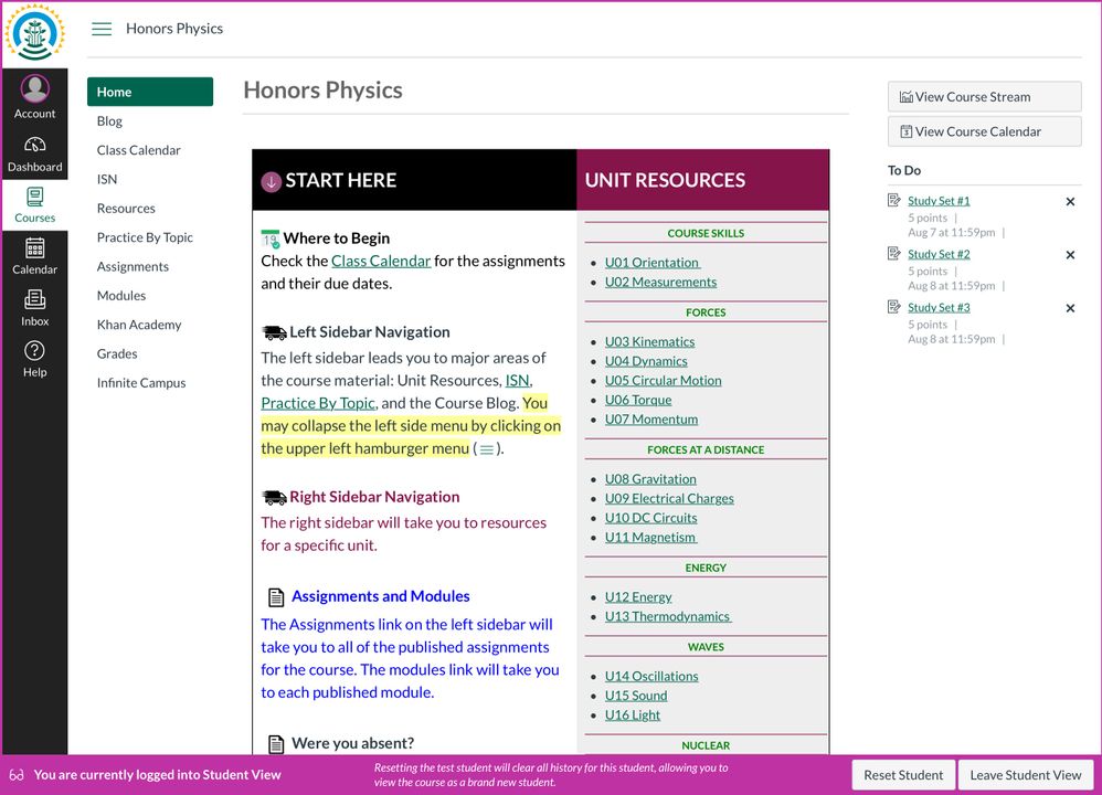
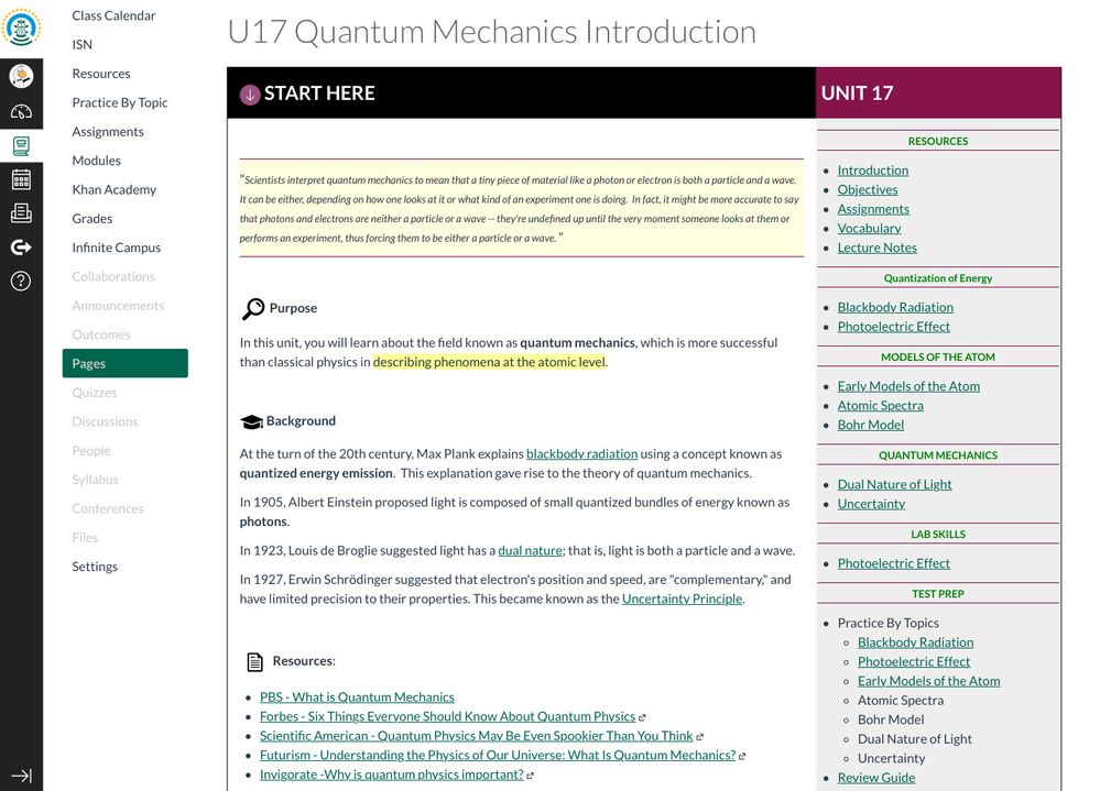
Thank you for the feedback. Placing an image with an empty left column probably isn’t the best example but I’m not 100% complete on the design. It’s closer to 20%. Here are two more images.
This shows the landing page.
This one shows the first page for the unit.
In watching students, the F pattern (from old studies) has been used as arguments against the sidebars for years. I prefer sidebars with purpose — not ads, etc. Regardless, student feedback has been unanimous but I’m asking students who just finished the course with an older look. Most students have stated they wish their course looked this way and one wondered out loud, “why do school canvas sites suck? Give me the information in one click.”
Design isn’t easy and everyone has their preferences. One click is a challenge!
Again, much of what you wrote is valuable and needs to be considered in this new design. Thank you!
Great work here. Pleased you also got some student feedback too. Sometimes you dont always agree with or cant always promise what students want but you seem to have met both requirements.
To interact with Panda Bot, our automated chatbot, you need to sign up or log in:
Sign InTo interact with Panda Bot, our automated chatbot, you need to sign up or log in:
Sign In
This discussion post is outdated and has been archived. Please use the Community question forums and official documentation for the most current and accurate information.