The Instructure Community will enter a read-only state on November 22, 2025 as we prepare to migrate to our new Community platform in early December.
Read our blog post for more info about this change.
Turn on suggestions
Auto-suggest helps you quickly narrow down your search results by suggesting possible matches as you type.
Options
- Subscribe to RSS Feed
- Mark Topic as New
- Mark Topic as Read
- Float this Topic for Current User
- Bookmark
- Subscribe
- Mute
- Printer Friendly Page
Five-Star Course Design: The Living Planner @ Aoba-Japan International School
- Mark as New
- Bookmark
- Subscribe
- Mute
- Subscribe to RSS Feed
- Permalink
- Report Inappropriate Content
04-28-2021
07:25 AM
Name: Vincent Favard
Institution: Aoba-Japan International School
Course: The Living Planner (Template)
Audience: K-12
PROCESS
When your institution or course needed a solution, what were the "must-haves" or goals for its design?
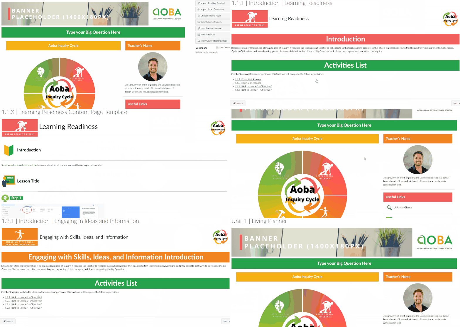
The main goals for the design were to create a shared template that improves the alignment of Canvas LMS with the way we plan and deliver our courses, that facilitates whole-school alignment across programs/campuses as well as collaboration up and down the school. All courses at Aoba-Japan International School are centered around the Aoba Inquiry Cycle, a 4-phases learning journey.

Additionally, the course had to align with our Core Values and identify areas of the course where they are reinforced with the use of icons.

Finally, student involvement in the planning process is a key element to how learning takes place at our school. Therefore, we wanted to empower our teachers to create courses with a UI/UX as intuitive as possible and to minimize the number of 'clicks' needed to navigate and/or complete tasks to maximize the engagement opportunities such as students setting their goals for a unit or reflecting on what they learned.
Is there a review process for course design at your institution? If yes, explain how it impacted your design decisions.
When we started designing courses, we did not have a review process. We quickly learned the importance of review and collaborative decision making which references shared values, objectives, and protocols documented in our course design and review process. We now review between every stage of our Course Design Process:
- Submit a proposal > Review
- Plan the course > Review
- Build visuals > Review
- Build 1 module > Review
- Build the course > Review
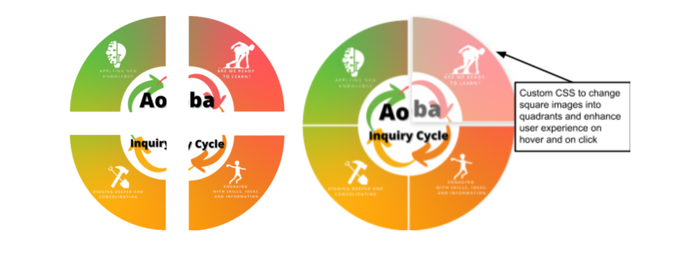
For example, we started to use buttons organized in a linear manner to represent the 4 phases by which we organize our Units of Inquiry.



During review, this was identified as not the best way to represent our learning journey. In order to portray the cyclical aspect of learning at A-JIS, we redesigned the buttons as 4 quadrants arranged in a 2x2 square format and used custom CSS to highlight each quadrant on hover so that they would enhance the user experience by behaving like the expectations that we have of a button.
In what capacity is this design utilized at your institution? How is it shared, distributed, and/or celebrated?
This is our only template and used across all courses. We distribute it to teachers via Canvas Blueprint for official courses, when they are created, and Canvas Commons for users to import in their sandbox and experiment. This allows us to automatically update all courses when we make changes to the template, and therefore to save time and improve our alignment across the school.
Overall, what did you learn in the design-process process?
Our biggest “Lesson Learned” was on the importance of review stages at key points in the design process. Making sure that the plan was approved before starting to build would have saved us a lot of time in having to adapt or redesign specific elements.
A concrete example of that is navigation buttons added to every page. For every page you build ahead of time, if changes have to be made, this is an additional manual change you have to make. On the other hand, if the plan is approved, the navigation buttons can be part of your page template(s) and be easily duplicated throughout the course.
SPOTLIGHT
Which aspects of this course design do you identify as the strongest or most effective? Why?
Navigation is without a doubt one the strongest elements of this course design. As we want students to navigate through our phases of learning, we designed a course navigation system that allows students to move between the Home Page, the phases’ introduction pages, and the activities for each phase and back.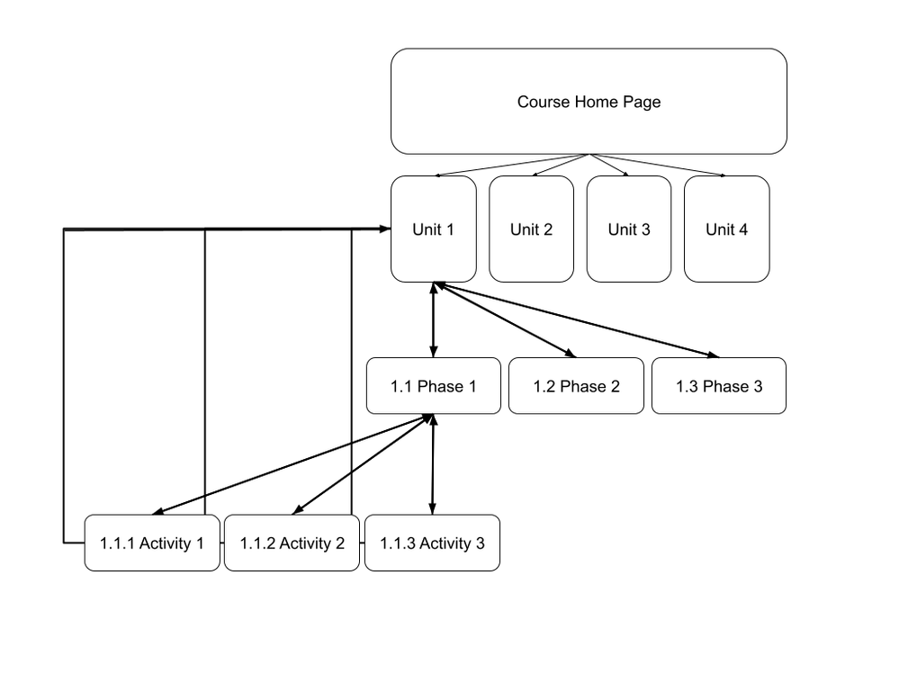
Which tools and resources did you use as you created assets for your design?
Tool 1 - Canva: We used Canva to template our Visual Design elements (Banners, Icons, Buttons, Course Cards) and share with our teachers so that they could create their own copies, aligned with our designs.

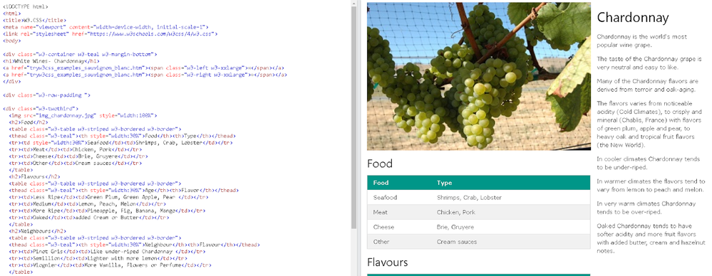
Tool 2 - W3Schools: We used the W3Schools’ documentation and CSS file to improve the user interaction and experience in our courses. The most useful feature was the CSS Demo, where you can experiment with the code to generate features that you would like to use (click here for an example demo).
How did your design decision help you increase the engagement of and/or improve the learning experience for your students?
At A-JIS, students play a key role in the course planning process and we wanted to transform what normally happens in face-to-face situations into an online environment. To achieve this, we designed several templates to engage students by using Discussions (setting their goals for a unit), assignments (reflecting on their learning), or New Quizzes for students to self-assess their performance according to the same criteria as the rubric used by their teachers.
What do you find to be the most important aspects of Instructional Design or UDL in this course?
As a school, we want to reinforce our core values in our teaching practice and to raise student awareness of what they represent. The icons representing our core values, and the Iconology page describing them, improves our alignment in terms of practice and helps students to become aware of their meaning, role, and when they are being reinforced.
ADVICE
When beginning a new design or updating a design, what are three things you recommend designers do to improve the end-product?
1. Use a color palette:
If your school has an official logo and color palette, make sure that you have it on hand at all times when you create your visuals (icons, banners, buttons) for your templates and make sure to use colors consistently across your designs.
In Canva, you can create a Brand Kit that is always pre-loaded when you create your visuals:
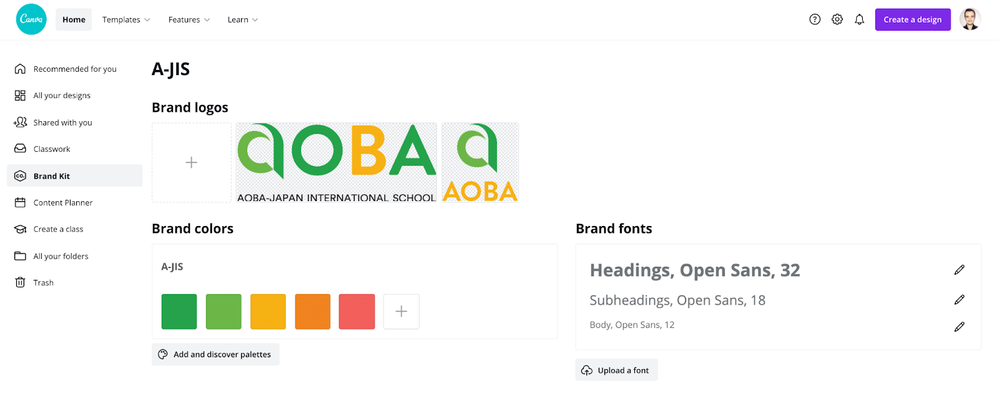
If you do not have a color palette to start from, you can use Coolors to generate colors that work well together.
2. Plan ahead:
Planning your course with a Course Map or outlining and identifying what type of elements you will need in your course will help you in several ways in terms of design:
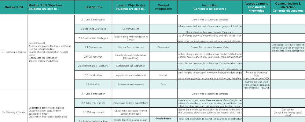
- It helps you to identify unique elements that are often used throughout your course (eg. Discussion)
- It allows you to have an overview of the distribution of activities in your course and whether you have a repeating structure.
- It helps you to identify and balance or tweak activities before building them in the platform.
The points above will help you to decide what unique designs you will need, what you will template, and will be able to duplicate throughout the course to save the most time in the building stage. I like to start by defining the learning objectives for the course, plan for how they will be assessed and how the students will be prepared to succeed on the summative assessments.
3. Create templates and duplicate:
Consistency across the course will greatly improve the quality and feel of your design. The easiest way to achieve consistency is to start by creating templates for all your needs and to duplicate them.
- Start by creating templates for your visuals (buttons, icons, banners), this will help you to create page, assignment, discussion, and quiz templates that have a similar look and feel.
- Review your initial designs for Accessibility. For example, you can upload screenshots of your designs onto Pilestone’s Color Blindness Simulators to check across different vision simulations.
Accessibility Test 1
- Duplicate your Canvas templates and re-organize/tweak them to create a module (or unit) template. This will save you time by not having to create every page from scratch and will create a structure that you can re-use.
- Duplicate your module (or unit) templates to create all modules for your course and tweak them accordingly.
3 Replies
- Mark as New
- Bookmark
- Subscribe
- Mute
- Subscribe to RSS Feed
- Permalink
- Report Inappropriate Content
05-11-2021
02:57 AM
This is EPIC!!! Well done everyone.
- Mark as New
- Bookmark
- Subscribe
- Mute
- Subscribe to RSS Feed
- Permalink
- Report Inappropriate Content
05-11-2021
06:20 PM
Thank you for sharing!
- Mark as New
- Bookmark
- Subscribe
- Mute
- Subscribe to RSS Feed
- Permalink
- Report Inappropriate Content
05-11-2021
06:26 PM
Like it...
I noticed that you mention planning several times, and that is something which I believe we tent to skimp on when we create courses.
Thanks for the reminder about it...
 Community help
To interact with Panda Bot, our automated chatbot, you need to sign up or log in:
Sign inView our top guides and resources:
Find My Canvas URL Help Logging into Canvas Generate a Pairing Code Canvas Browser and Computer Requirements Change Canvas Notification Settings Submit a Peer Review AssignmentTo interact with Panda Bot, our automated chatbot, you need to sign up or log in:
Sign in

This discussion post is outdated and has been archived. Please use the Community question forums and official documentation for the most current and accurate information.