The Instructure Product Team is working on implementing a better solution to collect your feedback. Read Shiren's blog for more information.
Turn on suggestions
Auto-suggest helps you quickly narrow down your search results by suggesting possible matches as you type.
- Community
- Canvas
- Canvas Ideas
- Canvas Ideas
- [Account Settings] More intuitive term sorting/pre...
Options
- Subscribe to RSS Feed
- Mark as New
- Mark as Read
- Bookmark
- Subscribe
- Printer Friendly Page
- Report Inappropriate Content
[Account Settings] More intuitive term sorting/presentation
[Account Settings] More intuitive term sorting/presentation
Status:
Open
Submitted by
SethBattis
on
04-19-2015
09:57 AM
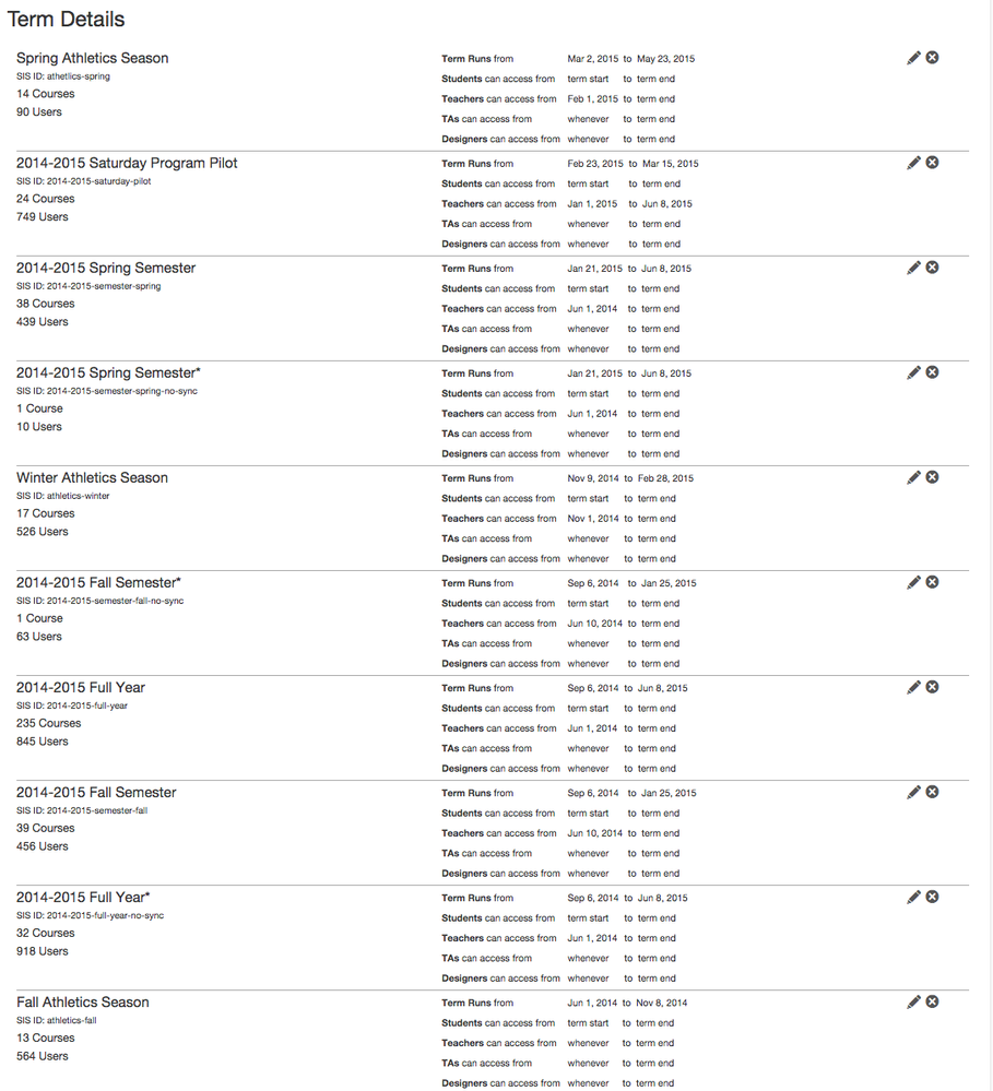
So, my impression is that terms are sorted based on date and, perhaps, name. But it doesn't seem consistent. For example, here's the term order on the admin Terms page, which appears to be in descending order by start date, with terms with the same dates sorted alphabetically. Which makes sense.
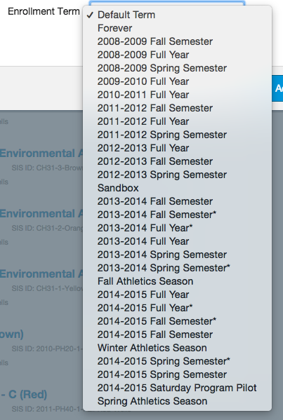
But now, when I go to a term pull-down menu, that order is reversed, putting my active terms at the bottom of the list:
I see three key improvements to be made in the presentation of terms:
- Let's be consistent and use the same order in every listing. Doesn't matter what order -- but it should be the same. I don't have the bandwidth to re-figure this out every time I look at it.
- Let's make sure the active terms are most readily available. This probably means that they should stay at the top of the Terms page and move to the top of the drop-down menu.
- Let's mark active terms so that they're more readily apparent. For example (as you can see below), I use some CSS to highlight active courses in user details -- that visual cue for active terms would be great. And in the drop-down, there could be a divider between the active terms (top of the menu, ideally) and the inactive terms (bottom of the menu, ideally).
(As an aside… what on earth order are courses listed in? I mean… jeez. Also, obviously, I fiddled with the CSS of the div that holds the course listing so it autosizes to include everything, rather than just display 3 or 4 courses.)
47 Comments
 Community help
To interact with Panda Bot, our automated chatbot, you need to sign up or log in:
Sign inView our top guides and resources:
Find My Canvas URL Help Logging into Canvas Generate a Pairing Code Canvas Browser and Computer Requirements Change Canvas Notification Settings Submit a Peer Review AssignmentTo interact with Panda Bot, our automated chatbot, you need to sign up or log in:
Sign in


