The Instructure Product Team is working on implementing a better solution to collect your feedback. Read Shiren's blog for more information.
Turn on suggestions
Auto-suggest helps you quickly narrow down your search results by suggesting possible matches as you type.
- Community
- Canvas
- Canvas Ideas
- Canvas Ideas
- [Admin Tools] Leave Admin Account Items in Sidebar
Options
- Subscribe to RSS Feed
- Mark as New
- Mark as Read
- Bookmark
- Subscribe
- Printer Friendly Page
- Report Inappropriate Content
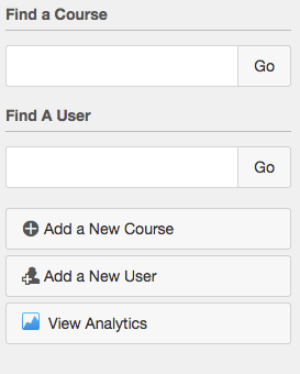
[Admin Tools] Leave Admin Account Items in Sidebar
[Admin Tools] Leave Admin Account Items in Sidebar
So in my daily duties as Canvas admin I have to search for courses and users over and over again from different locations within Canvas. It would be quite convenient if the 'Find a Course,' 'Find a User,' 'Add a New Course,' 'Add a New User,' and 'View Analytics' items that appear in the sidebar when you select an account were visible to admins in the sidebar at all times. Included is an image of the items I'm referring to. At minimum the first two "Find a ..." should be included but I see no reason not to just leave all 5 items visible in sidebar for admins.
32 Comments
 Community help
To interact with Panda Bot, our automated chatbot, you need to sign up or log in:
Sign inView our top guides and resources:
Find My Canvas URL Help Logging into Canvas Generate a Pairing Code Canvas Browser and Computer Requirements Change Canvas Notification Settings Submit a Peer Review AssignmentTo interact with Panda Bot, our automated chatbot, you need to sign up or log in:
Sign in
