DocViewer annotation usablitilty

This idea has been developed and deployed to Canvas

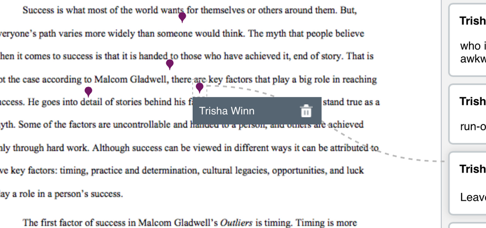
I am an English prof, so commenting on papers is a necessity. When I click above a sentence to comment, I get a big gray box with my name in it hovering over the sentence. I can't see what I am commenting on! This seriously slows down my grading. This is NOT an improvement over the Croc viewer. 

240411_canvasannoshot.png

Comments from Instructure

Please see Canvas Release: Canvas DocViewer  for updates

14 Comments
hmcmichael
Community Participant

Totally agree.  I'm grading my first batch of summer essays, and the "fewer clicks" goal doesn't seem to be the case.  I'm having to click a lot more than usual to move around so I can see what I'm commenting on because of the big gray box.  Also, the strikeout tool has lost its functionality because it places the suggestion off to the side instead of above the word that's been crossed out.

Stef_retired
Instructure Alumni
Instructure Alumni

Thank you for submitting this idea,  @trisha_winn  Welcome to the Canvas Community! At the moment, we are leaving this idea open for voting. But have you also submitted a support ticket for this behavior? Development continues on the new tool, and it's possible that the engineers have already identified this as an issue; if they have, it's not a matter for the ideation process, and in that event your ticket will ensure that you receive updates on the progress of any fix. You can submit a ticket by following the instructions in How do I get help with Canvas as an instructor?

Please update the conversation here on the status of your ticket, including the case number, so that others will be able to refer to it when they submit their own tickets.

And with respect to DocViewer in general, we would like our Community members to read Insights: Canvas DocViewer‌ and Canvas Release: Canvas DocViewer‌, and then follow the instructions in Canvas Community Feedback Guidelines‌ to submit their feedback.

trisha_winn
Community Novice
Author

This is what I received when I submitted a help ticket:

240452_helpticketdocviewer.png

So it seems I am in an endless circle at this point. 

Stef_retired
Instructure Alumni
Instructure Alumni

"Endless circle"--no, you're not,  @trisha_winn ‌! Smiley Happy Or at least, you've successfully broken out of that circle.

Our goal was to make sure that you had already pursued the support option, and since you have (and thanks for providing not only the case number but the text of the response), we will leave this idea open for Community consideration.

bhuggins
Community Participant

Since the commenter name already appears on the content box on the right side of the paper when inserting a comment, it seems completely unnecessary to have that gray box there at all.  I think removing the gray box and thickening the dashed line a little should fix up this interface issue.

240662_Screen Shot 2017-07-06 at 2.23.02 PM.png

I would also suggest making the pins somewhat transparent so they don't block any text either.

trisha_winn
Community Novice
Author

I also told support that the comment boxes are huge, and when you make several comments, they end up far from the original sentence or stacked up on top of each other. This is confusing for students, and not helpful.

Chris_Hofer
Community Coach
Community Coach

Hi  @trisha_winn ‌...

A new document on plans for DocViewer updates was posted this afternoon.  You might be interested in #1 and #4 listed here: https://community.canvaslms.com/docs/DOC-11679-docviewer-plan as it seems to relate to your above Feature Idea submission.

jhartman1
Community Novice

Students cannot download the annotated doc and once they resubmit, they cannot see the previous comments.  I have spent additional HOURS providing feedback on students' research proposals using the new tool, which has many bugs.  This changed with no notification in the middle of the semester and caused tremendous problems in my course.  I was astonished when the help desk manager said she hoped the bugs would be fixed by the fall semester.  These need to be fixed immediately to restore required functionality.

Chris_Hofer
Community Coach
Community Coach

Hello  @jhartman1 ‌...

Students cannot download the annotated doc and once they resubmit, they cannot see the previous comments.

You might want to check out item #2 in the document DocViewer Plan.

This changed with no notification in the middle of the semester and caused tremendous problems in my course.

I'm not clear on what you mean here.  According to this document, Canvas Release: Canvas DocViewer, DocViewer was introduced to people in early June and then rolled out later that month.  Any changes to the Canvas LMS are typically given in the form of Beta and Release Notes...which are also linked in that document.

If I'm not interpreting your statements correctly, could you please provide some additional clarification?  Thanks.

Jeff_F
Community Coach
Community Coach

And if you place the insertion point too close to the right margin (which has been my process for more than a decade), the box with your name actually covers the comment box so you cannot see if your cursor is ready to type or what you are typing.

242390_2017-07-19_10-33-20.jpg

ps.  this has me pondering average and maximum name lengths (globally), if my name needs to be shown twice, responsive design so the box size fits my name, if it should be smaller and line wrap longer names, if it should be semi-transparent or hide my name until I mouse over it, etc.