[Gradebook] Gradebook background cell color and Statuses
I've had many instructors who have indicated that they cannot find the specific status color when looking at the Gradebook.
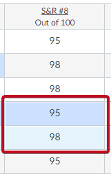
It turns out that the applied color of a cell is different when it's in a cell that has a white background, and a cell that has a grey background.
Example:
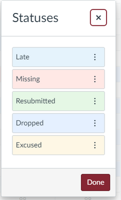
This column from the gradebook looks like 2 different "Statuses" because the 95 is in a row with a grey background, and the 98 is in a row with a white background. In actuality, the status for both of these grades are the same: Dropped. Based on the status setting:
Granted, that the similar shade of blue should have been something more distinct from the "Late" status, but in glancing at the Gradebook, this assignment looks like it has 2 different statuses for these student submissions. This happens with all status colors (pink vs. darker pink, green vs. darker green, etc.).
I propose that when a status color is displayed in the Gradebook, that the background cell color is set to white first, then the status color is applied, thus resulting in a consistent color/shading being displayed.


