The Instructure Product Team is working on implementing a better solution to collect your feedback. Read Shiren's blog for more information.
Turn on suggestions
Auto-suggest helps you quickly narrow down your search results by suggesting possible matches as you type.
- Community
- Canvas
- Canvas Ideas
- Canvas Ideas
- Remove colour overlay from course cards that have ...
Options
- Subscribe to RSS Feed
- Mark as New
- Mark as Read
- Bookmark
- Subscribe
- Printer Friendly Page
- Report Inappropriate Content
Remove colour overlay from course cards that have an image
Remove colour overlay from course cards that have an image
Status:
Completed
Submitted by
stuart_ryan
on
08-30-2016
07:40 PM
| This idea has been developed and deployed to Canvas |
Howdy all,
Firstly I have to say the new course cards image feature is awesome and a great leap forward. I have been using it a bit now and have a small request for a future revision.
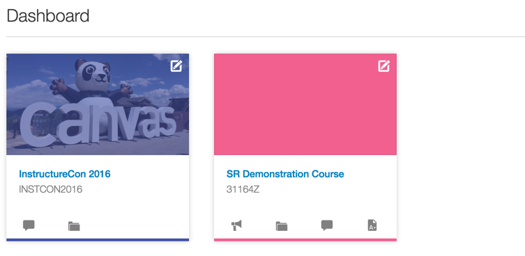
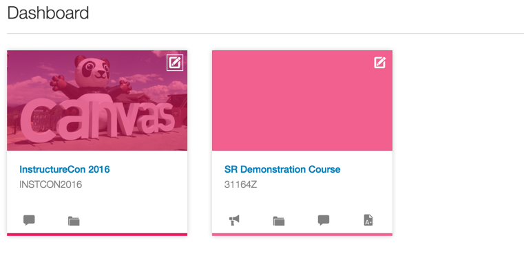
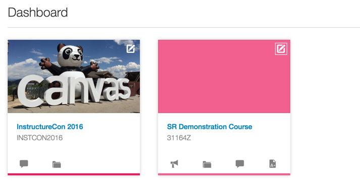
When a course is given an image for the course card on a user's dashboard, I would really like to see the colour overlay removed (so that the image does not looked washed out with the user selected colour).
Ideally, I would love to see this configurable on an account level rather than an individual course level, but that is just from an administrator's perspective.
Just to visualise this more, the current behaviour with a couple of different colours:
And the ideal/requested behaviour:
Additional thoughts:
I do realise the colour is important for a few different areas in relation to the course, so perhaps the bottom bar could be extended as a border around the entire card (just as one example).
Many thanks team,
Keep up the awesome work!
| Comments from Instructure |
For more information, please read through the Canvas Production Release Notes (2017-05-13)
208 Comments
 Community help
To interact with Panda Bot, our automated chatbot, you need to sign up or log in:
Sign inView our top guides and resources:
Find My Canvas URL Help Logging into Canvas Generate a Pairing Code Canvas Browser and Computer Requirements Change Canvas Notification Settings Submit a Peer Review AssignmentTo interact with Panda Bot, our automated chatbot, you need to sign up or log in:
Sign in


