Course Images

QC99_tsilvius
Community Champion
27
31338

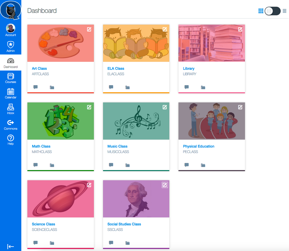
courseimages.pngWe are really enjoying exploring the potential for the course images feature in Canvas class settings particularly with emerging readers at the elementary level and especially with our English Language Learners. Using course images, teachers can now help students find their courses even faster using pictures to represent a class on a student dashboard. As a quick demo I created a few subject classes in the screenshot to the right and added a graphic that hopefully universally represents the course content. As reading skills develop students will rely less and less on the graphic and perhaps use their course color or nickname they create.

Can students change this?

As we know, students and observer (as well as other roles in your classes) can customize the course color and nickname of the course box on the Dashboard. The teacher cannot control the course color nor nickname. One of the strengths of the course image feature is that the teacher does control this image, and it is seen not only by the students but also by their family members using Observer accounts.

How do I get this?

If Course Image is not enabled at your institution, please ask your sysadmin to turn it on or allow it. Allowing will give you the ability to turn it on as you are able in any course you want if you are ready for the feature.
courseimage.jpgIs it easy to upload an image?

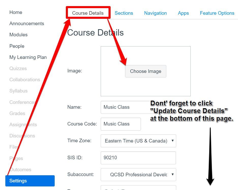
Easy as pie! Once you have this feature turned on for your Canvas instance, click into any class/course and then click on the class Settings in the bottom left of its class menu. In the Course Details subtab you'll notice a Choose Image subtab. Click it and upload from your computer or browse the photo sharing site currently available, Flickr. Once uploaded you return to your Course Details where you can see the uploaded image in the Image box. Don't forget that last step -- Update your course details at the bottom of the page, then view your new course image on your Dashboard with a proud smile!

Got Clipped?

Did your course image get clipped-off?

     -  If you answered either "no" or you answered "yes," but it doesn't bother you, then you can stop reading right here.

     - If you answered "yes," and it does bother you, I'm right there with ya... we can fix this! Keep reading.

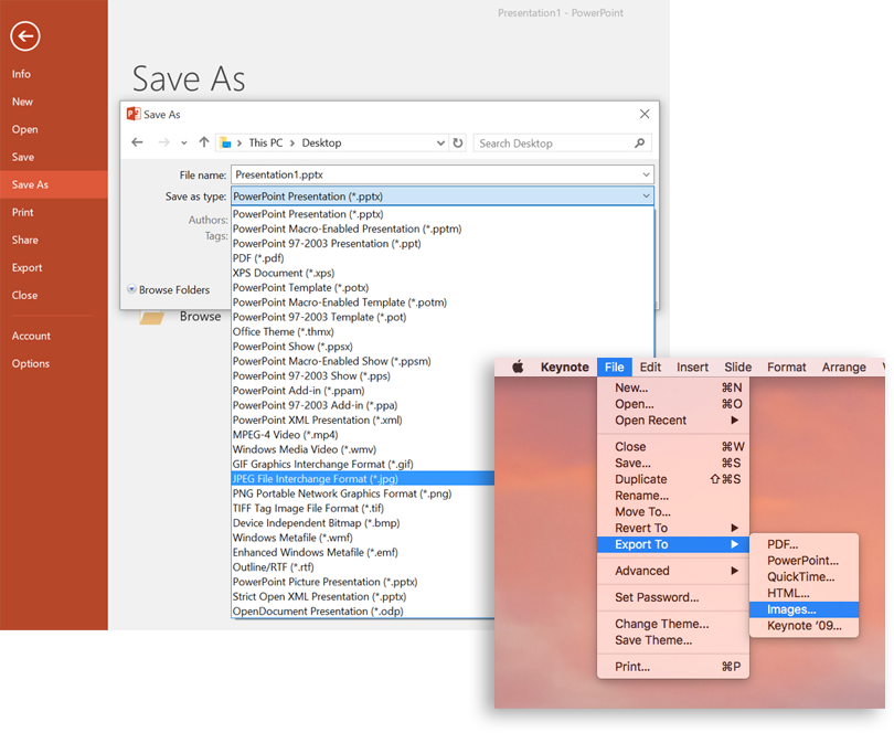
To right-size your graphic to avoid course-box clipping you'll need to submit it with the dimensions of 262 x 146px. Some folks are fine with that reminder from the image upload screen and know what to do. Others needed an extra helping hand getting the image right-sized for the course box dimensions. So to help I created a resource that will get the job done using a familiar-to-most-teachers program, PowerPoint. After custom-reformatting the PowerPoint slide (measured in inches, by the way) to a relative aspect ratio closest to the 262x146 pixel dimension, we can now use this custom slide in this file "to crop" without even having to crop!  Actually, instead of cropping teachers simply select Save As and select "JPG" as the file type. Whatever image they have placed within the customized slide dimensions in the PowerPoint file saves with the right-sized aspect ratio needed for the graphic. It's all about meeting teachers where they're at.  Help yourself to a copy below with the directions.
saveas2.pngHelp me crop!

For the best fit of your graphic in the class box so that it doesn't get clipped for being too large crop it to a size of 262x146px. If you're not sure how to do that we have a solution for you, but you'll need the powerpoint file linked below to do it. MacOS users can open this Keynote, too.

  1. Download and open this file in PowerPoint: CanvasClassImageCropHelper.pptx (attached below).
  2. Reduce your zoom view (bottom right corner of powerpoint to 100%) to see these directions repeated in the file to the sides and below the slide.
  3. Place the graphic you want for your Canvas class box completely inside of the slide boundaries. No corner dots (AKA - handles) or boundary lines of the graphic can be outside of the slide.
  4. Click your File menu and select Save As... MacOS users click File and Export... to Images.
  5. From the Save as type drop menu select JPEG.
  6. Save your graphic on your desktop so that you can find it easily. If prompted select "export this slide."

What's actually happening is you're taking advantage of PowerPoint and Keynote's ability to export slides as graphics; the graphic type in this case is a JPEG. Since this PowerPoint slide is a customized size set to the closest match possible (for you techy people out there, this means trying our best to convert 262 x 146 picture elements to inches) your slide is exported already right-sized for your Canvas class box dimensions.

I'd rather watch it in action first.

I don't blame you. I prefer video for many things, too. Here is a very long-winded, let's start at the very beginning, video demo that takes you through the entire course image process using the PowerPoint file above. You are more than welcome to watch if it helps you more than the text directions above and the text directions in the PowerPoint file do.

Updating Canvas Class Image - YouTube

27 Comments
Stef_retired
Instructure Alumni
Instructure Alumni

This is fantastic, QC99.tsilvius​! And I love this: "It's all about meeting teachers where they're at." You've certainly provided the ways and means to do this for course card images. The Dashboard mock-up you created is elegant. Thanks for creating this resource!

QC99_tsilvius
Community Champion
Author

Thanks so much, Stefanie. The more we share strategies with each other in our buildings and in this Community, the stronger we all become.

Shar
Community Champion

Thank-you QC99.tsilvius​ !!!

What a wonderful resource, write-up, and the PowerPoint file is a gem!! :smileygrin: Everything is wonderful!

I just tried out the PowerPoint file following your directions and I'm confident our instructors will be able to do the same without any problems at all. It was just so easy! Thank-you so very much for putting this all together!

Cheers - Shar

Stef_retired
Instructure Alumni
Instructure Alumni

Here's an update, QC99.tsilvius: I just downloaded the PowerPoint file and using it to optimize my selected image was a snap! I've customized two course cards so far and am merrily clipping away.

I don't know if it's because I'm using an antiquated version of PowerPoint (2007, to be exact), but I did encounter an extra unexpected step: When I opted to save the file as JPEG, I was presented with this additional dialog box:

ppt-clipper-dialog-box.png

So went ahead and clicked "Current Slide Only," and all is well.

Thanks again!

QC99_tsilvius
Community Champion
Author

wisely.jpgThank you for mentioning this, stefaniesanders​. PowerPoint asks this for even the most updated version, too, but I'm thinking that the wording might be different. If you look at my step 6 I'm asked to export this slide for this portion.  So rest assured, it is not because you are using a version from 97. We get that type of prompt even on our PowerPoint of the future  🙂  It is even funnier to think that even though the file has only one slide, the PowerPoint doesn't realize it has only one slide and still asks you.

QC99_tsilvius
Community Champion
Author

ishar-uw​​, thanks for the feedback. Some might not care about whether the image is clipped/cut off or not, but for those who do and who might not understand digital imagery manipulation skills like cropping vs. resizing for example, the PowerPoint should help reduce that potential user frustration. Thanks for writing here that you're going to be trying it out. If you're able please share any feedback from those you're helping if any comes your way.

Todd

Stef_retired
Instructure Alumni
Instructure Alumni

Thank you for posting a meme of one of my all-time favorite movie lines. Smiley Happy

QC99_tsilvius
Community Champion
Author

I use it every chance I get! LOL

QC99_tsilvius
Community Champion
Author

We heard back from one of our art teachers who added a course image of a camera to her digital photography class box. The next day students thanked her for doing this; it made her class stick out even more easily for them to find faster. This is especially helpful because we integrate with our district SIS, PowerSchool, and both student and teacher users get a LOT of auto-created classes "dumped" on their dash some of which aren't used. For those users who haven't selected favorite classes yet (for one reason or another), looking for the unique course graphic helps everyone get to resources faster. Ask any teacher that in the K12 classroom those seconds count!

tdurbin
Community Contributor

This is going to be great for our faculty! The only complaint that I have is the color tint that stays even when a photo is applied. It's nice to have the different color stripes along the bottom of the tile, or even as a border to the photo/picture, but the tint is a bit of a turn off over what could be a great picture/photo representing the courses.

QC99_tsilvius
Community Champion
Author

One idea to help with this is to use the hexadecimal color selector on the course box/card when you edit the color on the Dash. The color for "white" is FFFFFF. Type those 6 Fs in the color selector and you'll get a "WHITE" overlay. Unfortunately, the downside of this white overlay is a washed-out appearance but that's just the way it is. Also keep in mind that every user can select their own color overlay for the course boxes. So if you select white even as the teacher of the class it will not make your students' course boxes white.

Before the white color change:

before.PNG

After the white color change:

after.PNG

Shar
Community Champion

Hi  @tdurbin ​,

Something is in the works...

It's good to be ready when it (whatever it is) happens.

Smiley Happy Shar

QC99_tsilvius
Community Champion
Author

LOVE IT!  Voted today! The Polaroid down the page is hilarious! Thanks for sharing, ishar-uw​​.

Stef_retired
Instructure Alumni
Instructure Alumni

QC99.tsilvius​ and  @tdurbin , it's been mentioned elsewhere that if a user enters FFFFFF in the color field, the edit button disappears for students viewing the Dashboard through the iPad mobile browser.

QC99_tsilvius
Community Champion
Author

Eep! That's a good tip to share with kids using the iPad mobile browser, stefaniesanders​. -- Students, don't change it to white or you're stuck until you're back at a desktop. But if the teacher changes it to white the white color won't transfer to the students. That's a bit reassuring. Fingers-crossed for the no-color-if-course-image feature request.

DrNufer
Community Coach
Community Coach

Perhaps if it is off-white then students can still see it.  Something like: #E4E3E3. 

PSU_Tony
Community Contributor

Good stuff!

Stef_retired
Instructure Alumni
Instructure Alumni

I hope that anyone who is interested in customizing Dashboard course cards will join me for a CanvasLIVE​ quick demo, Add Images to Your Course Cards, coming up on Thursday, January 19, 2017. Teachers and admins who are already familiar with the process of adding images to course cards will find this to be a quick refresher; those of you who haven't yet tried this will learn the how-to's, and will also pick up some tips and tricks on image selection and sizing. RSVP “yes” to the event if you will be there--and if you’re interested, but your schedule doesn’t allow you to attend in real time, RSVP "no" or "maybe" to receive all event updates. Your RSVP ensures that you will receive a notification should the event be cancelled or changed.

jwelchans
Community Member

Thanks for the PPT file!  That will be a handy resource to share with teachers.

On a related note, I have an idea that is open for voting about adding the functionality of image cropping,

https://community.canvaslms.com/ideas/9348-image-cropping 

Feel free to check it out and vote.

Thanks!

rniolon
Community Explorer

I think they just turned this on for us at the end of Summer. I like it, as it gives a small amount of visual stimulation to the dashboard and if you use the image on the course pages too, it can make navigation a little easier.  I do wish viewers had a way to control the sorting of the entries in the dashboard. For example, I would prefer to have my Monday classes at the top and Thursday classes at the bottom of the list... but I haven't seen a way to do this.

Stef_retired
Instructure Alumni
Instructure Alumni

 @rniolon ‌, you're in luck, because there is a way!  @James ‌ has devised an awesome solution which he has comprehensively detailed, and after reading the instructions, I was able to install it in under 15 seconds; it really is that simple. Smiley Happy Please have a look at Sorting Dashboard Course Cards‌ 

Users can implement this on their own—and school admins can enable this at the account level should they choose to do so!

rniolon
Community Explorer

OK - I am bookmarking that! I'll find a course designer to implement it...
James Jones - This is what makes open source cool - thanks Smiley Happy

kalexander
Community Member

I teach art and humanities courses and therefore use appropriate historical artworks for the Dashboard course "cards". Is it possible to select NO color. The imposition of the colors over the artworks distort their colors. I would like this available as an option, if possible.

Ken Alexander

kona
Community Coach
Community Coach

 @kalexander , Yes, but only for yourself. Your students would still see the color overlay unless they turn it off as well. To turn it off go to the Canvas Dashboard and click on the three verticle dots on the far right side of the page. One option you’ll see is for color overlay. Uncheck this and you’re good to go.  

Eileen_ADL
Community Member

GENIUS - thank you! 

Lsheehy7
Community Participant

Hello @QC99_tsilvius!

I am so excited to find this since we are currently moving to Canvas for the fall! I was a little disappointed that I wasn't able to download the PPT. Has it moved or is there another way to find the template?

Thank you!
Laura

PS: Never mind! I found the file again at the bottom of your post, and it works! Thank you!

QC99_tsilvius
Community Champion
Author

Wow, @Lsheehy7 I'm so glad that you can get some more mileage out of this post, Laura! The original post date was 2016. Welcome to Canvas, by the way. You're going to love it here!

Best wishes!
-Todd