PowerBI DAX & Chart Question
- Mark as New
- Bookmark
- Subscribe
- Mute
- Subscribe to RSS Feed
- Permalink
- Report Inappropriate Content
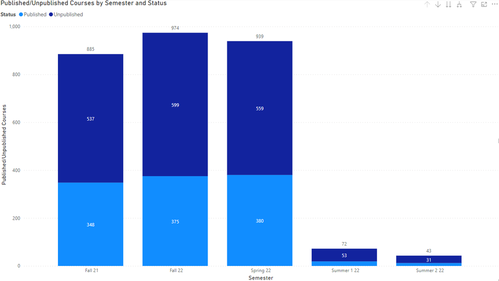
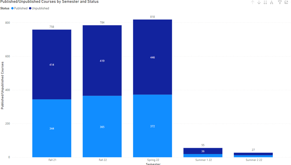
I created a chart report that shows our numbers of published & unpublished courses year over year. One thing I'd like to exclude is courses with 0 enrollments. These courses would never be published, so it skews the results.
I created a new column in my course_dim table called student_enrollment, then I wrote a DAX statement for that column:
student_enrollment = calculate(countrows(enrollment_dim),
filter(enrollment_dim, enrollment_dim[type] == "StudentEnrollment"
&& course_dim[id] == enrollment_dim[course_id]
&& enrollment_dim[workflow_state] <> "deleted"))
The courses with 0 enrollment are blank instead of showing a 0, which doesn't seem like it should be a problem.
When I add the student_enrollment column as a filter to my report, I select "Show items when the value is not blank", then click Apply filter, nothing changes. If I change it to "is blank", all the results disappear. Any ideas?
Solved! Go to Solution.
- Mark as New
- Bookmark
- Subscribe
- Mute
- Subscribe to RSS Feed
- Permalink
- Report Inappropriate Content
Okay, I figured it out. For some absurd reason, even though I had the chart selected when I clicked the checkbox next to the field, the filter was being applied to the page and not the visualization. I had to explicitly drag the field to the visualization filter area.
Also, one of my coworkers suggested adding '+0' to the end of the formula to force a number value in the calculation instead of leaving them blank, just in case there's something screwy with what blank means to PowerBI. Does it mean 0, does it mean null, etc.
I'm leaving this one up here so everyone else can learn from my mistake.


