Found this content helpful? Log in or sign up to leave a like!
Community Home - Mockups
- Mark as New
- Bookmark
- Subscribe
- Mute
- Subscribe to RSS Feed
- Permalink
- Report Inappropriate Content
07-20-2017
02:21 PM
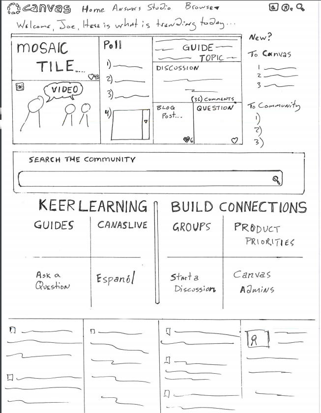
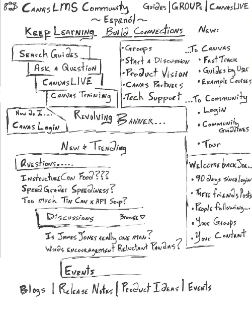
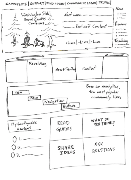
We asked what you'd like to see, and you said you want:
- to surface more recent and trending content
- a better search
- less text
- better (more flat) navigation
- to surface more useful resources
- easier orientation for new Canvas and new Community users
Your Community InstCon Mission, if you choose to accept, is to help us create a new design! We reviewed feedback and made some sketches, now we need your help.
- What elements of these sketches do you like/dislike? Share your feedback in the discussion below.
- Have additional ideas, share your own mockup here.
Mockup #1 (click the image for larger view) | Mockup #2 (click the image for larger view) | Mockup #3 (click the image for larger view) |
 |  |  |
