Dark Mode on Mobile

The content in this blog is over six months old, and the comments are closed. For the most recent product updates and discussions, you're encouraged to explore newer posts from Instructure's Product Managers.

jozsefdavid
Instructure Alumni
Instructure Alumni
20
14276

3.png

UPDATE (2022.08.30): Based on the comments and feedback we received regarding to this topic we would like to continue the discussion with our users. Please take a look at the survey we have created and fill it in and let us know what you think.

Survey: https://t.maze.co/109996831

Thank you.


I hope this post will make many of you happy. Well, more accurately not the post itself, but the feature which we are releasing for the Android and iOS Canvas applications. There were tons of incoming requests asking us to let the users decide between dark and light themes according to their needs. I don’t think I need to explain the reasons why it is important but to name a few:

  • Your eyes are light sensitive
  • Reading in the bed at night
  • Some brand colors are not visible correctly in one of the modes
  • Dark mode looks nicer than the light mode
  • Light mode looks nicer than the dark mode
  • etc.

Accessibility

The colors we are using are fulfilling the accessibility requirements of the guide: WCAG 2.1 AA, but I must highlight that it only applies to those colors we - the creators - can control. When your institution has a custom theme and branding those colors cannot be controlled by us so there might be unexpected results if the admins don’t test the brand colors in both light and dark modes. I must repeat it: If you want to have a system which looks right in light and dark modes too, you should always test your custom colors in both modes in the mobile apps! There is no golden rule and the goal of this post is not to explain accessibility guides, but here are some resources you can start with:

Scope

As we clarified in the beginning of this post, the described settings are only for the Canvas Mobile Apps including:

  • Canvas iOS Student app (v6.16.0)
  • Canvas iOS Teacher app (v1.16.0)
  • Canvas iOS Parent app (v3.6.0)
  • Canvas Android Student app (v6.18.1)
  • Canvas Android Teacher app (v1.18.2)
  • Canvas Android Parent app (already released a few years ago)

And a few more information that is useful to know:

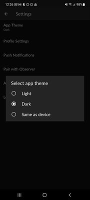
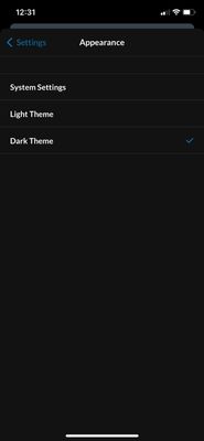
  • There is a possibility to follow the operating system and automatically select the mode according to the OS setting
  • There will be an extra popup window advertising the feature right after the app is upgraded to the new version. This popup will not be displayed again, but the setting will be available through a regular setting.
  • The setting can be easily managed from the settings menu

Android:

jozsefdavid_0-1656935463879.jpeg

iOS:

jozsefdavid_1-1656935463905.jpeg


If you have any questions, please comment here or reach out to our support team.

The content in this blog is over six months old, and the comments are closed. For the most recent product updates and discussions, you're encouraged to explore newer posts from Instructure's Product Managers.

20 Comments
chriscas
Community Coach
Community Coach

Hi @jozsefdavid,

Thanks for the information on this upcoming change.

As a Canvas admin, I'm very concerned by the statement "If you want to have a system which looks right in light and dark modes too, you should always test your custom colors in both modes in the mobile apps!"  Accessibility is a huge concern for our university, and finding a good accessible set of colors just for a single (light) mode is hard enough.  The way I'm reading this, you're saying the same set of theme colors need to work for both light and dark mode, which honestly is going to be a nightmare for many schools/institutions.  I realize this has been a hugely requested feature, but I feel if Instructure is going to bring this to mobile (and maybe even desktop eventually?), there probably need to be separate theme settings for dark and light modes.

In addition to the overall theme concern, I'm wondering how the accessibility checker is going to handle this for teachers as they create content (usually done in the equivalent of light mode on a browser).  If they are changing font color, for example, how will the accessibility checker work?  If they choose a dark font color, it may be okay against a light background, but be almost unreadable against a black dark mode background.  This is one of the biggest reasons I've been skeptical about Canvas offering a dark mode from the beginning.  While I know users want it, we're not talking about training a handful of admins about how to make things work right, but every single faculty member/instructional designer/ta around the world.

I'm interested to hear comments about the color concerns.  Maybe things are going to just work fine, which would be great, but I think we need a lot more information on this and need it quickly if this change is set to roll out quickly.

-Chris

jozsefdavid
Instructure Alumni
Instructure Alumni
Author

Hi @chriscas,

Thank you for your feedback. We spent weeks to find those accessible colors for dark mode, so we feel your pain.

We understand the concern that mobile dark mode alone might not solve all the problems while the web is not fully prepared for dark mode.
The native mobile applications can provide:

  • All the native apps' colors we can control are accessible in light and dark mode too
  • The user’s rich text content cannot be controlled by the app, but if the user did not define exact styles for the content (background and text color), then we make it accessible in dark mode.

What we can’t control in the mobile apps:

  • Brand colors set by the users
  • Rich text content with exact styles
  • Website appearance (on some screens we load Canvas responsive websites)
  • Dark/light themes on websites

The accessibility checker can check what is in the content area of the editor but it does not support light/dark modes at the moment.

From the accessibility compliance point of view the dark mode in the mobile apps I believe will not violate the accessibility requirements, since if the dark mode is not accessible, then the app still provides an alternative way of visualization to remain accessible by switching to light mode (supposing that the user content in light mode is already accessible). 


martinlarsson
Community Participant

Separate branding themes for light and dark modes are definitely needed! If there is no support for admins to set different branding for light and dark mode then it would be wise to allow mobile users to have a secondary dark mode option - "Default dark mode". A dark mode that overrides branding and ensures accessibility. With the accessibility checker in the RCE only being compliant when light mode is used - perhaps a default dark mode should override colors from the RCE also?

chriscas
Community Coach
Community Coach

Hi @jozsefdavid,

I'm attaching a screenshot of the dashboard from the ios student app in dark mode.  First, the card colors seem to be sync'd with web Canvas (which overall should be good), but that means something that looks good in dark mode will not look good on the web and vice versa.  We find most of our users do not exclusively use the web or the app, but a mixture of them (especially since not every task can be done on the app).  These color contrast issues are not good in that context.

Aside from the course cards and other content, you'll notice the "dashboard" button at the bottom is almost invisible because it's dark blue (part of the U-M Theme).  In light mode, things look fine.  I really hope Instructure is not telling admins that we have to change our university brand colors, because as you can probably imagine, that's next to impossible. 

I agree with @martinlarsson that either dark mode needs to override more things (which could start causing more issues), or we need more granular theming between light and dark mode.

Contrast issues with Dark ModeContrast issues with Dark Mode

jozsefdavid
Instructure Alumni
Instructure Alumni
Author

Thank you for the feedback to all of you!
This dark mode is only implemented in the mobile apps so indeed, it does not cover all the Canvas surfaces. My suggestion is to join the idea conversations about the dark mode in Canvas:

This is not a new topic, but we did one step forward. The dark mode on mobile is not only for accessibility purposes, but we want to serve those people too who do not require that, but they prefer dark mode for other reasons.

samuel_malcolm
Community Participant

Jumping in on what @chriscas has already rightly pointed out. The problem is even worse than expecting institutions to change their branding colours to suit the dark mode setting. From my testing, its actually not possible to set the theme editor in a way where the icons look acceptable in both light and dark mode. I don't think an accessible state is possible. Canvas does update the icon colours if you close and re-open the app after changing the light/dark theme, but this is clearly a bug.

On the browser, the active background nav colour is always white, this isnt controlled by the brand colours, it just is always white. So to have acceptable contrast with the white background on an active global nav item, the icon has to be dark. This obviously, is inaccessible in dark mode on the mobile. 

Even if you added custom CSS to make the colour of the background of an active nav item to be dark as well so a light icon would work, on mobile the light active icon colour would not work in light mode, because many views on the app do not load the custom stylesheets.

Therefore it's my understanding that an accessible state for this is not possible. making it even more alarming that this feature was advertised to users through a native mobile alert. 

basically if I am using mobile and change the theme, it goes to an inaccessible state that is unavoidable until the user fully closes and relaunches the app, whether I am changing to light or dark mode.Dark mode after changing the theme without re-opening the appDark mode after changing the theme without re-opening the appLight mode after changing the theme and not re-opening the appLight mode after changing the theme and not re-opening the app

mpfaff1
Community Participant

I'd like to add my vote that dark mode should override our custom themes until a school has the ability / option to set two different custom themes, one for light and one for dark. There's no way we'd be able to change our school colors or branding for this, and I honestly could not find a color that works on both a white background and #121212 (which is the almost-black background from a screenshot @samuel_malcolm posted above).

The fact that we'll have to tell faculty basically not to style their content is a puzzle as well. Could we at least get a warning added to the a11y checker, triggered by custom styling, that says something like "changing the text or highlight color may make the text difficult to read for students using dark mode," and include a button to "revert style" that returns text to its default styling?

"but if the user did not define exact styles for the content (background and text color)" - What about heading levels?

The issue isn't compliance so much as basic usability. I don't think many students would intuit that dark mode is going to have problems with some classes/assignments, but not others. If one instructor never color-codes anything, and another does, I'm picturing a student realizing partway through a timed quiz that they suddenly can't read the color-coded parts questions, or missing instructions that are in a different color. Also, according to the latest discussion, faculty are having trouble reading student submissions as well.

KatieDatko
Community Explorer

So, we just learned that there is no pop-up and if a student has dark mode on their device by default any content that uses <div> in html formatting or CidiLabs doesn't show up. Students have no idea what is happening and don't know that they have to go to their settings to change this.

It's also a huge accessibility issue to have this linked to a device's default setting. (White on black is not accessible for folks with astigmatism, any highlights default to a light yellow, again, not accessible.)

Many of us also don't have the resources to create palettes for both light and dark modes. 

As it is now, I don't know how many of our students have not accessed their content in the Canvas mobile app because they can't actually see it. 

ProfessorBeyrer
Community Coach
Community Coach

For those who need something to share with users who encounter dark mode and need help switching to light mode, I made a 17-second video:

king642
Community Member

We're encountering some color contrast issues that affect accessibility in dark mode.

While these issues are being resolved, are there classes you can provide to target these specific elements (see screenshots of navigation, links, course card headings, etc.) that have low contrast?

@media screen and (prefers-color-scheme: dark)

 Currently in iOS, the bottom tray menu/navigation doesn't have a selected/active indication in dark mode, and in light mode the indication doesn't meet WCAG contrast. The course content is also being affected. Here are a few screenshots indicating some of the contrast issues we're seeing in the UI with our theme:
https://imgbox.com/kRU7rDBi
https://imgbox.com/h4eaMudv
https://imgbox.com/49vfp4FR
https://imgbox.com/TK8uRySf
https://imgbox.com/SJ5KObY0
https://imgbox.com/klOheX1Z
https://imgbox.com/M3QrkSGb
https://imgbox.com/F642bqqM
https://imgbox.com/qRPjqwGp
https://imgbox.com/IQzJhS2s 

jozsefdavid
Instructure Alumni
Instructure Alumni
Author

Based on the comments and feedback we received regarding to this topic we would like to continue the discussion with our users. Please take a look at the survey we have created and fill it in and let us know what you think.

Survey: https://t.maze.co/109996831

Thank you.

filmjourney
Community Novice

I am also concerned because there seems to be a Chrome extension available now for the Dark Mode, which would affect all browsers not just phones: https://chrome.google.com/webstore/detail/canvas-dark-mode/jbfgmfpakhabhhpefblmehnadjjkadna?hl=en

king642
Community Member

Agreed @filmjourney, the screenshot of the dashboard used in the chrome store shows examples of the low text to background contrast on the course cards.

kdatko
Community Novice

Definitely @filmjourney. Even if this isn't an Instructure project, it might cause confusion among students or faculty who use this. 

chriscas
Community Coach
Community Coach

While the 3rd party extension is also troubling, it is at least something a user actively installed on their own and would generally be doing so at their own risk (I don't think there's a technical way to prevent add-ons from working, so it's almost a lost cause).  I'm more concerned about Instructure's own incomplete implementation right now.  I have filled out the survey and would be happy to talk more about this (as a person who actually does use dark mode on many websites that offer it).

-Chris

patrickdorls
Community Participant

I agree with the comments above. A theme editor that allows to brand for the dark mode is necessary. It's not satisfying to ask the universities to find colour theme settings that work on both light and dark mode.

Thanks to @martinlarsson I found this forum and I'm glad to see that many of you are pointing out the accessibility issues in dark mode.

Earlier this week, I created a feature idea for a separate theme editor for dark mode, feel free to vote for it Add theme editor for dark mode 

soxford
Community Contributor

Content in dark mode is also an issue if the instructor has chosen to remove highlighting by choosing a white background/highlighting instead of no background. The accessibility checker does not identify this as an issue and the teacher creating it cannot visually see that the white highlighting is used instead of no background.  Unfortunately, the dark mode does not change the white background/highlighting to black, and then there is white text on a white background.  This also occurs with a div and text box background that is white when instructors call out important information on the page.    

Can the developer team fix this issue so that when there is a white background/highlighting the text stays black or the white background turns black?  Instead, this becomes a huge accessibility issue since students are not warned when turning on the dark mode that they may not see all the content in the class. 

jozsefdavid
Instructure Alumni
Instructure Alumni
Author

Thank you for the feedback @soxford !

The developer team is working on the dark mode refinement currently. The mentioned problem is already known and we are taking care of it so the fix will be part of the refinement. Sorry for the inconvenience. Until we are working on the fixes my best advice is to ask the instructors to double check their content in the student app and in dark mode too.

natasha_sutevsk
Community Explorer

Hi there,

We've run into similar accessibility issues with dark mode on mobile. In some pages in Canvas, we've used custom styles that align with our University's branding. For example, we use a div to create a textbox with a background colour of #ebebeb and the text colour left at its default (#252b2b). When this is viewed in dark mode on mobile, the text colour is inverted to white, but the text box remains as is, making the text unreadable. This seems to be similar to previous posts in this thread. I'm wondering if there is any news on how canvas handles scenarios like this and if there are any adjustments coming that would render this correctly? @jozsefdavid ?


BethMay
Community Member

When will dark mode be available in desktop mode, and not just the mobile app?  We have users who have accessibility needs and are currently very frustrated with Canvas because of the lack of dark mode.  They do not all want to be forced to use the mobile app for their school work.