Icon Maker - Coming Soon To The RCE

The content in this blog is over six months old, and the comments are closed. For the most recent product updates and discussions, you're encouraged to explore newer posts from Instructure's Product Managers.

dlyons
Instructure Alumni
Instructure Alumni
35
12672

What is Icon Maker?

Icon Maker will allow Teachers and Designers to create simple and reusable Icons directly inside the Canvas RCE. No LTIs or desktop software required! 
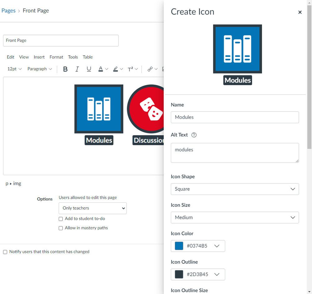
edit icon tray.jpg


Why did we build it?

Visual indicators are a great way to get a student's attention and for creating scannable, consistent content. This is true at all levels and even more so for our littlest learners. At the same time, creating these assets requires external tools which not everyone is comfortable using or even has access to. Icon Maker will provide quick and easy tools for creating simple icons, and make them reusable across your course.


When can I add custom images?

At release Icon Maker will only support pre-defined images.
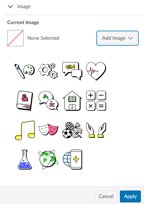
IllustratedIllustratedChoose your own colorChoose your own color

We'll be monitoring feedback for general purpose images we might add to these image sets but we know we're never going to be able cover every use case. That is why we're already working on letting you upload custom images. Custom images is planned to be a fast-follow after the initial release, and here is a preview of what that will look like. (Spoiler: it's pretty cool.)
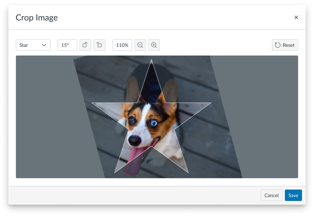
custom image preview.png

Sharing and Reuse

At first icons create with Icon Maker can be reused in a course, copied between courses in the same Canvas instance, shared between users in the same Canvas instance, and even downloaded/uploaded individually in the Files tool and still work as expected. Commons, and Common Cartridge (.imscc course export) support will be added in a future release.


How can I try it out?

Icon Maker is coming to beta soon so keep your eyes on the Canvas Release Notes for release info and how to enable it. We can't wait to see what you make!


Update March 9: As a result of some community feedback we've updated the name of this tool from Buttons And Icons to Icon Maker ahead of release to help prevent a potential accessibility issue. Thanks for always watching out for each other, Canvas community! 💖

The content in this blog is over six months old, and the comments are closed. For the most recent product updates and discussions, you're encouraged to explore newer posts from Instructure's Product Managers.

35 Comments
audra_agnelly
Community Champion

We've been waiting for this! Excellent News!

Feature request to add this functionality to the Student Applications section of the Resources tab of Canvas for Elementary (this section doesn't use the RCE, so I'm reaching, but better buttons there for our littles would be wonderful).

dkpst5
Community Participant

This looks like it'll be rather useful, especially if we can easily add our own SVG libraries.Will you be opening access to use existing "font icon" sets, like fontawesome, etc, alongside or with this? How about easy access to using Canvas' existing icons (for those of us who write documentation about Canvas within Canvas)?

dlyons
Instructure Alumni
Instructure Alumni
Author

@audra_agnelly, that's an interesting use case. There are no plans to do that right now, but I can see that some LTI providers don't include very good icons for us to use in that space. Thanks for the feedback! 

dlyons
Instructure Alumni
Instructure Alumni
Author

@dkpst5, we haven't ruled that out yet but we wanted to start with a purpose built set of icons, and then let users upload their own images first.

jlgathright
Community Coach
Community Coach

It would be GREAT if the Canvas icons for things like Quizzes, Modules, Assignments, etc. would be included in this library. When making directions for littles who cannot read "Modules", it would be great to put the Modules icon there so they can navigate for themselves. I've been asking for these icons for years! 🙂 (I know I can screenshot them, which is what I do.....but just a thought!)

knoxd
Community Participant

This is fantastic news!  I know many of our teachers want to liven up their Canvas courses, but get frustrated with the process of going from a third party platform, downloading, and uploading into Canvas.  They will love this update!  Thank you for continuing to improve the user experience.  I can't wait to try this!

jlubkinchavez
Community Contributor

Very cool. I'm wondering about how this will work with accessibility and the accessibility checker. My (admittedly incomplete) understanding of accessibility is that calls to action and links should be coded different but each could be visually represented by a button. And then there is alt text, or a label, or... It'd also be great if Canvas could offer up some best practices for leveraging this feature. I can imagine some teachers going overboard...

dlyons
Instructure Alumni
Instructure Alumni
Author

@jlubkinchavez, great question! These are images (or linked images if they link somewhere) so they expect alt text or to be marked as decorative. The accessibility checker catches them if alt text is not set and screen readers will read the alt text and link behavior as expected.

As for best practices, I would say these should be treated like any other images a teacher might use in their course. Of course we'll collect feedback as teachers begin using Buttons And Icons in their courses! 😀

Maeve_McCooey
Community Coach
Community Coach

Looks interesting, I would like to see how button links behave in content that has been copied from other courses or imported from commons.

sbj
Community Participant

@dlyons, to the accessibility question, I get why you all are calling these "buttons and icons" because they "look" like a button. But buttons have a specific meaning in web design and therefore in accessibility, so it would be wonderful if this angle of marketing was reconsidered.

There will definitely be the potential for issues with screenreaders if these images (whether linked or not) are generally referred to as "buttons."  For example, if instructions say "click on the button for Modules," the screenreader user will search for "buttons."  But nothing will come up. They won't know they are looking for an image. And whoever is creating the content has to know to never mark a linked image as decorative or else that will become inaccessible to the screenreader user (or is this baked in, as in, these buttons and icons cannot be marked "decorative?)

For anyone who wants to learn more about what actual buttons do, this is a great article on the basics of buttons.  

dlyons
Instructure Alumni
Instructure Alumni
Author

Thanks for that feedback, @sbj! We discussed this internally and we've decided even though we can't control the colloquial use of "buttons" by users we shouldn't contribute to the potential misuse of the term. I'll update this post soon with changes.

Thank you again for being an advocate!

bergs
Community Participant

Many of our instructors like to use emoji in the titles of their pages and other module items. It'd be awesome if these custom icons could be added in those places, too, but I understand how that might not be technically possible!

kaelkanzo
Community Explorer

Is there any near-term plan to make adding padding around images easier - such as adding it in the picture below? These buttons are great, but if we can't easily create adequate padding around them it'll be difficult to use in practice.


2022-03-15_14-59-18.png

dlyons
Instructure Alumni
Instructure Alumni
Author

@kaelkanzo, can you expand on what you mean how padding impacts the usability of the icons? I want to make sure I understand the problem you're concerned with. 

kaelkanzo
Community Explorer

It's not just with buttons, but with images in general. My understanding is the Icon Maker is making images that can be linked to content, is that right?

However, if you want to place an image/button next to text or place several buttons next to each other (such as going to Module 1, 2, 3 separately) instructors are left with three options to adjust the padding/white space:

  • Know how to play with the HTML to add and adjust the padding
  • Manually add a white border to the image itself
  • Try to manually add spaces which would only work in very few cases

@dlyons 

kevinhitt
Community Participant

Looks awesome!

dbrace
Community Coach
Community Coach

I am looking forward to this. I have an implementation question.

For an admin, I see the settings for this feature preview are "Enabled" or "Disabled" but there is not a "Locked" or "Unlocked" option.

My preference would be to set this as "Disabled" and "Unlocked" so that it can be enabled at the course level for anyone interested in using it.

Is this feature preview "all or nothing"?

dbrace
Community Coach
Community Coach

I see that it is possible to reuse an icon that has already been created.

Is it possible to edit an icon that has already been created?

Is it possible to duplicate an icon that has already been created?

dlyons
Instructure Alumni
Instructure Alumni
Author

@dbrace, you are correct that the feature must be enabled Account wide. This is to make sharing and reuse between courses and teachers less confusing (i.e. where one course or teacher has the feature enabled and another does not.)

Editing one or all instances in a course of an icon is support. Ditto on creating copies. 😊 When icons are shared or copied between courses the original is also left unaltered to make reuse easier.  

dbrace
Community Coach
Community Coach

Thank you @dlyons. How do we edit and duplicate an icon? I see the ability to reuse an icon (click on the "Saved Icon Maker Icons" option from within the RCE) but I do not see the ability to edit or duplicate.

UPDATE: I see, you need to click on the icon from within the large textbox and then click on "Edit". Where is the copy/duplicate option?

dlyons
Instructure Alumni
Instructure Alumni
Author

@dbrace, you were too quick for me! To "duplicate" an icon will depend on the context. If you're giving someone else a copy you can send the icon from your Course Files or if you copy the entire course the icons go along with it. If you're making a copy for yourself for some reason you will see when editing there is an option to overwrite the icon you are editing; when left unchecked this creates a new icon.

Is there any reason you would need two identical icons in the same course instead of just reusing the one?

dbrace
Community Coach
Community Coach

I was too quick for myself too, @dlyons!

Thank you for that guidance. I will check it out when I get a moment. This exact moment is not good.

Why would I want duplicates/copies? So I can create several icons that start out the same (like a template) and then make edits to them so that they are different.

sbj
Community Participant

@kaelkanzo, Giving your question a bump here as that's something we'd love, too:  Is there any plan to make it simpler for users to add padding and to align images with text on the page?  For example, to have an icon on the left hand side of the page and the accompanying text aligned right of it?  (Anything we can do to stop users from using tables for this kind of image alignment would be awesome!)

dlyons
Instructure Alumni
Instructure Alumni
Author

@kaelkanzo and @sbj, this is not something we're planning right now but it's something I'm keeping my eye on. WYSIWYG HTML editors (like the technology underpinning the RCE) make things like wrapping text and reflowing more difficult and fragile than they should be for sure.

kaelkanzo
Community Explorer

@dlyons I don't think the first step needs to be wrapping text, reflowing, or even making it mobile responsive. I found this community suggestion which I think illustrates it very well.

james_whalley
Community Coach
Community Coach


I love the idea of the Icon Maker. Upon testing though, I found that it is easy to make an icon that lacks the color contrast necessary to make it accessible. Although the accessibility checker will note if alt text is missing, it does not indicate contrast issues. As my colleague Julie Rummings says, "Alt text is primarily for those who use screen readers, but proper color contrast is important for those with low vision/color blindness." As such, I will be recommending to my team that we do not enable this feature until accessibility is improved.

 
christopher_gil
Community Coach
Community Coach

So, trying it with C4E View in Canvas and wanting to make sure that in Canvas For Elem view, the Icon maker used in Homeroom is not showing up in other subject areas. I assume that this will function like other things and that an icon made in 1 course or even in Homeroom can be used in other subjects.. 

It is possible I am missing something. 


Screen Shot 2022-05-02 at 11.16.53 AM.png

dlyons
Instructure Alumni
Instructure Alumni
Author

@christopher_gil, Icon Maker Icons belong to the course they were created in (your homeroom course, in this case) so you'll need to share them with any other courses you'd like to use them in. You can do so via Direct Share, course copy, or even downloading and uploading in the Files. 

christopher_gil
Community Coach
Community Coach

@dlyons thanks for the feedback, I know I am late to the icon party, but any plans to make icons made show up in user files (organized as such) so a user can grab an image rather than have to use Direct Share, course copy, or even downloading and uploading in the Files. 

Thanks,


Chris 


Screen Shot 2022-05-03 at 9.13.44 AM.png

dlyons
Instructure Alumni
Instructure Alumni
Author

@christopher_gil, there are no plans to associate them with a user right now but I appreciate your insight into the workflow you were hoping for/expecting. Would you be open to a short chat? If so I'll DM you so we can schedule.

christopher_gil
Community Coach
Community Coach

hey @dlyons I am always open to a chat, you can of course contact me. Let me know if that works. 


Chris 

phanley
Community Contributor

On the topic of adding additional image options, adding a third selection to the Current Image->Add Image modal that allowed selecting ui-icons from https://instructure.design/#iconography seems like it wouldn't require too much additional implementation work, and it would add a large number of options that were consistent with the overall UI of Instructure products.

Example image:

proposal for adding instructure ui-icons to the RCE icon makerproposal for adding instructure ui-icons to the RCE icon maker

dlyons
Instructure Alumni
Instructure Alumni
Author

@phanley, love the mock up! Thanks for including a visual with your comment! The instructure.design icon library won't be coming to the Icon Maker exactly because it is the icon library we use in Instructure products. That is, those icons are specifically designed to be used in building Instructure products, not the content that goes into them.

In the near term, custom images will completely open the doors on what an icon can look like and that should relieve pressure on the existing options being limited. Long term, I'm investigating the possibility of icon packs we might use so there is a broader, content appropriate, selection available.

rake_9
Community Champion

A functionality that we would be interested in but don't see is the ability for admins to provide a set of icons (so, rather than sharing from course to course, the files could be made available to all courses in a sub-account - preferably with options for how sharing would work with nested sub-accounts).

The challenge we see is for departments or programs were most courses use a common template.  Blueprints are often too structured - the courses aren't that similar; the new-ish template feature and anything from Commons tends to result in material getting duplicated as courses are copied for re-use. 

dbrace
Community Coach
Community Coach

@dlyons, thank you for responding to @phanley.

While I understand the purpose (to be used by developers) of the instructure.design icon library, it seems like a missed opportunity to significantly expand upon the number of possible icons that could be used while designing a course and Instructure/Canvas already has the icons available.

Instructure/Canvas would not need to create anything new and would need to connect the icon maker to the instructure.design library.

There are icons in that library that faculty/designers could use that would be native to the Canvas/Instructure experience.

I understand that that process would be more difficult than I explained and I hope that the development team working on Icon Maker reconsiders their decision.

+++++

On a different topic related to the Icon Maker, has any progress been made on adding a color contrast analyzer or will users need to use something like https://www.tpgi.com/color-contrast-checker?