RCE Updates - Summer 2020

The content in this blog is over six months old, and the comments are closed. For the most recent product updates and discussions, you're encouraged to explore newer posts from Instructure's Product Managers.

peytoncraighill
Instructure Alumni
Instructure Alumni
40
13630

As a long-time Instructure product person and a short-time Rich Content Editor product person, the new RCE has been keeping me up at night. Here are some observations and updates and requests for feedback.


I’ve come to understand two worthwhile motivations for this project. First, the new RCE is meant to simplify the content creation interface in Canvas, which is crusty and overwhelming today for new users and people who don’t use the bells and whistles—which are most of the people using Canvas. Second, the new RCE is intended to be responsive because it’s 2020. (Third, AOL Instant Messenger called and it wants its content editor back.)


With that said, the old editor does some stuff because it evolved over 10 years to be the way it is. If you know the knobs to turn and buttons to push, you can build some neat stuff relatively quickly using the old editor. We want the same efficiency in a better package with the new editor, and so do you! With that in mind, here are some things we’re working on to improve in the new RCE, in priority order.


1. The new editor’s toolbar needs some love


Reducing the size of the toolbar requires a careful look at the stuff that makes the cut. Somehow this button has thus far survived the cut:


LtR-RtL button


What’s that button, you ask?! It’s for toggling between right-to-left and left-to-right text entry modes. As it turns out, most people don’t ever need to do that, and we’re about to have a handy-dandy always-on menu to hold it for those who do.


On the flip side, LTI tools are really important in content creation. But as the last button on the toolbar today, LTI tools are the first to be hidden as the view shrinks. There are a few things we’re doing to address LTI tool visibility in the new RCE.


  • We’re moving LTI tools to the “media” section of the toolbar because embedding an LTI might as well be embedding any other type of media (video/image/document).
  • LTI favoriting will soon allow admins to set two LTI tools as “favorites” to appear on the toolbar for quick access.
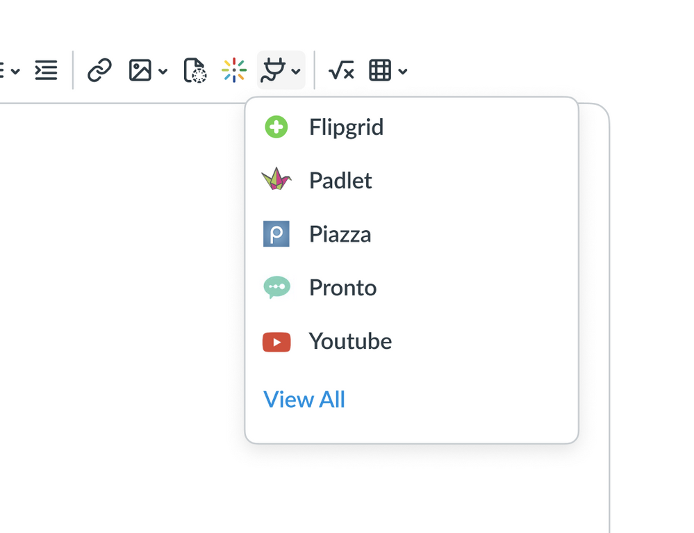
  • We’re adding a dropdown for recently used LTI tools. This dropdown may become a split button, where clicking the arrow shows recently used tools and clicking the primary button (plug) pulls up the last tool you used. Either way, it will look something like this:

recently used LTI tools


  • We’re planning to add an account setting for “Disable uploading to Canvas media” from the new RCE. We’ll still allow people to choose from files they already have in Canvas media, but this will let Canvas admins encourage the use of a school’s preferred media app during content creation if needed.


2. No one knows about the new editor's menubar


Well, if you do know about it, you probably don’t use it because you can’t remember the keyboard shortcut to make it appear and even if you can, you need to unhide the menubar each time you load a new page or refresh. Here’s the menubar I’m talking about:


new RCE menu


We could solve this by remembering your preference for showing or hiding the menubar, but that doesn’t really address discoverability. Instead, we’re going to fix this by showing the menubar all the time. It adds a line to the interface but...that seems like a worthwhile tradeoff.


3. The new editor is too clicky


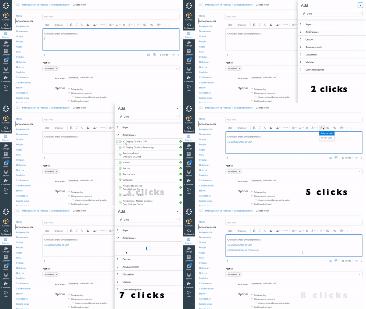
I counted the clicks between the old and new editors to add two consecutive links to course content:


old sidebar click counter

new tray click counter


Not...excellent. We’re looking at a few options to address clickiness, like:


  • Using a drawer instead of a tray (we call it a sidebar) to add content. The sidebar in today’s new RCE disappears with each interaction, and it really doesn’t need to, especially on larger screens. If it can remain in view and not cover the content, that's a win.
  • Remembering context. If you added a link to an assignment the last time you opened the sidebar, maybe assignments should already be expanded the next time you open the sidebar. This “context” thing is a big deal in mobile apps, but it can be helpful in web apps too. (See: Canvas remembers certain details about the last assignment you created for the next assignment you create.)
  • Fleshing out complete flows. Inserting an image and then adding alt text or setting usage rights as separate processes is an unnecessary timesuck. Unlinking content one link at a time is also bad. 


4. Navigating Canvas files is a bear


In a course with hundreds of images, finding the one isn’t necessarily easy, so we’ll be adding a search box to the file navigator.


Okay! That’s most of the RCE feature work we’ll focus on over the next few weeks. Having read through all of the RCE feedback and feature ideas I could find, and having talked to several power users, I think this work fairly represents what needs to happen before we shift everybody to the new RCE. If there’s something glaringly missing, please let me know and we can set up a time to chat.


Also, keep the bug reports flowing because I think we’ll be able to fix them at about the same pace as they arrive starting now.


Now onto a thing which bugs me and may not bug anyone else:


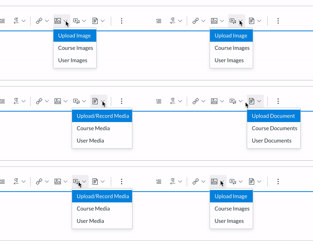
media dropdowns in the new RCE


All three of those dropdowns are presenting the same options...and the options are a little hard to parse (one option is an action, the other two are nouns...what’s the difference between course images and user images…)? By comparison, this layout makes a little more sense to me:


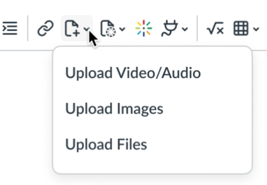
proposal for adding images


In this layout, the first decision is whether to upload something or to choose from something already in Canvas. The added bonus is it saves us a button on the toolbar. (Our instructional designers have already commented that we ought to include icons for each option in the dropdown Smiley Happy.)


Feedback welcome!

The content in this blog is over six months old, and the comments are closed. For the most recent product updates and discussions, you're encouraged to explore newer posts from Instructure's Product Managers.
40 Comments
christopher_phi
Community Champion

These look like great improvements  @peytoncraighill ‌!  Thanks so much for your work to make the new toolbar a more usable experience - I am especially excited about the ability to turn off Canvas Media and favorite our own media tool - looking forward to it! 

burrielr
Community Novice

That's wonderful news! Thank you for sharing. I'm looking forward to experimenting with the latest changes.

KristinL
Community Team
Community Team

This is awesome.

Peyton, thank you for taking the time to explain these growth points and the changes that are (hopefully) coming to the new RCE. For quite a while, I've been hesitant to switch over to the new RCE, and what you've pointed out here would alleviate so much stress. I'm excited about the potential of this version!

chriscas
Community Coach
Community Coach

Hi  @peytoncraighill ,

Thank you for the update addressing some common concerns about the new RCE.  We use Kaltura for video here, and I definitely like the improvements noted in #1.

For #2, I think that toolbar is neat (and I can never remember the shortcut either), but always showing that menu seems to somewhat defeat the purpose of simplifying the New RCE.  Perhaps it can be on by default with the option for users to hide (and remember to leave it hidden).  That could be a good compromise if it's technically feasible.

For #3, I certainly agree about the clickiness, but I think that's almost inevitable when you start the redesign with the goal of simplifying the base UI of the editor.  I know sometimes the current RCE might look too busy, but the new RCE might be swinging too much in the opposite direction sometimes.

Fir your last item about the documents/images/video buttons, I agree the menus aren't worded well.  That being said, I think a lot of people differentiate files, images, and videos and also don't always know if what they want to insert already exists in the course or not, so I'm not sure about your proposed Add icon.  What if, instead, there was just one icon for each, and a modal window with tabs for the different locations...  So Click on Documents icon, see a modal with tabs for Course Files, User Files, and Add New (or maybe just have the add new button as part of the course or user tab).  For Images, tabs could be Course Files, User Files, URL/embed, and Add New.  For video, tabs could be For Images, tabs could be Course Files, User Files, URL/embed, and Add New.  Schools with a video management system, Like Kaltura, should probably have options to disable the upload tab, and possible also the course and user tabs (to again try to ensure people are using things in the "right" platform at each institution).

Overall great updates though.  I certainly hope these can all be done fairly quickly so we have tome for testing and feedback before enforcement happens in December.  We have been very concerned that enforcement would happen before many of these enhancements, which would is not desirable at all.

Thanks again for your thoughts and hard work on this important topic!

-Chris

James
Community Champion

 @peytoncraighill ,

I'm glad someone is taking a hard look at the new RCE before enforcing it on people. Many of us have avoided turning it on and were dreading the day it was actually shoved on us for many of the reasons you point out. I turned it on in one of my sandbox courses just so I could answer Community questions about it, but wouldn't think of developing a course with it right now.

I like what you've commented on. I like the direction you're heading. It appears that you've been hearing what people have been saying. It may turn into something usable after all.

Here's my feedback.


I am not so sure about your proposed solution to your personal annoyance. Sometimes personal annoyances are the best motivators. When you use something regularly and the new system takes you 8 clicks instead of 3, you start to think about ways to minimize the clicks. That's what lead to a lot of my Canvancements -- the Canvas way was just taking too many clicks. I actually started looking at a way to pre-load the course links in the New RCE a few weeks ago, but ran into a stumbling block.

My concern here is that I don't think people think about where an item is stored first. They first think about what type of item it is and then they think about whatever prompt is presented to them next (maybe the location of where it's stored). That is, I don't think "Already uploaded to Canvas (1) is an image (2) that I want to embed," what I think is "I want to embed an image (1) that happens to already be inside Canvas (2)." 

People could be trained differently, but deciding just to mix up the way people have been doing because you are putting out a new release reminds me of Apple, not Canvas (they're also really bad about changing icons and expecting people to know what they mean). That said, if there is a time to do it because it's more efficient, then now is the time to do it.

To go along with that, if you think the image is in Canvas and then you find out it wasn't, you have to back up and start all over. Having a single button for images (like in the legacy RCE rather than a drop down) that adds the ability to upload from a file (rather than having it buried under Canvas menu like the old RCE) seems like a better approach. Here's a mockup of the new RCE "Upload Image" that includes an option for finding an image that is already within Canvas.

353396_pastedImage_2.png

Of course, the problem with that is that you lose consistency between image, media, and document because that technique doesn't really work that well for document and media. Those need to be on the drawer that remains visible until it is closed and doesn't have to reload the list of items every time you open it.

Consistency isn't the only factor, though, and Links should probably be thrown into the mix as another thing that you have two items for. One thing that was really nice with the old editor were the course links that were permanently on the side.

Maybe you have separate icons on the toolbar for images, media, files, and links. These open a dialog box and do not have drop downs to pick other options. Then have a way to toggle the content selector as a drawer instead of as a tray and all of the functionality exists in the content selector as well.

That's kind of the way it is now, but you have too many buttons with too many drop downs that take you to the same place (links, images, media, and documents). That makes more clicks. More clicks are bad for people who create a lot of content.

If the Add drawer (previously known as the content selector) had icons for links, files, media (this is currently under files), and images (this is currently under files); rather than just the Links and Files that exist now, it may be easier to navigate the system. That is, rather than adding so many things to the menu that take you to a specific place on the content selector drawer, move all of those buttons to the content selector drawer. This is where the context you mentioned comes in -- remember the place they were the last time they had the drawer open (default to links -- and you could have an "Add an external link" on that page as well

The old content selector had the ability to upload a file directly from there. It would be awesome if you could just drag/drop your file to upload it directly in the list of files. It's about allowing people to do things from where they are, not forcing them to go to some different place to do it. That's what makes it easy to use.


It seems that the new RCE has lost a lot of the efficiencies in creating content that were built up over those 10 years. It seems like another not-ready-for-production product that Canvas is determined to force on us (like New Quizzes).

Two things I remember seeing in the Community that aren't mentioned here are:

  • The ability to link to a YouTube video without it automatically embedding it.
  • Stop auto-expanding the height of the RCE to be the full length of the content when you insert a link. You lose the ability to scroll (the scrollbar disappears) and you lose your place in the document. Part of me has hope that switching to a drawer can fix this.

One thing that gets a lot of attention would be the ability to copy/paste or drag/drop an image directly into the new RCE. I voted against that idea, so I'm not counting it as part of my two things, but it does make life a lot easier and if there was some way to handle it properly and do the post processing to make sure it's a reasonable sized image or get the alt tags, then that would be a real time saver.

venitk
Community Champion
My concern here is that I don't think people think about where an item is stored first. They first think about what type of item it is and then they think about whatever prompt is presented to them next (maybe the location of where it's stored). That is, I don't think "Already uploaded to Canvas (1) is an image (2) that I want to embed," what I think is "I want to embed an image (1) that happens to already be inside Canvas (2)." 

100% agree with James here. 

One thing that was really nice with the old editor were the course links that were permanently on the side.

Also here. 

Maeve_McCooey
Community Coach
Community Coach

Hi  @peytoncraighill , I'm currently testing the New RCE in preparation for enabling prior to the start of our new academic year. All the ideas above sound very welcome but I agree that the UX/UI is not quite right, it is a bit of a clickfest and not the most intuitive WYSIWYG editor. You may have seen the following ideas/questions and comments -they all relate to the New RCE:


New RCE - Are there any plans to use the extra screen space? 
Select App: Insert icon instead of pointer shape? 

https://community.canvaslms.com/ideas/17325-apps-feature-in-new-rce 

I'm looking forward to seeing the improvements and will share any other thoughts on my experience of the New RCE. Do you have any indication what the timeline is for completing the changes listed above? 

Thank you,
@Maeve_McCooey

troyer_59
Community Explorer
"Fleshing out complete flows. Inserting an image and then adding alt text or setting usage rights as separate processes is an unnecessary timesuck. Unlinking content one link at a time is also bad."

Yay!

Now can you do something about the resizing of the new RCE box? Once I've added a picture, the box changes sizes as I type. Buggy!

New RCE Box resizes itself 

Aside: thank you for locking the toolbar at the top of the screen. 

venitk
Community Champion

 @Maeve_McCooey ‌ I have thoughts about the timing of enforcement that I included below. I would be interested in hearing your thoughts about what I wrote. 

venitk
Community Champion

 @peytoncraighill ‌, thank you for this refreshingly candid post with your thoughts about the new RCE. 

I'd like to bring up a question of timing. The new RCE is scheduled to be enforced on 12/19/2020. This is right in the middle of finals for a lot of institutions. In the best of times, such a major change would be problematic. But we're in a pandemic that will impact education more than almost any industry, so it's something else altogether. I'm going to lay out the discussion that's been going on with my colleagues and why I request you significantly push back the enforcement date and rethink your policy on enforcement dates.

To avoid having the RCE turned on in the middle of finals, we have to decide literally yesterday (more on this below) whether we want to turn it on before the Fall semester. However, the new RCE is a shambles (shambles=not ready for prime time). How can we responsibly turn it on now, when it would make an already chaotic semester even more difficult? Conversely, how can we responsibly wait until the middle of finals to turn it on and deal with bugs and training then? We have no good options. 

Why the urgency in deciding? Why do we need to have decided yesterday if we're moving to the new RCE? Documentation and training. When we transition to the new RCE, we will need to get communication out to our faculty about that new RCE, along with some training on how to use it. That communication would go out in our August newsletter, which I was supposed to start writing yesterday. When that newsletter goes out, it would need to include a link to, at the very least, a blog post we write about how to use the new RCE. In order for me to write that blog post, the RCE needs to be stable so I can write directions, take screen shots, etc. As you say here, it's not stable.

Even in a best case scenario in which faculty don't need to be trained on the new RCE and I don't need to write a blog post, at the very least I would need to go through 150 courses, page by page and assignment by assignment, to check for places where we give students directions that involve the RCE and update those directions, images, and videos. We are a 100% online program, so there are a lot of pages and assignments. I can't do that updating if the tool is unstable, and even if it were stable, I would need weeks to do this on top of the crazy race-to-the-finish that is summer for instructional designers.

So again, we have no good options. Do we turn it on now and update the documentation now, with the understanding that it will change over the next few months? Or do we wait until finals week and leave students without clear instructions on how to complete their assignments for items that use the RCE during finals? 

I understand that on a corporate developer level, it's helpful for you to put decisions off as long as possible. I totally get the "wait and see" approach. But instructional designers and admins don't think month-to-month. We think semester-by-semester and year-by-year. So here's my request:

  • Avoid enforcing major changes during a term, especially not during finals week. 
  • Because you are an international company, it's impossible for you to take into account every institution's term dates. Therefore, new tools should be stable and at parity with the existing tool for at least six months before they are enforced. Small tweaks and fixing bugs is fine, but not the major changes you're suggesting here. This would allow institutions to set an enforcement date that works with their academic calendar.
  • Depending on where your enforcement date falls in my term calendar, six months might just be barely enough time to go through the training, documentation, and updating process that I described above. So although I say six months, nine months would be much better.   

I'm hoping that this peek into what our process is will help guide your decisions on enforcement dates, not just for the new RCE but for future large developments. In a previous blog post, a Canvas employee said something to the effect that people worry a lot about a change before it happens, and once it's here they find it's no big deal. I'm hoping by sharing our process, you can understand why this is a big deal. We can't plug our students and faculty into the matrix to train them instantly. Many institutions also have faculty and students who are already on cognitive overload and emphatically do not want to be doing school online, especially right now, but with the way things are going, by December they will not have a choice.

According to my suggestions, the date for new RCE enforcement should have already been delayed to at least May 2021, if not August 2021. This decision should have been made by June, six months before the planned enforcement date. I respectfully ask that Canvas announce a delay of enforcement by the end of July so that we don't have to prematurely turn a flawed, major tool that will yet undergo large-scale changes. 

andrea_earl
Community Coach
Community Coach

Thank you for sharing! I am a power user but didn't see the text editor dropdown before this post. (It was well hidden).  Another issue I'm having is that when I expand a box in the New Quizzes to see what I've written, if I click away (or just wait too long) it shrinks down again and I have to expand it again. I like the little hash in the bottom right-hand corner for expanding, but could all of the RCE boxes stay resized until saved? This is driving me nuts. Thanks for all of your hard work. 

degensp28
Community Participant

These are really wonderful developments, but I am concerned that we know when New RCE will be turned on, but don't know when it will be up to snuff.

We all recognize that nothing is ever really done being developed, but the fact that we still have a December go-live date when there is so much still being done is worrying.

It would be nice if Instructure would provide us at least one semester with a (more-or-less) finished product before it was forced on. We need time to train faculty and update documentation.

hansonav
Community Participant

I think that is exactly it Katie. We all appreciate the ability to give input and see meaningful changes ahead of something launching, but having a reasonable amount of time to learn the intricacies of these changes, training, and updates when it is in its mostly "final" state is important too. Especially during the school year, administrators, instructional designers, tech coaches, and teachers are all trying to keep up with their students and make it through the day. It would be great to have more time, in this case, to see how these updates to the new RCE outlined above will work and have more than a handful of weeks to try it out before it is turned on for all and give some grace and time for those that are supporting and helping our teachers and students learn the functionality as well.

Maeve_McCooey
Community Coach
Community Coach

Hi  @venitk atie , all in all I think the planned improvements will be positive changes. Agile software development and cyclical academic practices are often at odds with each other, especially when a global product like Canvas has a wide range of customers with many region specific academic calendars to consider. It would be super helpful to know the intended timelines for the delivery of these improvements as this would allow us to plan all the necessary activities required prior to launching the new/updated feature.

venitk
Community Champion

Thanks for your thoughts. I definitely agree the changes will be great when they've worked out the major issues. I'm content letting the tweaks be worked out over time, but do think the major stuff--particularly stuff that students would need directions on how to access external LTI, MyMedia, Kaltura, etc.--should be worked out before we use it. 

Bobby2
Community Champion

Brilliant  @peytoncraighill ‌, this is such good news. Made my day.

Will be sharing!

fiona_clayton
Community Member

I love these developments, in particular being able able to search for a page because if you have 100 pages it's a nightmare trying to find the one you are looking for!

troyer_59
Community Explorer

I was encouraged to attempt multiple browsers. You can see that the resizing is an issue in Firefox and Chrome. Edge was troublesome because my organization blocks pop-ups, and I'm guessing that's how the interface to upload a new image functions: as a pop-up. Take a look:

Issues with new RCE 

James
Community Champion

Nice video, Megan. I knew it was bad, but not as bad as you showed.

valentinesking
Community Coach
Community Coach

Hey  @James 

Thank you for including:

not automatically showing inline preview of YouTube links; specifically would be nice if 

--> it was not automatic, and

--> it could be enabled/disabled for those who desire it.

Also, thanks to troyer.59‌ for mentioning the automatic resizing of the RCE window after an edit (and jumping to the top).

Sky V. King

debra_russell
Community Novice

Megan I totally agree with your comment about the resizing of the box. 

Why is it one size and immediately gets larger when you add content? If it's a page with a lot of content you have to find where you were working!

sgarcia1
Community Participant

On that same note, you can support this: https://community.canvaslms.com/ideas/16896-do-not-auto-adjust-height-in-new-rich-content-editor?sr=... I think if the resizing of the box was addressed, maybe there would have been no need to keep the toolbar static...

I really wish this could be addressed before the new RCE is fully implemented, otherwise my colleagues will want to kill me everytime they need to edit content Smiley Sad

Thank you!!

James
Community Champion

The first wave of improvements has been announced: Canvas Deploy Notes (2020-08-12) 

  • Toolbar menu always present instead of having to press a keyboard shortcut
  • Accessibility options when uploading an image rather than having to go back later to add them
  • External App (LTI) icon moved to Media section of the toolbar rather than being at the very end and being the first thing to disappear into the more options when screen size is small.
Maeve_McCooey
Community Coach
Community Coach

The toolbar menu being ever present is super useful. It's not dissimilar to a Microsoft Office type workflow, loving the expanding drilldown options as opposed to the click heavy alternative. 

venitk
Community Champion

I noticed that RCE enforcement has been pushed back to January. Thank you so much!!

Maeve_McCooey
Community Coach
Community Coach

Thanks for posting and letting us know @venitk😁

atcarver
Community Contributor

Does anyone know if striping rows will be part of a future RCE update? That is, alternating colors on rows of a table without having to go in and background shade each row? 

Shar
Community Champion

Hi @atcarver ,

If you're comfortable in the HTML editor, you can do the stripe rows already with a class. These stripes do not appear in mobile apps though, so you may as well do the background shading you are doing already.

Bootstrap table:

<table class="table table-striped table-hover"

Canvas table:

<table class="ic-Table ic-Table--hover-row ic-Table--striped"

The hover part is so that the table row gets a special highlight when ya mouse over it.

And for what it's worth, you can also shade the rows based on your Canvas theme colors:

<tr class="ic-Table__row--bg-neutral">

<tr class="ic-Table__row--bg-danger">

<tr class="ic-Table__row--bg-success">

<tr class="ic-Table__row--bg-alert">

Again, these colors do not show up in the Canvas mobile apps.

Cheers - Shar

erinhmcmillan
Instructure Alumni
Instructure Alumni

@atcarver Hello! Any enhancements for features will be posted in the Roadmap!

And if it isn't there, check out the Idea Conversations.

Thanks!

Erin

audra_agnelly
Community Champion

Any plans to default the editing field to a taller box when you open the page? I don't see this in the roadmap. While the editor expands as soon as your start editing, on an existing page its difficult to read your page and find where you want to edit in the short window. Manually expanding the window to read my page and then having it auto-expand to full height when I start typing is just silly, it contributes to the clickiness issue of the tool and makes the page feel jumpy when it resizes on you. If it's going to expand to full height as soon as you type, just start at full height. Or, start with a height that is going to fit on an average laptop screen and let the user expand for larger screens like we did in the old RCE.


snugent
Community Champion

I have been playing around with the latest updates. It is nice to see it becoming more usable. I still have issues with the way the links are creating and removed. In the current editor I often update links and it so easy. I can just click into the link and lick the broken link icon or if I'm using the content selector, I can select the text and select the new link. Two clicks in the current editor become many clicks in the new editor. 

erinhmcmillan
Instructure Alumni
Instructure Alumni

@audra_agnelly see one of the fixes listed in Canvas Deploy Notes (2020-09-09)

Thanks!

Erin

jeannesamuel
Community Explorer

You recommend: Using a drawer instead of a tray (we call it a sidebar) to add content. The sidebar in today’s new RCE disappears with each interaction, and it really doesn’t need to, especially on larger screens. If it can remain in view and not cover the content, that's a win.

Maybe call it a "slidebar" . Acts like a drawer and functions like a drawer, opens when you hover over slidebar tab. 

naumoski
Community Explorer

Hi - thanks for your hard work! I'm sure others have mentioned this before, providing a search field in any upload/add button in the RCE would be extremely helpful. I have worked on courses that have 200+ files, and each time it takes extra minutes to scroll and find them.

Similarly, the text area needs to expand on Edit. Clicking space or delete should not be a prerequisite. 


Rob_Tob
Community Member

As a chemistry teacher it would be really nice if the superscript/subscript button did not share a single toolbar item. I use a lot of super/subscripts and this adds a lot of extra clicks. Or if this isn't possible, at least give them a keyboard shortcut!

milesl
Community Contributor

We turned this on for our instance yesterday, and I quickly noticed that the sidebar does wonky stuff on larger screens.

When you open the sidebar, the compose window gets squished to the left, and a huge blank space appears between the compose window and the sidebar (marked in blue):

Screen Shot 2021-01-06 at 1.44.17 PM.png

I filed a bug and was promptly told that this was intended behavior. 😕

That can't be right. Please help us @peytoncraighill!

Video: https://youtu.be/dYbavxke1sI

peytoncraighill
Instructure Alumni
Instructure Alumni
Author

@milesl  That seems normal.


.......😂


I've made a ticket. We should be able to get to it pretty quickly!

joshua7
Community Member

@peytoncraighill It seems like there's still a number of usability issues (like the # of clicks to insert links / ability to edit links easily) that aren't resolved. Is there a reason the old RCE is still being deprecated on Jan. 16 without the new RCE being fully ready for new users? It's one thing for admins to deal with these issues, but forcing this change at the beginning of a semester for all teachers is going to cause a lot of frustration. They're creating a lot of content right now, and forcing this switch seems like really bad timing. Can't we keep this opt-in for a couple more months? Or until those usability issues are fixed?

gmorris1
Community Participant

All the custom buttons and functions we built for the RCE disappears when we turn on the new RCE. Grrr!!

DLRichardson
Community Member

I've just begun using the new toolbar, and I'm wondering if I've missed something. Before, when inserting an image from my course files, I had the option to resize before inserting. Now, it seems that I have to insert, then click on the image and wait for Image Options to appear before resizing. Is there a simpler method?

Also, my images are organized in labeled folders so I can locate them easily. Are my folders now viewable only when clicking on Files?