Update!
Mobile and accessibility team leads met last Friday to discuss documenting a mobile accessibility standard that we could publish. It'll define the contrasts, font sizes and screen-readers that we support and use in testing. Here's what it looked like, because smart people working on hard problems is always exciting to me:

There's going to be some squishiness in whatever we publish, but the goal is to focus expectations for mobile accessibility on something we/you can point to.
For a quick summary of the challenge: You can imagine distinct phone/tablet manufacturers being the equivalent of distinct web browsers insomuch as their systems handle accessibility modes differently. But in our case, there are many more phone manufacturers and operating system versions to consider than there are popular web browsers, and for users, changing devices isn't as straightforward as changing browsers on a computer.
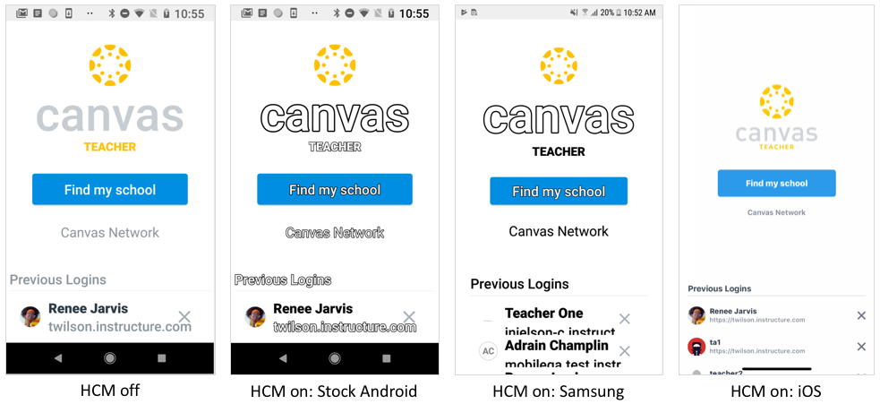
Here's how three different manufacturers handle high contrast mode on the login page of the teacher app:

Samsung: pretty good! iOS: barely noticeable. Stock Android: almost unreadable.
Then add a half-dozen more manufacturers, combine that with underdeveloped automated testing frameworks available for iOS and Android, and combine that with underdeveloped mobile accessibility standards, and the challenge is pretty clear.
But we're going to take a stab at providing some clarification that we'll likely need to iterate on. To the extent that we can, we'll continue to ensure accessibility is baked into designs that work across platforms. As usual, if you're running into blocking issues with accessibility on either platform, call our support team (most preferable), post in the community or email me so we can address them ASAP or otherwise communicate a plan to address them.


