@mbryant8 ,
I assume that you want it single spaced inside Canvas and not inside a word processor.
My first question is why do they need to be single spaced? It looks like you have headers (week numbers) followed by text. There should be extra spacing around a header and the other text is inside a paragraph, which adds extra spacing after it to make it more readable.
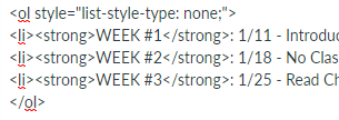
One way to reduce the spacing would be to treat it like an ordered list. Here are two examples of what you gave. The first is a simple ordered list. The second has some CSS applied to remove the numbering.

To remove the numbers, I went into the HTML editor and added style="list-style-type:none;" to the ol tag. Here's a lesson from the Canvas Instructor Guide that explains how: https://community.canvaslms.com/docs/DOC-13008-4152719750

Either way, the marking as the week # as strong (which shows up as bold) is not a good from an accessibility perspective because you're faking a header and it loses its semantic meaning when you do that. On the other hand, what you really have is an ordered list of what the students are supposed to do, so using a list to display it isn't a crazy idea.
Another option to consider is that the Canvas syllabus page automatically adds assignments to it. You could add these things to do to the assignments (readings could be a non-graded assignment) or content pages (and add it to the to-do list). Then it would automatically show up on the syllabus page.
Another way, which is what I do, is to upload my syllabus as a file and then link to it from the syllabus page. That preserves the formatting and it makes the syllabus page more useful since students don't have scroll through 23 pages of required material to get to assignments in date order. When students have to do that, they really just don't do it and the syllabus page loses one of it's primary benefits since they're not using it.
You can also modify the HTML to remove the padding and margins around the paragraphs or potentially set them to negative values to remove some of the extra spacing. That's going to be a lot of work as Canvas makes it difficult for people to change the default styles. The consistent look and feel across courses and pages is supposed to be beneficial for the learning process.


This discussion post is outdated and has been archived. Please use the Community question forums and official documentation for the most current and accurate information.