So, this actually turned out to be a pretty fun and straightforward way to learn how to play with divs. Trying to replicate single column tables instead of multi-column responsive layout is much much easier. Disclaimer: I'm an amateur in Instructional Design, nothing I say should be considered gospel or even necessarily right for that matter.
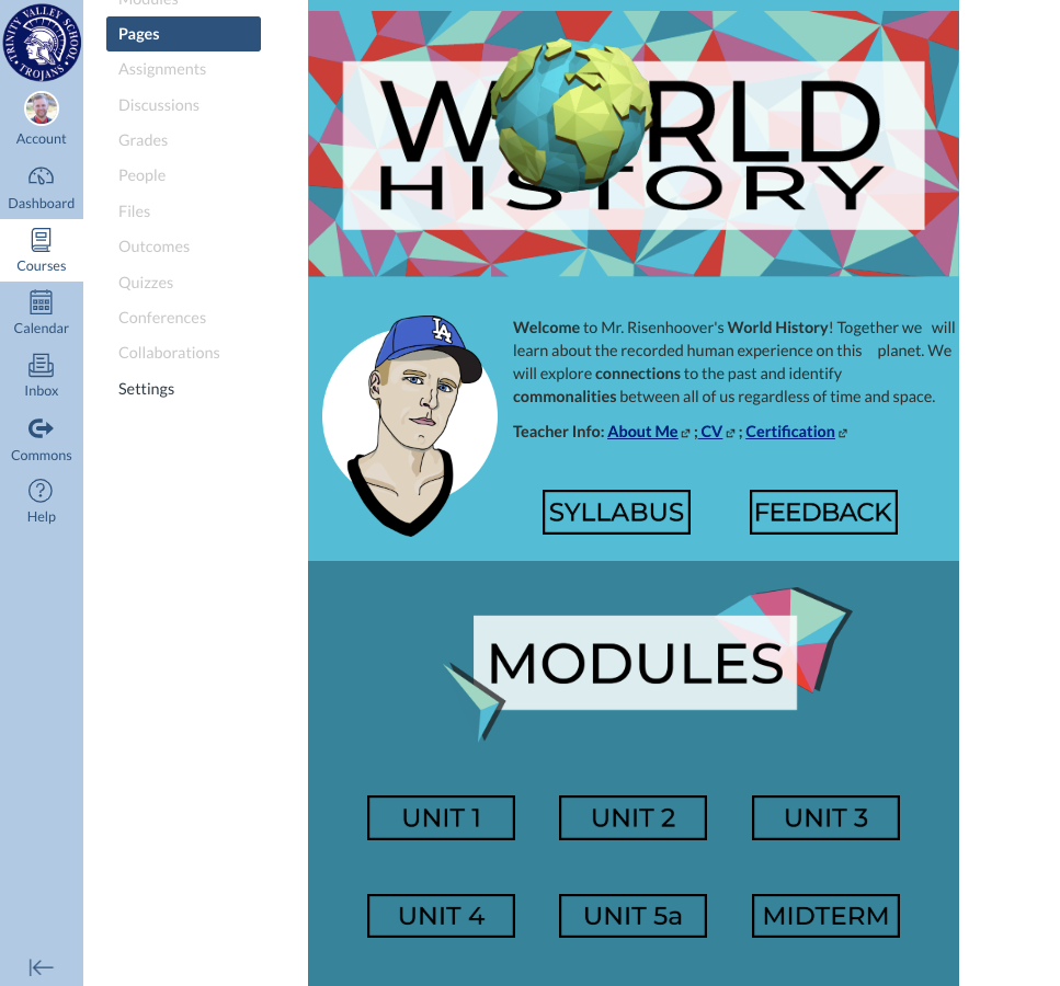
@lethbri2 , I really like the visual communication style of what you showed off. It definitely implements some of what is becoming more common place. 1) Single responsive column so mobile-ready from the start, 2) Alternating back ground colors to break up text into sections, 3) Simple graphics that convey just enough meaning, but not too much.
If I were to offer some constructive feedback from my limited knowledge, it would be:
1) Regardless of your layout technique, always check for contrast of FG/BG colors. WebAIM: Color Contrast Checker
2) Give divs a shot! Everything I can learn from looking around the internet says tables (Edit: tables for anything other than tabular data like layout) are a big no-no for accessibility. I enjoyed poking around at this last night so I went further and did a proof of concept of how your page could work with divs.
You can see this page in action (and view it's source code) in my FFT sandbox. It definitely still needs some design touch ups and probably some optimization of the div setup, but it should give you some confidence divs can do it without that much scary code.
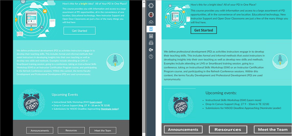
Here's a side-by-side of your image and a screenshot of my divs version:
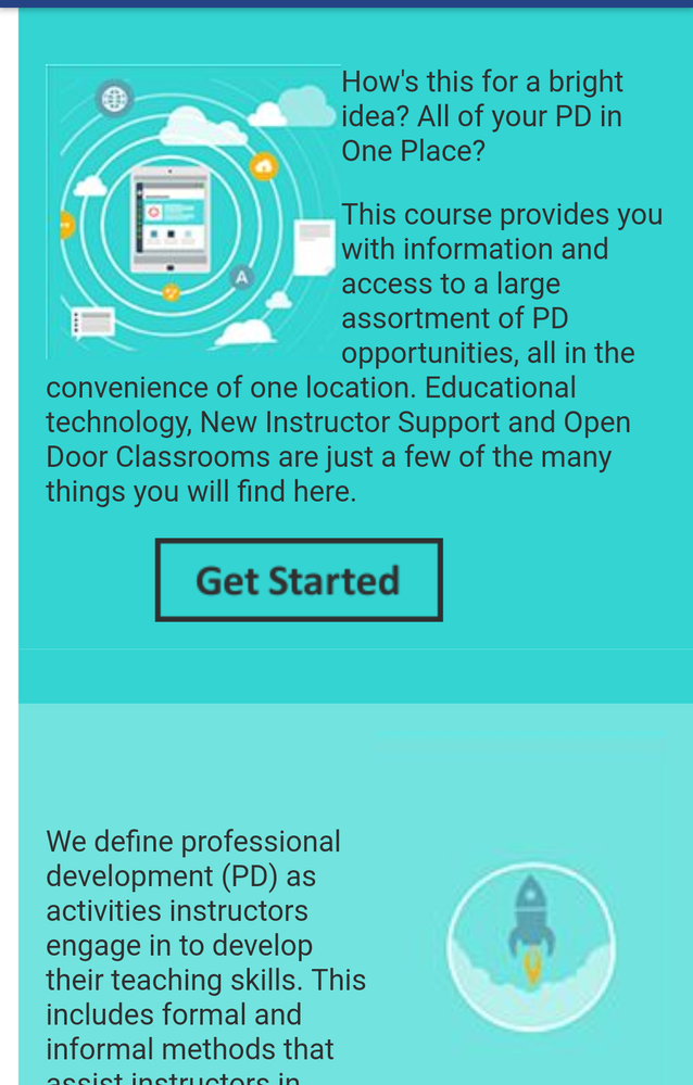
Here's a shot of it on my Android device in the app (it also looked good on the developer tools device previews for iPhone/iPad):
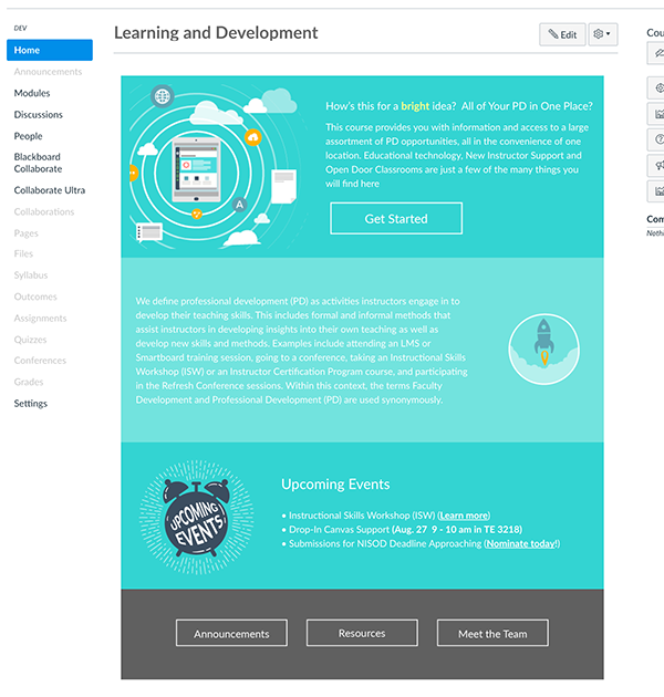
Here's a quick look at the source code if you just want to grab it and try it out (images are likely to break and I'm sure it's far from perfect):
<div style="max-width: 660px;">
<div style="color: #303030; background: #33D4D2; width: 100%; padding: 15px; min-height: 220px; overflow-x: hidden;">
<p><img style="float: left;" src="https://canvas.instructure.com/courses/1182151/files/53560896/download?wrap=1" alt="computer in circles with clouds" width="162px" height="162px" data-api-endpoint="https://canvas.instructure.com/api/v1/courses/1182151/files/53560896" data-api-returntype="File" /></p>
<p>How's this for a bright idea? All of your PD in One Place?</p>
<p>This course provides you with information and access to a large assortment of PD opportunities, all in the convenience of one location. Educational technology, New Instructor Support and Open Door Classrooms are just a few of the many things you will find here.</p>
<p style="padding-left: 60px;"><img style="float: left;" src="https://canvas.instructure.com/courses/1182151/files/53561358/download?wrap=1" alt="button_get-started.png" data-api-endpoint="https://canvas.instructure.com/api/v1/courses/1182151/files/53561358" data-api-returntype="File" /></p>
</div>
<div style="color: #303030; background: #72e3de; width: 100%; padding: 15px; overflow-x: hidden;"><img style="float: right;" src="https://canvas.instructure.com/courses/1182151/files/53561843/download?wrap=1" alt="rocketship" width="159" height="237" data-api-endpoint="https://canvas.instructure.com/api/v1/courses/1182151/files/53561843" data-api-returntype="File" />
<p> </p>
<p>We define professional development (PD) as activities instructors engage in to develop their teaching skills. This includes formal and informal methods that assist instructors in developing insights into their own teaching as well as develop new skills and methods. Examples include attending an LMS or Smartboard training session, going to a conference, taking an Instructional Skills Workshop (ISW) or an Instructor Certification Program course, and participating in the Refresh Conference sessions. Within this context, the terms Faculty Development and Professional Development (PD) are used synonymously.</p>
</div>
<div style="color: #303030; background: #33D4D2; width: 100%; padding: 15px; overflow-x: hidden;"><img style="float: left; padding-right: 60px;" src="https://canvas.instructure.com/courses/1182151/files/53562003/download?wrap=1" alt="clock with words upcoming events" width="192" height="156" data-api-endpoint="https://canvas.instructure.com/api/v1/courses/1182151/files/53562003" data-api-returntype="File" />
<p><span style="font-size: 18pt;">Upcoming events:</span></p>
<ul>
<li>Instructional Skills Workshop (ISW) (Learn more)</li>
<li>Drop-In Canvas Support (Aug. 27 9 - 10am in TE 3218)</li>
<li>Submissions for NISOD Deadline Approaching (Nominate Leader)</li>
</ul>
<p> </p>
</div>
<div style="color: #ffffff; background: #606060; width: 100%; padding: 15px; overflow-x: hidden;"><img style="float: left; width: 30%; max-height: 46px; margin-right: 5%;" src="https://canvas.instructure.com/courses/1182151/files/53562301/download?wrap=1" alt="announcements" data-api-endpoint="https://canvas.instructure.com/api/v1/courses/1182151/files/53562301" data-api-returntype="File" /> <img style="float: left; width: 30%; max-height: 46px; margin-right: 5%;" src="https://canvas.instructure.com/courses/1182151/files/53562302/download?wrap=1" alt="resources" data-api-endpoint="https://canvas.instructure.com/api/v1/courses/1182151/files/53562302" data-api-returntype="File" /> <img style="float: left; width: 30%; max-height: 46px;" src="https://canvas.instructure.com/courses/1182151/files/53562304/download?wrap=1" alt="meet the team" data-api-endpoint="https://canvas.instructure.com/api/v1/courses/1182151/files/53562304" data-api-returntype="File" /></div>
</div>



This discussion post is outdated and has been archived. Please use the Community question forums and official documentation for the most current and accurate information.