Hi Melissa -
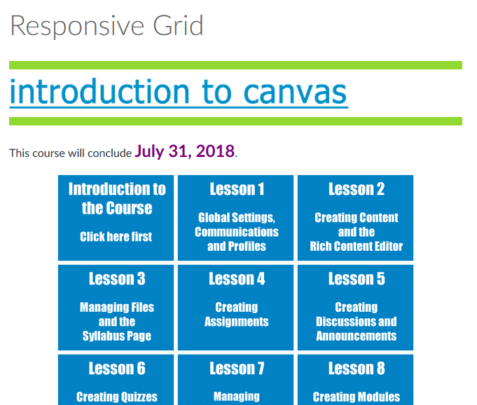
You could achieve the same effect by creating two rows of buttons under your header image. I continue to struggle to get these to be as responsive and fit the way I'd like, but essentially:
Banner image
<div style="min-width: 100%; padding: 15px 20px 15px 20px;">
<p><img src="[location]" alt="banner" width="95%" data-api-endpoint="[location]" data-api-returntype="File" /></p>
Followed by buttons organized in rows
<div style="min-width: 50%; padding: 15px 0px 15px 0px;"><a id="" class="btn btn-inverse" style="width: 27%; margin-top: 5px;" title="Course Syllabus" href="[location]" data-api-endpoint="[location]" data-api-returntype="Page">Course Syllabus</a> <a id="" class="btn btn-inverse" style="width: 27%; margin-top: 5px;" title="Project Overview" href="[location]" data-api-endpoint="[location]" data-api-returntype="Page">Major Project Overview</a> <a id="" class="btn btn-inverse" style="width: 27%; margin-top: 5px;" title="Library Resources" href="[location]" data-api-endpoint="[location]" data-api-returntype="Page">Library Resources</a></div>
Gets me the following page layout:

As I mentioned, I continually struggle with getting the size relationships correct. I'd be interested to hear if there is an easier way to do this. I'm stuck in a trial end error approach. Of course, on mobile, the buttons show as hyperlinks.


This discussion post is outdated and has been archived. Please use the Community question forums and official documentation for the most current and accurate information.