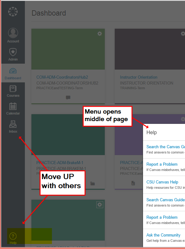
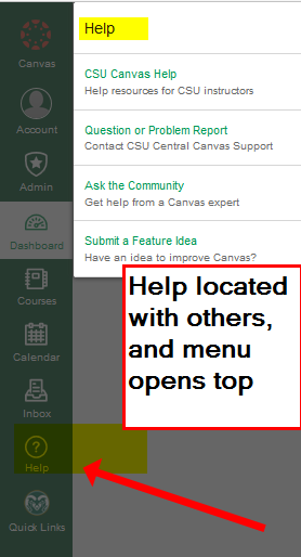
New UI – HELP BUTTON & MENU- Move it UP w other buttons & consistent fly-out

  This idea has been developed and deployed to Canvas


  Idea open for vote Wed. May 4, 2016 - Wed. August 3, 2016  Learn more about voting...

The HELP button in the left navigation menu is super important.

1- MOVE IT UP, inline with the other buttons!! (so people can see it easily).

2- Set the fly-out menu to open top & left, matching the Account and Courses menus.


Users won’t know to use the Help button if they can’t see it.

Consistency is a sign of quality.


Now, Help TOO LOW:                                                Improvement: Move Help UP in-line; menu opens top left:

179673_Help-bottom.pngHelp-bottom.png  179672_Help-Inline.pngHelp-Inline.png
This idea was from our Canvas College Coordinator Team, who are speaking for their users.

Melody Brake - Colorado State University


  Comments from Instructure


For more information, please read through the Canvas Production Release Notes (2016-08-27)

21 Comments
925024864
Community Champion

I agree with you Tom... it's just too hard to see/find where it currently is, especially for new users.  I just hope this gets Instructure to reconsider it's placement and visibility.

ronmarx
Community Contributor

There's an idea that is directly related to this one regarding the SAVE button for Canvas developers. Please vote UP for it here: Add and/or Move Save Button for Developers

Thanx,  @ronmarx ​

cesbrandt
Community Champion

 @ronmarx ​, that idea doesn't actually have anything to do with this one. This idea is with regards to moving an existing option on the main navigation while the idea you're linking to it regarding adding a new button to all edit pages. These are two very different ideas regarding two very different concerns. Further, it can't be voted on due to having been archived for being too broad. At least, there's no voting controls for me.

Having said that, I wouldn't mind having an additional set of buttons for Save, Publish, and Cancel at the top of the edit pages. It'd be helpful for doing bulk updates where the change is in the content or one of the first settings (which still displays on my initial screen view without scrolling), however, I wouldn't even consider it to be a minor annoyance. It's really just one of those niceties that isn't better or worse for having it.

If you want to post a new copy of that idea and address the concern about it needing to be elaborated on, please feel free to share it with the previous submissions of the idea and I'll give it a +1.

ronmarx
Community Contributor

Christopher,

Your point is taken, but I was focused on your idea of freezing the pane so it doesn't scroll with the rest of the content. (It would be silly to replicate buttons all the way down the page.) Yes, I've used other LMS products that have the Save button in both the top and bottom margins of the edit page, but it wouldn't be a bad thing to either freeze the top margin (like your idea), or have those important function buttons float with the page as it scrolls.

This is what makes these two ideas similar, IMHO. It's all about function accessibility for the various types of Canvas users.

BTW, I voted up for this idea. Check to see that your avatar shows up in the voter list, mine does. As you know, CanComm allows one vote per person.

Thanx for the feedback.

i_Ron

cesbrandt
Community Champion

While I never mentioned floating either of these, the idea had crossed my mind as I was reading the other Save button threads, but that is easily accomplished with institutional CSS. Floating just wouldn't do any good given that it would still fall in line with the content. Instead, you'd have to give it a fixed position. This will require JavaScript to avoid its positioning inadvertently causing problems with other parts of the page.

Either way, it remains, at least in my mind, an unrelated idea to this one.

With regards to voting, you can tell if you voted by looking at the buttons. The option you've selected will be a darker shade of grey and won't change colors when you mouseover it. If they're the same color and change shades on mouseover, then you haven't voted.

Renee_Carney
Community Team
Community Team
  This idea has been developed and is On Canvas Beta How do I access the Canvas beta environment?

For more information, please read through the Canvas Beta Release Notes (2016-08-15)

Renee_Carney
Community Team
Community Team
  This idea has been developed and deployed to Canvas

For more information, please read through the Canvas Production Release Notes (2016-08-27)

925024864
Community Champion

Awesome sauce... This is great!

Renee_Carney
Community Team
Community Team

ROI.png

Thank you to admin_brake for submitting this idea, as well as, 700958421​,  @kona ​, dreesd​, cesbrandt​,  @kmatson ​ harker​, petern​, e01166​, 925024864​,  @tom_gibbons ​, &  @ronmarx   for your contributions. Your investment in this idea helped refine a feature which is now part of the Canvas! Smiley Happy

KristinL
Community Team
Community Team
Status changed to: New