The Instructure Community will enter a read-only state on November 22, 2025 as we prepare to migrate to our new Community platform in early December. Read our blog post for more info about this change.
Turn on suggestions
Auto-suggest helps you quickly narrow down your search results by suggesting possible matches as you type.
- Community
- Canvas
- Canvas LMS
- Canvas LMS Blog
- Spotlight on Five-Star Course Design
Spotlight on Five-Star Course Design
Instructure Alumni
- Subscribe to RSS Feed
- Mark as New
- Mark as Read
- Bookmark
- Subscribe
- Printer Friendly Page
- Report Inappropriate Content
Spotlight on Five-Star Course Design
What’s Included in This Post?
• Course Examples of Five-Star Course Design
• Course Examples of Five-Star Course Design
As educators, we want our students to have the best learning experience possible! What creates the optimal Canvas experience? I like to think of a Canvas course as an experience, similar to an experience you might have when visiting a hotel. Your experience at a budget inn will not likely not be the same as an all-inclusive resort, right? As an Instructional Designer, I’d like to share three best practices that I believe make the most considerable impact on student learning and help give students that state-of-the-art experience.
Welcoming Home Page and Consistent Elements
When visiting a hotel, your experience starts in the hotel foyer when you check in, and it sets the stage for the experience to come (Do you feel welcomed? Does it look nice? Do you know where to go?) Thinking of your Canvas Home Page like a hotel foyer will help set the course’s tone and what’s to come! All that’s necessary to be effective is a visual welcome like a banner or other graphic or welcoming message, and a clear starting point for learners.
Let me set your mind at ease…you do not have to know HTML or be a graphic designer to design an effective course! I remember years ago seeing a full-page Nike ad in my local newspaper. The entire page was white, and there was a tiny black Nike Swoosh in the center of the page. I wondered why the page was so empty but realized that it caught my attention, and that was the point! It made me realize that sometimes SIMPLE IS BEST. Sometimes too much on your Home Page can be distracting or overwhelming to the student.
|
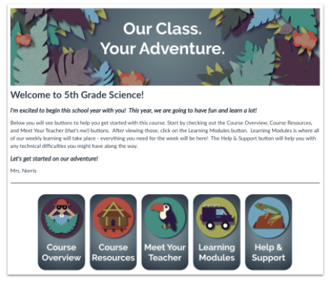
Below is an example of a Primary Home Page that sets the tone with a fun, adventure-themed Home Page. Here you see one banner, a welcome message, and five buttons - it’s simple and easy to understand where to go to find things like a schedule or daily activities. Graphics similar to these can easily be created using a free graphic software program like Canva! If you need help learning Canva, I highly recommend the tutorials in Canva Design School! |
When you visit a hotel, you see the branding, colors, and decor incorporated throughout the spaces. Carrying the same look and feel of your Home Page throughout the course in your pages and learning activities with consistent colors, layouts, and organization can help create an optimal experience for students!
|
The screenshots below are from Apple’s Swift curriculum (take a look, these courses are free in Canvas Commons!) Notice how clean and minimalistic the Home Page is and how that same look and feel is carried throughout the content pages and learning activities! Also, notice that the “feel” of this course is not the same as in the first adventure example, but each is equally effective in inviting a warm welcome and guiding the learner on where to go. |

Course Navigation and Organization
Now, imagine being in a hotel and not knowing how to find your room, the elevator, the pool, or a restaurant. We never want students to feel lost in a course. I prefer to hide most of the Course Navigation and have learners access everything from the Modules area. Think about your course objectives and think about how you will introduce the content. Start your Module with a Canvas Page that gives an overview of the topic and what’s to come. Then, start introducing your content to your learners. Pages are a great way to present a variety of instructional materials. In Pages, you can incorporate videos, articles, teacher-made resources, websites, and even tech tools to help build the foundation of learning. Then, include learning activities that create meaningful interaction and engage learners to promote the achievement of your objectives (i.e., discussions, practice quizzes, assignments, etc.)
Putting things in the order that you want students to encounter them and using Module Prerequisites and/or Requirements can keep students from skipping around and missing important content. With everything organized in Modules, students are less likely to get lost, which can make all the difference in your student experience. Looking at the course through Student View can also help you better understand the student experience.
|
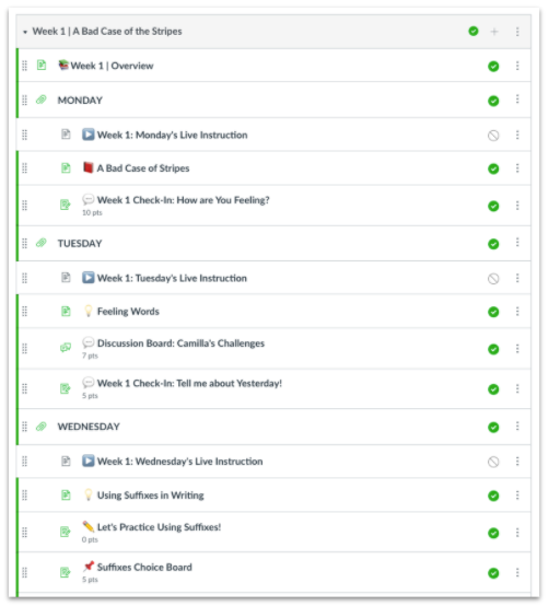
Below is a snippet of a weekly module shared by Kern County Superintendent of Schools (KCSOS) in Bakersfield, California. Using Text Headers, indentions, and clear naming conventions can help students have a smooth course experience and limit frustrations. You might choose to use emojis to visually represent things within your Modules for young learners. In this module example, each day’s Live Instruction Page was intentionally left unpublished until the teacher added the daily recording to the page. Universal Design for Learning (UDL) principles like student choice, engagement, and expression, were also incorporated in this module. Hats off to my friends at KCSOS for their terrific work in supporting districts, teachers, and students! |
Accessibility and Mobile-Friendliness
Now back to my hotel example - imagine if there wasn’t an elevator and you had to trek up 50 flights of stairs to get to your room. When designing a course, it’s essential to think about all learners and their ease of use. All students, regardless of variability, should learn. Building for accessibility and mobile-friendliness is critical.
In a past CanvasLIVE, Taking Your Canvas Course to the Next Level, Dr. Deonne Johnson walked through actual courses with teachers and showed how to make them accessible. I highly recommend watching this CanvasLIVE if you’ve never seen it! She explained that public places began installing wheelchair/curb ramps in the ’90s to comply with the Americans with Disability Act (ADA). However, many people who don’t use wheelchairs are also thankful for those accommodations! For example, if you are pulling your luggage or a stroller behind you as you enter the hotel, those ramps make your life much easier! Designing well is advantageous to all learners! Two fabulous resources to learn more about accessibility and mobile-friendliness are the General Accessibility Design Guidelines and the Mobile App Design | Course Evaluation Checklist.
Our go-to resource for creating an overall quality Canvas course is the Course Evaluation Checklist v2.0, which Dr. Deonne Johnson used in the CanvasLIVE I recommended above. I love this checklist because it’s simple, easy to use, and based on research. It’s great because anyone can use it, no matter their subject area, grade level, or tech-savviness!
Final Thoughts
For more course design inspiration utilizing best practices, explore our Ready-Made Template Suite. Our Instructional Design team offers templates, consultation, badging services, course evaluations, workshops, and more. Explore Instructure’s Learning Services that may be of interest to you or your organization.
Please comment below. We’d love to hear from you!
Our Instructional Design team offers templates, consultation, badging services, course evaluations, workshops, and more. If you would like to learn more about our services, please contact your CSM or @deonne_johnson, Manager, Learning Services, via djohnson@instructure.com
25 Comments
You must be a registered user to add a comment. If you've already registered, sign in. Otherwise, register and sign in.
kimberly_ellis
Instructure AlumniAbout
Wiggins, MS
Bio
An amazing Instructure Community member!
Badges
 Community help
To interact with Panda Bot, our automated chatbot, you need to sign up or log in:
Sign inView our top guides and resources:
Find My Canvas URL Help Logging into Canvas Generate a Pairing Code Canvas Browser and Computer Requirements Change Canvas Notification Settings Submit a Peer Review AssignmentTo interact with Panda Bot, our automated chatbot, you need to sign up or log in:
Sign in
