Hi @james_peth ,
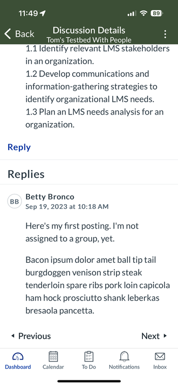
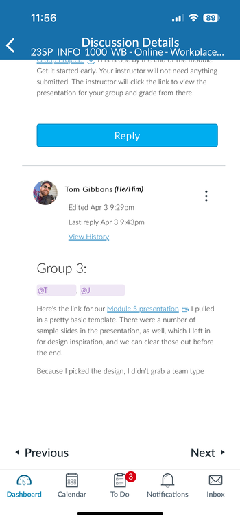
What mobile app are you using? Student or Teacher? Maybe there is some idiosyncrasy with the iOS mobile app, but for me using Android Student mobile app, I do not have the same issues as you. But I've also added some custom CSS for the Discussions Redesign as well.
IMPORTANT NOTE: Discussions Redesign for mobile uses the regular desktop CSS. You CANNOT make changes to the mobile css and get results in the mobile discussions.
All this is to say that you have to add CSS for desktop, tablet (landscape), and phone sizes for the discussion redesign in your main CSS. You can test it out in your desktop browser Inspect mode changing the viewport to see the results.
First, I'll share screenshots and then I'll share the code. I am still waiting for things to improve with the Discussions Redesigned because July 20 is getting closer and closer. But I switched the Discussions Redesigned early with a pilot course so that I could start working things out.
 Classic Discussions - Android Student App
 Discussions Redesigned - Android Student App
It takes more space to view Discussions Redesigned because of the menu area top of page and more information in the reply block about the reply/replies.
 Discussions Redesigned - Fire Tablet Student App
I added customized our Discussions Redesign to put borders around the text in tablet landscape and desktop mode (borders show in split-screen too) and borders around the enter reply with name, date, text in mobile and tablet portrait mode (borders do not show in split-screen).
I know that @cesbrandt also shared some CSS with border and padding, but I haven't tried it yet. So I'll just share what I have and remember it all goes in the main CSS file and you can change colors as needed.
For regular desktop browser:
/* border on first reply text in thread */
.css-8rac1c-view-flexItem {
	border-width: 0.0625rem;
	border-radius: 0.25rem;
	border-style: solid;
	border-color: var(--ic-brand-primary);
}

/* border on thread reply text */
.css-1hatz2-view-flexItem	{
	border-width: 0.0625rem;
	border-radius: 0.25rem;
	border-style: solid;
	border-color: darkorchid;
}

/* font size on thread reply text */
.css-138gh4t-view .user_content {
	font-size: 1rem;
}
For Tablet:
/** Tablet Discussions Redesigned **/
/* border on reply text only */
.css-1hcnpfq-view-flexItem {
	border: medium solid darkgoldenrod;
}
I admit that when I realized that tablet had different CSS selector, I was frustrated and just put in the darkgoldenrod color too check it and then decided to leave that color. 😅
For Mobile:
/*** For Mobile Discussions Redesigned ***/
/* discussion header and prompt space */
.css-16umzoa-view--block {
	padding: 0.5rem !important;
}

/* remove left and bottom padding around header, prompt, and all replies */
.css-3qn3vl-view--flex-flex {
	padding: 0 !important;
}

/* border on thread reply block */
.css-1wzf0w1-view--flex-flex {
	border-width: 0.15rem;
	border-style: solid;
	padding-left: 0.75rem;
	border-radius: 4px;
	margin-bottom: 0.25rem;
	margin-left: 15px;
	border-color: var(--ic-brand-primary-lightened-15);
	position: relative;
}

/* remove mobile border around reply text for phone screens */
.css-1wzf0w1-view--flex-flex .css-1hcnpfq-view-flexItem {
	border: none;
}
/**** end Mobile Discussions ****/
And yes it's a lot to customize, but maybe it'll be not needed for full launch. I'm still hopeful. 🤞
Cheers - Shar ⭐


