Discussion Redesign Updates

The content in this blog is over six months old, and the comments are closed. For the most recent product updates and discussions, you're encouraged to explore newer posts from Instructure's Product Managers.

SamGarza1
Instructure
Instructure
52
7904

Canvas.png

For the past many weeks and months, my team and I have been seeking customer feedback for our ongoing redesign work for Discussion and Announcements. We have been on numerous calls with customers, engaged with users in the Canvas Community, had a usability study shared with us from the University of Minnesota (more on that at InstructureCon), and had ongoing conversations with early adopters. We have listened to that extensive feedback, and I am pleased to present the result of that exercise:

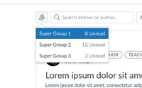
The first item we tackled and have delivered is the ability to see the unread counts to groups. We deployed this item on April 10th, and we have had positive feedback on that addition. If you have had any experience with this feature you feel is worth sharing, please add comments below. 

Group drop down showing three group discussions each with their own unread count.Group drop down showing three group discussions each with their own unread count.

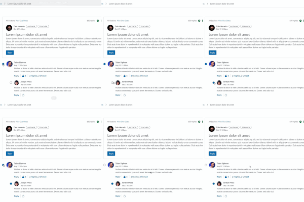
The next round of features that we’re working on is the ability to mark Discussions as read with One Click, and also to add a setting that disallows threaded replies.

GIF showing the read/unread indicator being marked and unmarked.GIF showing the read/unread indicator being marked and unmarked.

We're considering changing which date we sort on and want to get user input on this. Currently, it's the last date in the thread. Would users prefer the original behavior date of the original post? Let us know your preference and feedback on this idea. 

Any and all comments below are welcome!

The content in this blog is over six months old, and the comments are closed. For the most recent product updates and discussions, you're encouraged to explore newer posts from Instructure's Product Managers.

52 Comments
chriscas
Community Coach
Community Coach

Hi @SamGarza1,

Thank you for keeping the community updated on the changed with the redesign.  I can definitely say the one click mark as read will be a huge win to have back (in an accessible way).  I have a couple thoughts to share as well.

Regarding the sorting, since we turned on the redesign a few weeks ago, I know we have faculty who really want the old sort behavior (date of original post) back.  What I don't know is if there are any people who actually like the new last date of thread sort.  Would it be possible to have both somehow?  If only one is possible, I think a majority of our faculty would want it back to the old method.

About the "setting that disallows threaded replies."  I know the original discussions had "allow threaded replies" which is the opposite of this new setting (but serving the same purpose with a different default).  From a user experience perspective, I wonder if having a dropdown in the UI instead of a checkbox would be more clear.  "Discussion behavior" or something where the options would be "threaded discussion" and "unthreaded discussion" as it's really one or the other, right?  On the back end, it could still just be a flag that's getting set like the checkbox does, just visually for teachers this might be more clear.

Finally, is the fix to disable the "graded" option when "full anonymous" is selected coming out soon?  I just checked again in our environment, and I can select Full anonymous and still choose to select graded and all I get is an info message saying, "Grading and Groups are not supported in Anonymous Discussions," which I don't think is the intended behavior based on past conversations.  Just a little reminder in case the fix slipped off the radar.

Thanks again for all you're doing with the discussion redesign!

-Chris

canvas_admin
Community Champion

Hi @SamGarza1 

While overall our institution would prefer the thread to sort based on the date of initial post rather than replies, I can imagine other institutions or use cases even within our own institution where based on most recent reply would be beneficial or preferred.  Therefore, I would ask that this be an option (checkbox, button, etc.) where one setting is default but can be changed to the other if so desired. If that's possible, I think that would be great.  If not possible, then our vote would be for date of initial post sorting.

govreacl
Community Contributor

Faculty want the old way of sorting.

leward
Community Contributor

Hi @SamGarza1 ,

For the group discussion functionality, would it be possible to add back the count for total replies as well as the unread count.  A number of users commented that both statistics were important for instructors to gauge the level of activity in each group without having to dive in to each group.

Also, I think you mentioned that the use of a smaller font for replies to the initial post was to help show thread hierarchy, but some users think its a bug.  Regardless, the smaller font size is harder to read for older users like myself.  Would you consider increasing the indent or some other visual indicator to show hierarchy instead of reducing font size.  The current design does seem to use indents, but for some reason, a reply to the initial post is left aligned with the initial post instead of being shifted to the right.

mwolfenstein
Community Participant

Hi @SamGarza1. Thanks for the awesome update! If we could also get a date on checkpoints that would be excellent so that those of us in facilitative roles can communicate it to our campus communities.

Regarding sorting, I've posted about this in a few different places on the community site (e.g Initial post sorting date, discussion revision: major issue). Rather than get into the details again, I'll just say:

As I've mentioned previously, Reddit gives users sort by new and sort by hot, and they each serve different functions. If both isn't an option in the near term, I strongly encourage going with post date rather than activity date.

dbrace
Community Coach
Community Coach

Thank you @SamGarza1! We enabled it (still providing the ability to disable it on a course-by-course basis because it is not locked) for the beginning of our Summer semester (which started yesterday).

  1. Sorting
    1. please provide an option so that each person can decide on a discussion-to-discussion basis
    2. I believe that the default should be the style from the old sort behavior
  2. When should we expect checkmarks to be available?
    1. I believe we were told the end of Q2 in 2024, which is the end of June.
    2. Will that goal be met?
  3. The wording is not as important to me because (in theory) it could be changed if there is confusion but allowing or not allowing threaded replies should be an option.
  4. I have lost track of this but is an edited reply considered to be unread or read if someone already viewed the original reply before it was edited?
Mike_S
Community Member

Hi @SamGarza1,

Thank you for the update.

Our Faculty would like to have the old sorting back. Another item that our Faculty has brought to us is that they would like to be able to collapse the student's original post on the Discussions. In the redesign, you can only collapse the student's replies to a post, not the original post. In the old Discussions, you could collapse the original post by clicking on the up-side triangle in the center of their post.

Jeff_F
Community Coach
Community Coach

Hello - here is recent feedback from our initial set of 22 faculty early adopters:

-------- 

I can no longer tell if I responded to a student. They posts get all scrambled due to new posts on top. This wouldn't be a problem if it was just initial posts, but the replies are also put in this sort as new posts and so the order every time I go in is different. I have to review every post to see if I responded. I used to be able to just scroll to the bottom and see if I had new posts. Can't do that anymore.

The new design looks good and new features easily accessible. However, it seems the "Sort" button does not arrange the posts in an orderly manner whether in the mode of "Oldest First" or "Newest First".
"Due to the updated layout of the discussions, I am having to spend more time navigating the discussions than before. Here is why:

- Some of the features become refreshed when toggling through them. For example, clicking ""Expand Threads"" followed by sorting by ""Oldest First"" re-collapses the threads. I wish they stayed consistent amongst each other.

- Despite sorting posts by date, some are also sorted based on their number of replies and/or number of likes. This is a problem for the Study Hall discussions where students are required to both answer problems others have not answered yet and submit new problems to the discussion. If these posts end up sorted based on their number of replies and/or number of likes in addition to their date, then they may end up scattered across the discussion rather than concentrated on the top or bottom, as it was before. I wish sorting by date only depended on the date rather than the number of replies and the number of likes.

- When using ""Go To Reply"" when viewing unread posts, the side pane does not always show the thread leading up to the initial post. It sometimes stops at a reply to an initial post, confusing me at first, and requiring me to use ""Back"" to see all the posts rather than simply showing all of them as soon as it opens.

- The previous format allowed me to mark posts as read by clicking on the blue dot to the left of the student's name. Now, clicking on the blue dot does nothing, and I have to use the vertical ellipsis followed by ""Mark Post as Read."" This is now an extra step I have to perform, and I have to worry about misclicking unintended options in the dropdown list. This was not a problem before, so I wish clicking on the blue dots to mark posts as read was restored (in addition to clicking on empty dots to mark posts as unread).

- The group discussions' number of unread posts are see-through, blending into the background and very hard to read. Also, I initially had to search for my groups by finding the ""Groups"" icon on the top-left corner. To prevent my students from getting confused, I had to point them towards the icon. This differs from the previous format where the group that each had access to was openly visible rather than tucked away in a corner, in addition to having the number of unread posts be clearly visible. I wish these were restored.


All in all, the new format favors condensing things away from me and my students, making things harder to find and taking discussions longer to grade than they should. I find myself spending more time clicking through replies to find them, as well as repeatedly sorting the posts. This was not a problem with the previous format, but now it is to me. I really, really wish Canvas goes back to the previous format, or at least restores the majority of it into this new format. It was much more intuitive and fast for me to use, but now I have to spend time navigating the new condensed format."

The new design is helpful in tracking student responses to one another.

I have found this new design incredibly frustrating as the posts that have a new reply get moved up rather than new initial posts. This makes it very difficult in finding posts that I have read (or not read) and replied to because posts are constantly in a state of flux depending on when someone has replied to that post.

The design gives students many more options to deliver creative work and, on the instructor's side, features that reveal more information about the intensity of students' interactions. The question remains whether students like it or not. I did not ask them, nor did they complain or praise the new system features. My efforts to keep the interaction vivid have increased. That's okay with me. Ultimately, whether or not it pays off concerning the learning outcome must be surveyed critically.

It is hard for participants to see the replies to discussions' posts.

Harder to follow discussion threads.

The redesign makes it more difficult to see the discussions as a whole

The layout is a bit confusing, not as easy to track/follow replies. And seems a little buggy; if you sort to say oldest to newest and have everything expanded, it collapses.

It allows me a new ease of operations, especially in grading, to conveniently look back at all of the student's posts in an assignment over the term. However, I dislike that in my comments and replies to students I can use only color and no highlighting of bold face to draw students' attention.

Replies are buried and must be clicked to view. Order changes in a way that is too hard to review every day. The old way was much more efficient for instructors.

This is far inferior to the old format in clarity and ease of use.

It too time consuming to operate

I'm just used to the older design. To me, it seemed basically easy to navigate, especially with the ability to collapse all the threads and then examine/open each one individually.
But, I'm getting used to the newer design.

Seeing which discussion questions I have responded to is difficult. I don't like not seeing all of the responses automatically.

I like that it compacts the discussions to contain all replies within one original discussion response.

Discussion boards default to collapsed form. This means that students will tend to skip instructor replies or have a more difficult time finding instructor additions.

It is confusing to me as instructor and to students as well. It is not clear to students where to respond. Some responded to "Comments" under the video which does not appear in the grading page as having replied to other students which is required. Other students find the "Reply" button but there are too many buttons on each page.


Sylvia_Ami
Community Contributor

Thank you  @SamGarza1 for the opportunity to provide feedback. Our faculty's most common sort request is to sort by the date the last post was made (newest to oldest). One use case is:

  • I know I last looked at the discussions on May 18. I want to see the posts that have been made since that time. 
ChantelSolomon
Community Novice

Bring back the sort by date posted!  ◡̈ 

nogueim
Community Explorer

Thank you @SamGarza1 for allowing feedback on this issue.

Our faculty would like to have the redesign to offer sorting by both, initial post date and activity since each serves a different function for our users.

ProfessorBeyrer
Community Coach
Community Coach

Thank you, @SamGarza1 for this post. I use group discussions and appreciate the message counts that appear when I select the group icon. Like @leward, I would love to see the count of total messages in addition to the count of unread messages. It's a quick check to tell how active each of my groups are.

I noticed something that could be improved in the current appearance, and that is the box around the counts does not appear to be responsive to the length of the group name. The embedded screenshot shows how the message count bleeds over the border of the box: 

Discussion message count for groupsDiscussion message count for groups

hfchen
Community Participant

Please give us the option to sort by both newest thread and newest post date. But gun to head and I have to pick one I prefer the original post date which I think is the behavior prior to the new redesign.

mskoch
Community Participant

Regarding sort by newest option, my preference would be by original post (edit: since that part is usually more significant than replies posts). But why not make both options available and let instructors choose the one that suits the use case best? That would be a true enhancement. 

mwolfenstein
Community Participant

Just an aside here, but I've noticed that a lot of the replies about sorting method are framed in terms of faculty control. This made me think about two things:

  1. We're talking about a tool that is for user control in general. Even though the use cases being discussed are faculty-centric, having both sorting options would be advantageous for student users as well.
  2. What could we (Instructure plus existing users) do to get more student voices involved in this space? When faculty and faculty support voices (and sys admin voices) determine a discussion, we have the potential to miss the most important end users of all.

Just a moment for reflection. Additionally, thank you to everyone providing examples, but thank you to @Jeff_F in particular for the wealth of qualitative data supporting what seems to be the common perspective here.

Nancy_Webb_CCSF
Community Champion

Sorting! In order to sort the most recent post (unread) to the top, it seems like you would need an "unthreaded" view.  Perhaps next to the sort button, a threaded/unthreaded button? or threaded/flat?

Sometimes seeing a reply all by itself doesn't make sense, you have to see it in context.  But sometimes you may just want to see new posts without having to search deep in threads.  Like in the classic discussions, a button on out-of-thread posts to "View in discussion" would be helpful.

I also like the suggestion to collapse threads displaying the first one or two lines per post rather than entire posts, some posts can be quite long, have images etc.

NathanHolic
Community Member

I'm trying to keep my reply polite...

But I am incredibly frustrated by this update. It completely alters the look/ feel of my discussions, and now changes nearly everything that I do with my low-stakes assignments. I honestly don't know if I can still use the discussions in the way that I've been using them for ten years.

I echo other faculty above who would like the old version back, and/or who would like the option to use the old version.

I want to be able to see the discussion board in its entirety, to see all of the collapsed postings. I would like for students to have the same ability, to not have to always use the "search" feature. I would like to read through a few postings, then collapse those that I've read. I have so many tasks that rely upon this ability, and I find it callous for the design team to suddenly make changes that force faculty to change the nature of their courses. 

I'm frustrated, as I've said, but I'm now also anxious and lost about what I'm going to do moving forward. I have students CURRENTLY POSTING in a discussion forum that was suddenly redesigned overnight, and it's chaos.

-NH

Nancy_Webb_CCSF
Community Champion

Hi @NathanHolic , that's hard to have a change thrust upon you while a course is active.

At our school, it is a choice right now as to which to use.  Did your school force it on you?  Look in your Settings/Feature Options tab and see if there's a choice to turn off Discussions/Announcements Redesign.

There are some really great features to this redesign, which is still being tweaked.  Updates will hopefully address your concerns.  

NathanHolic
Community Member

Appreciate the response.

I contacted our help team, and was told that the update is permanent, and that my only recourse was to post a review here. Not sure that was a helpful response from our team, but it is what it is. We're a school of 70,000 (UCF in Orlando), so I've got to imagine that others will be dismayed when we return in the Fall.

-NH

Nancy_Webb_CCSF
Community Champion

I'm sorry to hear it, @NathanHolic.  You might want to "like" some of the suggestions above, it adds your vote to proposed changes.  There are many discussions here in the Community about things that are/aren't working with this redesign.  They are asking for us to speak up about sorting and other changes that will make it work better for teachers and students.

eric_orton
Community Contributor

I agree with those who have said that they want to be able to choose to sort by date of original post in the thread or date of the most recent reply. I also think that it should be possible to choose, for either of these, whether to sort newest first or oldest first.

SamGarza1
Instructure
Instructure
Author

Thank you all for the feedback on sorting discussion threads! Our team is looking at the different options that would be possible to implement before the redesign is enforced and what work we'd like to prioritize once it's enforced. At a minimum, it looks like we'll be going back to sorting on the initial post date since it has the largest impact on instructors when they're going through and reviewing posts. I'll post an update to the blog above once we've confirmed the work. 

 @chriscas @canvas_admin @govreacl @mwolfenstein @dbrace @Mike_S @Jeff_F @Sylvia_Ami @ChantelSolomon @nogueim @hfchen @mskoch @Nancy_Webb_CCSF 

SamGarza1
Instructure
Instructure
Author

@chriscas Thank you for mentioning that the "graded" is still available when selecting an anonymous discussion. It looks like something might have regressed which caused this to come back. I'll work with the team to ensure it gets disabled again. 

NathanHolic
Community Member

@SamGarza1 

Respectfully....the "sorting" seems to be the main concern you're identifying...But for me (and for many of my colleagues), it's the ability to collapse the postings in the discussion forum. This redesign only allows you to collapse the replies to the postings.

In my courses, and in the courses that many of my peers have designed, we have a full class of students post in these forums. Yes, we can sort. Yes, we can search. But it is overwhelming to see ALL of the posts loading, and it is impossible for us (and for our students) to simply scroll down the page. The ability to collapse allows us to avoid having ALL of the posts load (many of which will be very long, and will contain embedded images). Just today, I experienced a great deal of lag, and had to reload the forum, walk away, etc. I just want to collapse the initial postings. I want to look at who has posted, very quickly. I want students to be able to scroll through the forum and find group-mates from in-class. I want to be able to create five unique threads in a forum, with questions in each thread, and allow students to expand/ collapse/ respond to these threads, without the unbearable clutter of everything loading and displaying all at once.

Again, to emphasize: the sorting is...fine. I'm glad you're looking at that. But please do not discount the need that many of us have for expanding/ collapsing. I am currently teaching a course in which this new design was suddenly thrust upon us (end of week two in a six-week summer course) and suddenly the students are overwhelmed in their peer review forum and unable to find anything, or complete the assignment that they've been given. 

-NH

SamGarza1
Instructure
Instructure
Author

Hi @leward that's great information on how not only the unread count but the overall count is being used by instructors. I'll take this to the team to see where we can fit it in. 

@ProfessorBeyrer Our team is already working to address that overflow issue and should have the fix out soon. 

I appreciate the feedback on the visual accessibility of the redesign. It sounds like there are others who agree and are finding it difficult to track threaded replies or identify when threaded replies begin. This is a larger item for us to make changes to but I will start looking into it with our design and accessibility team.

I know we're working on resolving a bug currently with the indents not aligning consistently which will hopefully help in the short term.   

@Jeff_F thank you also for gathering all that feedback. 

SamGarza1
Instructure
Instructure
Author

Hi @NathanHolic

I'm sorry to hear that you've had such a negative experience with the discussion redesign so far and that it was disruptive to you and your students. Our enforcement date is July 20th in production. Until that date, you can work with your institution to temporarily disable it so it's not disrupting your course part way though. 

To your point about being unable to see all of the collapsed postings, do you mean having all of the threads expanded by default or being able to collapse the initial responses?

Just in case you may be viewing the discussion in our split view instead of the inline view. The inline view still has a button at the top of the thread to expand all of the threaded replies. It is not on by default, however we are looking into longer term solutions to give instructors and students greater control over their default discussion experience.    

I appreciate you sharing more detail about your use case as well. I know this redesign has been primarially UI/UX changes with only minior feature improvements but it allowed us to make backend improvements that will allow us to build new functionality in discussions easier. Use cases like yours for peer review is the kind of discovery we're collecting now so we can start designing new kinds of discussions. 

This blog was geared towards gathering feedback specifically on the sort order and what the preference of the community would be for it. I'm also tracking any other feedback left here or in the user group for this feature and bringing it to the team to discuss feasability and impact. 

cheryltice
Community Participant

Hello, @SamGarza1,

Thank you for your response. I will share my reply here and at the blog link.

Regarding your question about the potential need for setting discussion options at the course level for all users, I think it would be useful for instructors to be able to set discussion options at the course level to ensure a consistent experience for all students in a course. Based on the feedback we have received so far, the ability for instructors to organize initial posts in chronological order would be most useful.

At the same time, I think individual settings should be available to allow users to adjust individual settings and override any course-level settings if they differ. Flexibility for users to customize their own experience is important.

Our instructors will be relieved to hear that the one-click "mark as read" feature will be in a future release. Hopefully, it will be released soon.

Thank you for looking into the issue with links and the permissions for editing/deleting.

Regarding the email notification issue, when the instructor receives an email notification from the discussion board, if they reply to it from the email message, the reply is added to the discussion and formatted the same way as the email.

Please let me know if you have any other questions! Your attention to these issues is appreciated.

Best,

Cheryl


mwolfenstein
Community Participant

@SamGarza1 What @NathanHolic is talking about actually goes to a deeper question about the design of discussion forums. This part caught my eye when I was looking at his post here:

The ability to collapse allows us to avoid having ALL of the posts load (many of which will be very long, and will contain embedded images). Just today, I experienced a great deal of lag, and had to reload the forum, walk away, etc.

as well as this part

I want to be able to create five unique threads in a forum, with questions in each thread, and allow students to expand/ collapse/ respond to these threads, without the unbearable clutter of everything loading and displaying all at once.

There are two different user needs that Nathan has identified here which were being met in the old Canvas Discussions, albeit in ways that I would assert are limiting to the user in other ways. Let me break each one down a bit for your team to consider.

A Quick Loading Scannable Page

The first thing that I'm seeing here is the use case where you have a lot of posts on the page and you need the whole thing to:

  1. Load quickly even if you don't have a blazingly fast connections speed (and especially if they have bigger content elements like images) and
  2. Allow you can take in the status of all the posts at a glance and see just enough content so that you can determine which posts you need to do a deeper dive on.

There are a lot of potential design choices that Instructure can make to meet these needs, but it's worth recognizing that they are closely relate but very distinct needs. The first part could be handled by giving users an option to see truncated top level posts that can be expanded, but that alone doesn't actually give you the whole solution. In addition, it's related to a problem with the old UI that actually created friction for the workflow of getting into discussion posts to engage with them.

The second part adds even more complexity in terms of design choices, and some of those choices can potentially create accessibility challenges (a point your team is of course familiar with). This second part is actually bound up in the other major user need that I'm seeing here.

The Organization of Discussion Posts and Responses

What Nathan describes here is a use case where you have unique threads under a larger board. The UX language here can vary, but for my purposes I'm going to use the term forum to define the container for all discussions in a course, boards to specify containers within a forum, posts to indicate the element that is called a discussion in Canvas (e.g. +Discussion on the interface creates one), and replies to indicate every response that can sit under a post. It's essential in this context to keep a flexible view of these data elements in so far as there are many use cases and a lot of utility for many users in either having both boards and free standing posts in a course, or no boards at all which is the only use case the current implementation allows for (and the only one the prior implementation actually permitted, more on this in a second).

The ability to have boards with posts is a feature that the old Discussions allowed users to essentially fake by having the instructor pre-populate a post with a set of responses where they then want the student to reply to those existing responses. This is the case that Nathan describes when he says, "...five unique threads in a forum," Notably in this use case, students are not being asked to post top level replies which is why I say that the old UX allowed a user to fake this experience in a functional way. An extensible solution for this use case revolves around the more sophisticated type of organization for discussions I've described above. Given Nathan's use case, it's evident as you expand to possible implementations that grading might need to be done at a board level or at a post level. Equally, grading might not need to happen at all. Similarly, one might want to put either a board or a post into a module. Above all, this involves a top level UI that allows the teacher role (and equivalent) and potentially the student role (definitely for groups) to see and organize discussions in a nested manner to meet certain use cases.

The old Discussions didn't do this and the new Discussions don't either. From my perspective, the best place to focus on meeting this need more effectively is not within the UX of a single discussion topic. The topics (e.g. Discussions in current Canvas UX) work much better at meeting the needs of topics (e.g. posts) in the redesign. Instead, it's the top level UI and, unfortunately, the underlying data structure for discussions that needs additional redesign to actually meet these needs in a way that doesn't potentially mess up the significant improvements that the redesign has lent to the Discussions experience.

About Those Images

Since I'm already doing a deep dive, I can't help but also pick up on @NathanHolic's mention of embedded images as a problem. He mentions it in relation to page loading, but I've actually brought this up here in the community previously when I was accidentally referring to file attachments. We still have the issue where images added to a post through upload in the RCE count against the user's file storage limit. Every faculty I work with who teaches a course where they regularly require students to add images to posts (basically all of my faculty in the Fine Arts division and a bunch of others) want one thing more than anything else in the world out of Canvas. They want those images embedded in posts to not count towards the users storage limit, and instead to behave as expected with assignments. They inevitably get into this situation towards the end of every semester (or at the beginning for advanced students) where students are running our of storage and struggling to complete late term assignments. I provide guidance on downsizing images, and it's an important thing for all web users to learn, but it nonetheless goes against how users expect Canvas to operate based on how assignments work with file storage.

Please bring this one to the attention of the team as well. For now, I just want to know that they're aware that it's an issue.

Thank you again for all the work you're doing keeping us here in the community informed, and for engaging with us to get feedback. I appreciate you, and I know I'm not alone in that.

Edits: After defining terminology I was using forum when I meant board Forum(course discussions container)>Board(non-existent in old or new discussions)>Post(current +Discussion)>Reply(current reply) is the terminology for the hierarchy I'm using to describe the broader use cases.

ErikFritsvold
Community Explorer

Dear @SamGarza1 

I echo the appreciation for soliciting some input on this.  Like others, I have also posted on this topic elsewhere in the Canvas Community.  In short, I strongly urge Canvas to bring back the old sorting method which determines chronology and layout by original post only.  As an alternative, provide Instructors the option of configuring this setting how they prefer.  

I oversee a 100% online program that runs about 25-28 courses per semester, many of which have very active discussion boards.  it is not uncommon to get 200-350 posts per week in a class of approximately 20 students.  The University switched my program to the "new" sorting and "mark as read" system in January of 2024 and it was a disaster.  After several weeks I was able to get the program switched back to the old original sorting methods.  Here are excerpts from a memo I wrote to my institution and Canvas on this topic.  Kindly pay particular attention to the quotes from faculty and students. 


Core Problem: DB Chronology

            The core issue with the new 2024 DB functionality is how the LMS organizes the chronological order of DB posts and threads. In the previous 2023 model, chronology was solely based on the original post, resulting in a clear and orderly discussion layout that both students and faculty could easily follow as discussions progressed.

However, the new 2024 DB functionality determines chronology based on either the original post OR follow-up posts. This leads to constant rearrangement and reshuffling of the DB layout and post order. Given that LEPSL DB threads can often contain hundreds of posts, attempting to track engagement or locate where one left off becomes exceedingly difficult and frustrating for faculty and students alike.

Despite the presence of enhanced search features in the new 2024 DB functionality, they offer little assistance in navigating the chaos caused by the continuous reshuffling of conversations and posts. Upon investigation, the Learning Design Center (LDC) concluded that we do not have control over these determinants of chronology through settings or options.

If DB chronology were determined solely by the original post, this issue would be resolved.


Faculty Feedback

            In early January, faculty immediately and universally expressed discontent and concern over the new DB experience.  I received daily phone calls, texts and emails with faculty complaints, including some scathing critiques.  Here are some direct and candid quotes from LEPSL faculty,


Each time you opened up Canvas, you had to address comments that were already reviewed to get to the new material.  In other words, double work was required every time!     


Normally we can adjust, but this is unworkable


As a result of the changes, my ability to maintain my high level of interaction was greatly impacted.  I spent more time searching for new comments, fearful that I may miss a student’s newest comments.  In fact, there were some situations where I did miss new comments as a result of these changes.  Before these changes this would never have occurred.  I was thankful to say the least that the system reverted back to the “old way” to manage our classrooms! 


The best part of LEPSL now s****


Student Feedback

            Here is some additional commentary from MS LEPSL students. 


As many have stated, and I must reiterate, the discussion board posts are the backbone of this program. Having said that, it is imperative for time management, that students be able to quickly and easily identify which posts have been read and move on to read the others. The new version requires significantly more time as we would have to expand conversations frequently and reread posts repeatedly, reducing the amount of time of actual engagement with one another.


The "new" version of the discussion board functionality is confusing, difficult to track, and time-consuming. The new model detracts from the discussion boards' purpose, which is to enhance our experience and education, not create frustration and distraction. The original model, based on the chronology of the first post, was much easier to navigate and follow and facilitated learning much better than the new model.


The changes that had been made to the DB in January made the course more difficult. The amount of time I spent searching through posts to find my own input was a poor use of my time. I concur that with time management being so valuable in this program, the “old” chronological version of Canvas should be utilized. Thank you.


The change was inadequate and took away from the collaborative experience that is the core of the LEPSL graduate experience.


Overall, the Canvas update in January 2024 was fatiguing and troubling.  The chronology update replaced a once intuitive and easy-to-follow learning tool with a seemingly disorganized patchwork of posts. Whenever I reviewed the DB posts, I had to reassemble a puzzle before I could understand the discussion and respond.


I had a very difficult time navigating the DB in January. I could not understand why the comments kept reshuffling. It was extremely frustrating and time consuming. Even looking for my original posts so I could respond to those who commented was extremely difficult and made the learning experience very hard. I was so thankful when it was able to be switched back so I could finally read post chronologically and find specific post when necessary.


pray4
Community Participant

I asked last time and was ignored, so I will try it again.

You are still building a tool with a set rollout date to PROD on 7/20/24. The tool is clearly not ready for prime time and it is unfair pressure on your clients and those of us who provide support and administer these systems at our institutions. Will you please confirm the launch date for this tool and if it is still July so I know how to address with our success rep and escalate?


kailey
Community Participant

@SamGarza1 I'm glad you'll be bringing back the original behavior of sorting only on the initial post date. That is definitely the preference for us. Do you anticipate the work being complete prior to the July enforcement date? 

My institution is enabling Discussions Redesign between our Spring and Summer quarters (mid-June) and it would be a horrible experience to our users to have the ordering of posts behave one way when starting off a new quarter (not to mention - a new way from what they're used to) and suddenly have the behavior change in the middle of the summer quarter. The best option is to allow for both options so users can choose their preferred sort method. Ideally, the default would be based on the initial post date. 

jschofield
Community Participant

When will all the new discussion and announcement features be available on the beta canvas shell to test and play with? We are fastly approaching the July release and not all features are avalible.

ali_lee
Community Explorer

I'm glad to see that the sort function is something you're looking into . This was one of the biggest problem our Faculty identified. They definitely prefer the old method of sorting the threads i.e., the original post first. Any idea when this will be implemented would be appreciated.

Also, many of our faculty have reported a duplication of their replies to student posts. The replies disappear when the page is refreshed. So I suspect that it seems to be ore of a problem with Chrome. My faculty say it does happen with frequency. While this has problem been duplicated it is extremely difficult to do so, and it I have heard a number of people have this problem. Have there been any reports of this from other institutions?

Nancy_Webb_CCSF
Community Champion

@ali_lee some faculty are also reporting duplication of replies that disappear with refresh. There seems to be a caching problem.  On both Chrome and Firefox....both teachers are using Macs, do yours also use PCs?

ali_lee
Community Explorer

@Nanan Yes, our faculty use both PCs and Mac's and have reported this on both. They usually use Chrome and I'm not sure if they also have this problem with Firefox. They have ensured their OS and browsers are up to date and cleared the cache. But it hasn't helped.

Nancy_Webb_CCSF
Community Champion

One teacher said that editing a post didn't indicate it had been edited until he refreshed the page. But for me, it appeared without refreshing.  I think I will call support to get my name added to a help ticket if one exists.

Nancy_Webb_CCSF
Community Champion

@ali_lee , I just called Canvas support to report this discussion redesign duplication problem.  After reassuring that teachers tried clearing the browser cache and are not clicking submit twice, or having Internet connection errors, they sent this problem up to the engineers.  Maybe you could also report this problem, the more who do so the higher it will go on their list.

ali_lee
Community Explorer

@Nancy_Webb_CCSF  - Thanks. Great idea. I will call them to discuss this as well.

fcurry1
Community Contributor

I HATE having hidden threads/replies.

Why is there no way to expand all the discussions by default?

Why on earth would I ever want to hide comments that are being made from myself?   If some people like that feature, fine, but why not allow the end-user to pick?

This one small change has made it so much more difficult to do my job.

Please, give us the option to roll back to the previous way discussion forums were handled.

This is truly awful.


embleton
Community Participant

It would greatly improve readability if the split screen panel could be manually adjusted in width (e.g.,  drag to the desired width)!


embleton
Community Participant

replies are not being marked as "read" when displayed ... this creates extra work for instructor and students and creates confusion.


embleton
Community Participant

Group discussion posts and replies are not reported in the main Discussions index page. Makes it seem that there are no posts!

Instructor must enter the discussion > click the Groups icon. Then it only indicates # unread posts, not total posts. So that's inconsistent and incomplete info.

Must then click group name to see that group's discussion. - to move to a different group's discussion DO NOT click the big "Select group" label. Need to go back and click the Groups icon. ... This is a non-obvious navigation path .. instructors will end up on the discussion index page of the next group rather than in the same discussion activity in the next group.


dhenry8
Community Member

Please go back to the old Discussion Board format. I had a student just drop the course because the new format confused her so much.

When I reply to a student's post, they no longer can see it unless they know to click on the reply button. In our increasing large class size, this is a huge waste of time for a student to click on endless reply buttons trying to find what an instructor might have to say (as well as other students).

So, I have taken to duplicity-I post as a reply to the student and I post the same post so that everyone can see it.

But Canvas could solve this problem by returning to the old model.

Thank you for reading.

cmuir
Community Participant

@SamGarza1 I saw that you said in a post on 23 May, "...it looks like we'll be going back to sorting on the initial post date..."  I really, really hope this is going to be implemented, and will be rolled out very soon.  Not being able to have threads in a fixed chronological order is not only destroying the way I use the discussions for my classes, it's creating a major accessibility barrier to doing my work. 

cheryltice
Community Participant

Given the number of significant concerns raised by many users regarding the mandatory enforcement of the updated discussion interface, it seems wise to consider the following approach:

  1. Suspend the current enforcement deadline
  2. Provide institutions with the option to revert to the previous version
  3. Invite experienced educators who teach various class sizes to participate in beta testing of future updates, incorporating requested improvements.
  4. Once the redesign effectively promotes open dialogue and addresses accessibility concerns, allow institutions a full academic year to transition before mandating its use.

Has this type of phased, user-centered approach been considered as a potential solution?

ErikFritsvold
Community Explorer

Dear  @SamGarza1 


Greetings.  Any updates from your 5/23/2004 post below?  This morning I had a chance to work with our University's Canvas "test" environment and the problematic sorting process for discussion boards remains the same.  With 11 days until the mandatory "upgrade" I am concerned and holding out hope Canvas might make a last minute change to respond to the many concerns raised in this discussion.  Any info would be appreciated. 


v/r

Erik


Screenshot 2024-07-09 at 12.55.12 PM.png 


@SamGarza1

jschofield
Community Participant

I've checked the beta version we have, and the Checkpoints feature that was expected to be added in the June/July update is still not visible. Do we have any updates on when all the features will be available to test before New Discussion goes Live?

stimme
Community Coach
Community Coach
ekeddy341
Community Member

The way Discussions are now being sorted is very problematic for the way I use one of my Discussion assignments. Students post answers in the Discussion and then can look to my post to compare their answers (they can't see posts until they post). Now, because I post the answers as soon as I make the Discussion assignment, my answers are stuck way at the bottom or, now with the Discussions being on multiple pages, on the last page. Students aren't even seeing it and can't check their answers. Please bring back the chronological view (based on first post, not replies) with oldest post on top. Also, please get rid of the multiple pages view and bring back everything being on one page. Finally, why do we now have a separate box pop up to put in the due dates? It just takes us extra time to make these Discussion assignments now. I can't see any benefit to it.

pray4
Community Participant

@ekeddy341 there are now two different paths to the Assign To settings. You can either select the Assign To button in the upper right on the discussion thread, or you can select Edit from the dropdown on the kabob and it appears on the same page along with the other options much like it used to.

As for your other comments, they won't get any traction here so you may wish to submit those as an idea/feature request in the community if something similar has not already been submitted. Personally, I feel your pain and wish they'd retained a Classic Discussions option much as they did with Quizzes while they sorted out all of the kinks.