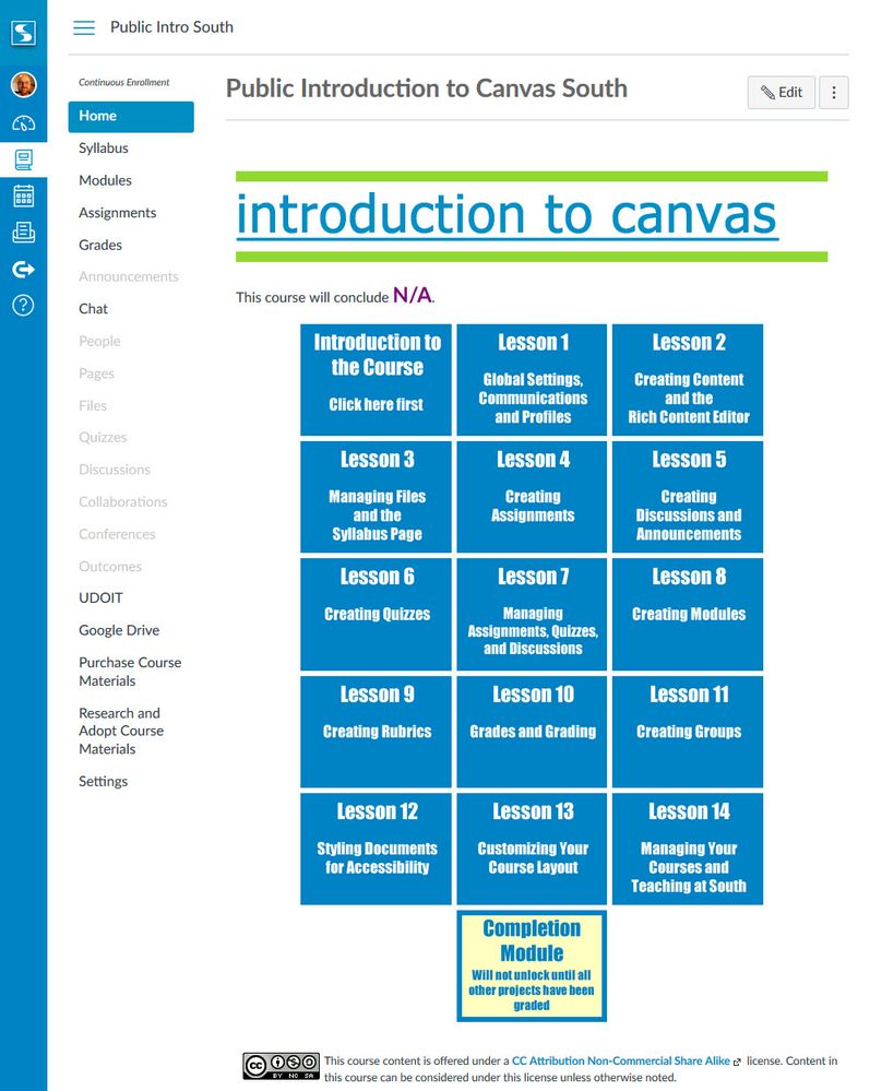
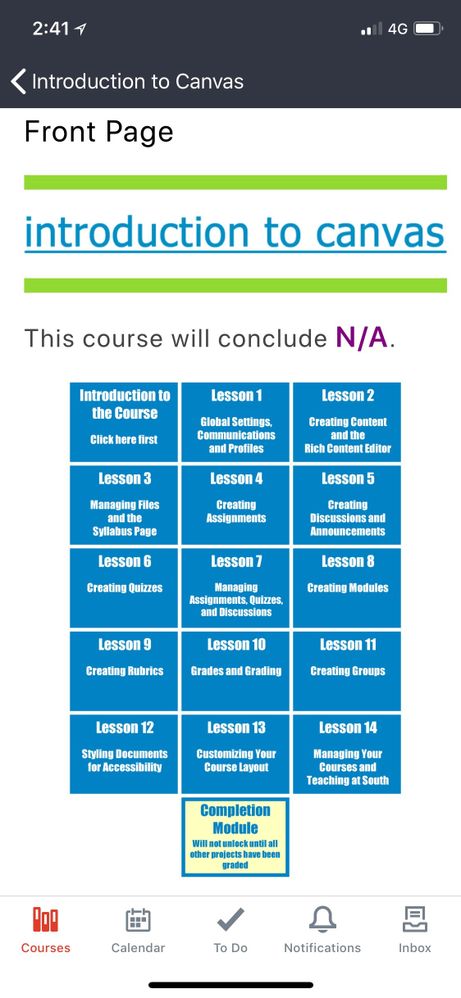
Hi @rseilham ,
I will have one of my colleagues test the app on iOS to see how it fares. I believe it should fare well as the gal that created the templates and the code is an iOS user.
As far as the CSS and JS, we are sticking to pretty simple stuff and after looking at things, we aren't actually using any extra JS code other than the built in code triggered by the "enhanceable_content" class we use to create the tabs in our most complex template. We know at some point this will be going away and hope to have a different solution in the future.
To get our two column layouts to work and respond to the mobile devices we use the Bootstrap Grid classes. To accomplish what you see in the video, we use the following code to split the screen into center based content and the right side menu:
<div class="col-xs-12 col-md-9 ischool-content"></div>
<div class="col-xs-12 col-md-3 ischool-sidebar"></div>
This Bootstrap code is what makes the menu collapse to below the content on both the app and the mobile browser. We use a variation of this same Bootstrap code to get our 3 column course schedule page to collapse to a single column on both the app and the mobile browser.
You can see all of the underlying html and css code at: https://docs.google.com/document/d/1Ig4lZovLpi-QW8L68mXshri4Se3rA4a_pwVfc-eLSV4/edit?usp=sharing
Hope this helps. I should mention that my colleague, putrih is the person that did all the heavy lifting to figure out how to make this work.


This discussion post is outdated and has been archived. Please use the Community question forums and official documentation for the most current and accurate information.