- Mark as New
- Bookmark
- Subscribe
- Mute
- Subscribe to RSS Feed
- Permalink
- Report Inappropriate Content
How can I make a table responsive without CSS?
I have seen so many great tutorials about how to create a responsive table using CSS. However, our institution has CSS disabled. So, I am left with HTML and creativity. I have tried everything that I know. Does anyone know of a way to make a table responsive with just HTML or any other method other than CSS?
I simply want to be able to have 5 buttons, evenly spaced, horizontally across the screen.
Solved! Go to Solution.
- Mark as New
- Bookmark
- Subscribe
- Mute
- Subscribe to RSS Feed
- Permalink
- Report Inappropriate Content
So if your global CSS override is only available to your admin to change you can still do some work in the Canvas RCE with inline CSS styles. If you need some examples of this let me know and I'll see about getting one put together for you.
- Mark as New
- Bookmark
- Subscribe
- Mute
- Subscribe to RSS Feed
- Permalink
- Report Inappropriate Content
This works beautifully (after I changed the text color lol)! Thank you!!!
- Mark as New
- Bookmark
- Subscribe
- Mute
- Subscribe to RSS Feed
- Permalink
- Report Inappropriate Content
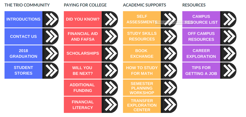
Here is what I am attempting to do. Right now I have image buttons in a standard table, which look cool but are not responsive at all. I would like to keep the same structure (evenly spaced, 4 columns and then the buttons in rows) but have it be responsive. I am willing to let go of the image buttons and use standard buttons.
- Mark as New
- Bookmark
- Subscribe
- Mute
- Subscribe to RSS Feed
- Permalink
- Report Inappropriate Content
I'm not sure what you mean by having 'CSS disabled', but it's a fundamental feature of the browser to interpret CSS so if you can still use inline CSS, you might look into flexbox: CSS Flexbox (Flexible Box) . Put each button in a box and then style the outer container to occupy the entire width of the view.
- Mark as New
- Bookmark
- Subscribe
- Mute
- Subscribe to RSS Feed
- Permalink
- Report Inappropriate Content
We have CSS in Canvas set to Admin only. So, only admin have access to the code and can change it.
- Mark as New
- Bookmark
- Subscribe
- Mute
- Subscribe to RSS Feed
- Permalink
- Report Inappropriate Content
So if your global CSS override is only available to your admin to change you can still do some work in the Canvas RCE with inline CSS styles. If you need some examples of this let me know and I'll see about getting one put together for you.
- Mark as New
- Bookmark
- Subscribe
- Mute
- Subscribe to RSS Feed
- Permalink
- Report Inappropriate Content
Yes please! If you want you can use my work email instead of on here. hlbrown@nic.edu
- Mark as New
- Bookmark
- Subscribe
- Mute
- Subscribe to RSS Feed
- Permalink
- Report Inappropriate Content
For the good of the community I wanted to point out that there is at least one other discussion about this here: Anchor a div?
I worked out this example based on some of the things that I found there:
<div class="content-box">
<div class="grid-row">
<div class="col-md-2 col-md-offset-1"><a class="Button Button--primary" role="button" href="#" style="text-decoration: none; display: block; text-align: center;
color: #ffffff; font-weight: bold;margin: 10px auto">
Button 1</a>
</div>
<div class="col-md-2"><a class="Button Button--primary" role="button" href="#" style="text-decoration: none; display: block; text-align: center;
color: #ffffff; font-weight: bold;margin: 10px auto">
Button 2</a>
</div>
<div class="col-md-2"><a class="Button Button--primary" role="button" href="#" style="text-decoration: none; display: block; text-align: center;
color: #ffffff; font-weight: bold;margin: 10px auto">
Button 3</a>
</div>
<div class="col-md-2"><a class="Button Button--primary" role="button" href="#" style="text-decoration: none; display: block; text-align: center;
color: #ffffff; font-weight: bold;margin: 10px auto">
Button 4</a>
</div>
<div class="col-md-2"><a class="Button Button--primary" role="button" href="#" style="text-decoration: none; display: block; text-align: center;
color: #ffffff; font-weight: bold;margin: 10px auto">
Button 5</a>
</div>
</div>
</div>
I hope that helps.
- Mark as New
- Bookmark
- Subscribe
- Mute
- Subscribe to RSS Feed
- Permalink
- Report Inappropriate Content
This is pretty cool. I assume you can do it with images just as easily. The weird thing is it doesn't show as anything in the RTE. It is just blank. Are you experiencing that??
Mark
- Mark as New
- Bookmark
- Subscribe
- Mute
- Subscribe to RSS Feed
- Permalink
- Report Inappropriate Content
That's because only the button text will render in the RCE and in this example, the text is white so it disappears into the background. If you change the color attribute value to something else (e.g. ffffff --> ffe180), you'll see the the five buttons in a vertical stack in the RCE. Once you click Save, it will render them in the five columns.
Here's another example that sets the background color of four flexbox columns that will render in the RCE. (Again, note that they'll show up in a vertical stack until you save the page.)
<div class="grid-row">
<div class="col-xs-12 col-sm-3" style="background-color: #0058a0; ">
<p> </p>
</div>
<div class="col-xs-12 col-sm-3" style="background-color: #fdb913; ">
<p> </p>
</div>
<div class="col-xs-12 col-sm-3" style="background-color: #66addc; ">
<p> </p>
</div>
<div class="col-xs-12 col-sm-3" style="background-color: #ffe180; ">
<p> </p>
</div>
</div>
- Mark as New
- Bookmark
- Subscribe
- Mute
- Subscribe to RSS Feed
- Permalink
- Report Inappropriate Content
Yes, sorry the text was intended to be white against a colored background button. I removed the background color and forgot that the text was still white.
Thanks for pointing this out and offering a solution.
- Mark as New
- Bookmark
- Subscribe
- Mute
- Subscribe to RSS Feed
- Permalink
- Report Inappropriate Content
Is there a way to put a space or border between these?
- Mark as New
- Bookmark
- Subscribe
- Mute
- Subscribe to RSS Feed
- Permalink
- Report Inappropriate Content
Yes, by using the margin CSS property:
<div class="grid-row">
<div class="col-xs-12 col-sm-3" style="background-color: #0058a0; margin: 0 5px;">
<p> </p>
</div>
<div class="col-xs-12 col-sm-3" style="background-color: #fdb913; margin: 0 5px;">
<p> </p>
</div>
<div class="col-xs-12 col-sm-3" style="background-color: #66addc; margin: 0 5px;">
<p> </p>
</div>
<div class="col-xs-12 col-sm-3" style="background-color: #ffe180; margin: 0 5px;">
<p> </p>
</div>
</div>
Notice the first value of 0 is for the top and bottom margins of zero pixels and the 5px is for 5 pixels of spacing on the right and left sides of each column. You can play with these numbers as you like. If you wanted just a right hand space on each side the rule would be:
margin: 0 5px 0 0;
/* Order of these values is top, right, bottom, left */
- Mark as New
- Bookmark
- Subscribe
- Mute
- Subscribe to RSS Feed
- Permalink
- Report Inappropriate Content
Have you been able to get margins to work in responsive columns? They always seem to shunt the final column under the first in my experience in Canvas like so:
My workaround has been to add a border to the div or image in the same color as the page background, but I'd love to know if there's a way to get the margin property to play nicely in Canvas when using flex columns.
- Mark as New
- Bookmark
- Subscribe
- Mute
- Subscribe to RSS Feed
- Permalink
- Report Inappropriate Content
It's getting sent to the second row because the added margins push the width of the content beyond the width of the row. Flexbox isn't taking your added margins into account when it originally sizes and divvies up its columns. So, if you want to increase the space between the items without pushing them to a new row, you'd have to decrease the width of the items themselves. Or as you said, simulate the effect using a white border to create fake gutters (this would have the effect of also reducing the amount of content space available inside the box).
- Mark as New
- Bookmark
- Subscribe
- Mute
- Subscribe to RSS Feed
- Permalink
- Report Inappropriate Content
This works beautifully (after I changed the text color lol)! Thank you!!!
- Mark as New
- Bookmark
- Subscribe
- Mute
- Subscribe to RSS Feed
- Permalink
- Report Inappropriate Content
Would definitely second Jeff's comment about the Anchor a div? post. Some excellent suggestions and actual examples all inspired by @debra_mansperge initial question
- Mark as New
- Bookmark
- Subscribe
- Mute
- Subscribe to RSS Feed
- Permalink
- Report Inappropriate Content
Use percentage in table. Code as below; edit in the HTML view of the WYSIWYG editor.
<table class="ic-Table ic-Table--hover-row ic-Table--striped" style="width: 80%;">
<tbody>
table with 80% will look like this:
Header 1 | Header 2 |
---|---|
this is something | this is something else |
another thing | and some more things |
Having said that - you want to use tables for layout, which is a bit of an accessibility no-no. I'm going with the flexbox solution. That will work fine, and you just add the code into your editor (you don't need css for it). In-line styles work fine.
- Mark as New
- Bookmark
- Subscribe
- Mute
- Subscribe to RSS Feed
- Permalink
- Report Inappropriate Content
A simple method is to add a container element with overflow-x:auto
around the <table>:
<div style="overflow-x:auto;">
<table>
...
</table>
</div>
- Mark as New
- Bookmark
- Subscribe
- Mute
- Subscribe to RSS Feed
- Permalink
- Report Inappropriate Content
Hi heather brown,
Hopefully you've come back and to see all the fine examples left here. I'd like to offer one final easy flexbox solution, presuming that you know how to create the buttons.
<div id="NavBox" class="grid-row around-md">
<a class="btn" title="Button 1">Button 1</a>
<a class="btn" title="Button 2">Button 2</a>
<a class="btn" title="Button 3">Button 3</a>
<a class="btn" title="Button 4">Button 4</a>
<a class="btn" title="Button 5">Button 5</a>
</div>
The magic in line 1 is the class around-md which automagically spaces the 5 buttons with even space around them. There's also between-md which will put equal space between the buttons. It's in the Canvas LMS Styleguide under Grid (and scroll through 4 examples)
It's a fast and easy way to get the spacing. However, it does not do the magic in the Canvas app, so you would still have to include some back-up styling (padding, float, or display) for when the buttons are displayed in the app.
Hope this helps,
Cheers - Shar
- Mark as New
- Bookmark
- Subscribe
- Mute
- Subscribe to RSS Feed
- Permalink
- Report Inappropriate Content
Here is what I am attempting to do. Right now I have image buttons in a standard table, which look cool but are not responsive at all. I would like to keep the same structure (evenly spaced, 4 columns and then the buttons in rows) but have it be responsive. I am willing to let go of the image buttons and use standard buttons.
- Mark as New
- Bookmark
- Subscribe
- Mute
- Subscribe to RSS Feed
- Permalink
- Report Inappropriate Content
It turns out that what you're trying to do is easier than any of the things that have been suggested because you're using images as your links. If you just want them to shrink with the window size, that's pretty easy to accomplish. Look at the code on this page in @tom_gibbons course. He creates a div to hold the whole grid and then puts his images in order and gives them a width of 33%. You would set your width at 25%. Then you could go through and anchor them using the RCE. It's much easier to do this than it is to design the buttons using the html/css mix that we have to use in Canvas.
- Mark as New
- Bookmark
- Subscribe
- Mute
- Subscribe to RSS Feed
- Permalink
- Report Inappropriate Content
Lots of lovely suggestions here! If you're willing to give up on the "evenly spaced across the page" requirement, here's a very simple, low tech solution that looks pretty good:
<hr /><center>
<p>
<a href="link1.com">Link 1</a> |
<a href="link2.com">Link 2</a> |
<a href="link3.com">Link 3</a> |
<a href="link4.com">Link 4</a> |
<a href="link5.com">Link 5</a>
</p>
</center><hr />
You can pad things out with non-breaking spaces, but remember that text will wrap if the window gets too small.