Creating an inviting course home page

Stef_retired
Instructure Alumni
Instructure Alumni
192
102615

The course home page is a critical navigation waypoint for students. As course designers, we can choose from numerous style ideas to make the course home page inviting and intuitive for our students.

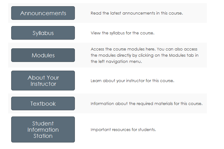
This is a stripped-down version of a course home page I'm currently using.
Buttons-for-home-page.png

I created this home page using a table, and I used the "btn btn-info btn-large" attribute for the buttons.

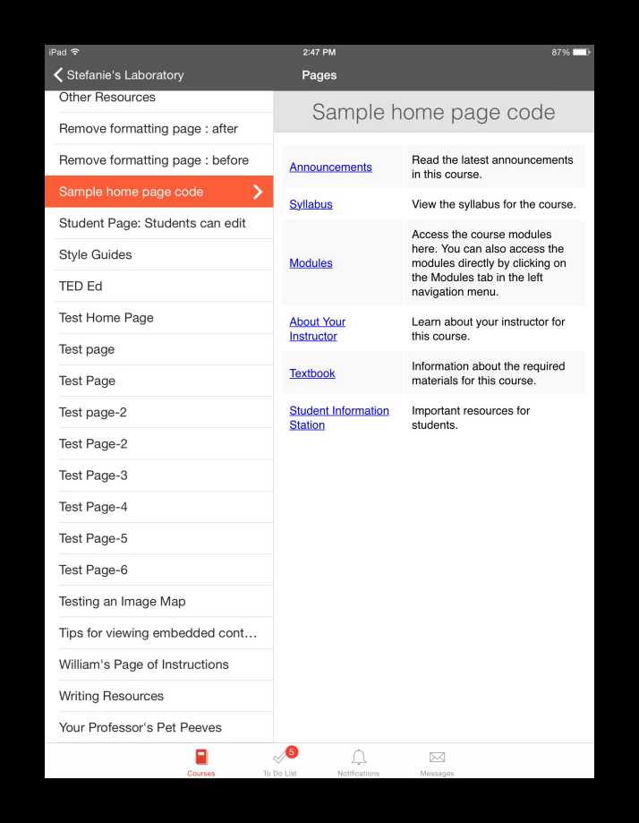
The functionality of this home page style is compatible with mobile devices, but the buttons themselves won't appear in the app. This is how the same home page looks in the Canvas App on an iPad.
Home-page-code-in-Canvas-iOS-app-resized.png

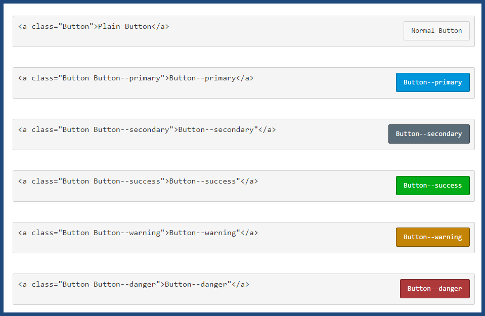
The image below shows examples of other button styles.
button-codes.png

The button code is inherently versatile. For example, using this code:

<p><a class="btn-large btn-block btn btn-danger btn" style="width: 100%;" title="Click here to view the Course Announcements" href="https://community.canvaslms.com/courses/[insert-course-number]/announcements" target="_blank"><strong>Course Announcements</strong></a></p>

...I can create a clickable button across the top of my home page to direct students to announcements:
Button-for-course-announcements.png

At many schools, teachers are tasked with creating their courses and course home pages. I'm currently training a cohort of teachers, and more often than not, when they create their syllabus page, they simply insert a link to their own syllabus file at the top of the page. The result is neither pretty nor inviting--so I've been teaching them the method of having the syllabus file auto-open for inline preview.

How do you create your course home pages? Do you have a standard template that is used across all of the courses at your institution? Do instructional designers create the pages, or are your teachers given instructions on how to create their own, and what they must include on them?

[Note: Need help with HTML? Read snugent​'s awesome blog, Rich Content Editor HTML Cheatsheet]

192 Comments
GideonWilliams
Community Champion

Not sure about this Constancia but have you seen these from Pasco County using Google Fonts and stuff - Pasco Page Templates - MSTR - 2014-15

They are amazing...and free to use... Gid

Stef_retired
Instructure Alumni
Instructure Alumni
Author

 @cwendt ​, I looked at the website you provided, and noticed that it states:

All of these templates are created using valid, W3C-compliant HTML and CSS code and are very useful for beginners looking to understand how to build a website from scratch.

However, W3C-compliant HTML is a more comprehensive category than Canvas-RCE-compliant HTML. Canvas has an HTML Whitelist that displays the elements, attributes, and tags that the Canvas RCE supports. I'd suggest you download one of the templates and compare its code to the Whitelist; if you find something in the template code that isn't listed on the Whitelist, the template won't work as designed in Canvas.

I like to work in a sandbox course, so I'd just copy and paste the code for one of the templates into the HTML Editor of a test content page and save it so I could see how it behaves.

But if you're talking about saving the template file as an HTML file in Files and pointing to it from a content page, that's an entirely different matter, and is an approach I've avoided. Others here on the blog probably have experience with that.

Feel free to provide us some sample code from one of the templates so we can have a look at it!

kmeeusen
Community Champion

Thanks for sharing those, Gideon. Wish I could grab the HTML code for those pages, they are very good and some neat tricks are in there.

GideonWilliams
Community Champion

I thought you could? On that link there is a ZIP file. Here is some more information from it - templates_themes_and_all_that_jazz - mrslattke's library  and they also presented in InstructureCon 2015 which is  here Templates, Themes and All that Jazz - YouTube  Enjoy :smileyshocked:

cwendt
Community Champion

Oh, *that* explains it! I tried working with it, but only some of it came through—must've left behind the tags/coding that are more complex.

I definitely need to learn more HTML. I am feeling limited.

Thank you!

kmeeusen
Community Champion

Thanks, Gideon, I found it.

GideonWilliams
Community Champion

Let me know how you get on

bgibson
Community Champion

I tried one of the templates from the URL you listed and pulled the index.html page into Expression Web 4 (the free install from Microsoft, that I mentioned above).  It only had an "index.html" page so I added an "about-us.html" page by copying the "index.html" page.  I then made changes to the page content and the navigation items and zipped the whole folder up.  Did an import and unpackage into the Files area of my Canvas courses and then linked to the "index.html" page.  Pulls up nicely and the two links "Home" and "About Us" work fine.  See here index.html: FSU Web Tools

Okay, I know HTML.  If you don't know the basics... in this case probably how to create proper HTML "links"  (<a href=...) and where exactly to past content, then you would have a problem.  But, yeah these templates would work well.  *I qualify that because I am going to have to work with the width of the pages because they are hiding the right navigation items in the Canvas course.  [If you know HTML coding, you could use Notepad to create the pages.]

Stef_retired
Instructure Alumni
Instructure Alumni
Author

 @josh_emmitt ​ has created a resource in the Higher Education​ group demonstrating various techniques for creating a nifty-looking syllabus page: Creating a "button" oriented syllabus page  The design techniques he describes there can easily be applied to any content page in Canvas.

stephanie_pope
Community Champion

Hey Everyone,

Something else to factor in while creating pages...accessibility. I've created a "quick glance" chart of W3C's levels: A, AA, and AAA. It's nice to see them all by ranking. Level A is the minimum requirement to comply. I hope this helps. I wasn't able to attach a document to this thread (for some reason), please find the document on this thread Instructional design theories

Stephanie

kmeeusen
Community Champion

Thanks for all of this Stephanie!

One of the things that we have started doing as a UDL thing is to test our pages on a PC, tablet and phone to see how the page renders on various devices. When we include graphic elements, we now size them in percentages instead of fixed pixel sizes to improve their rendering on small screens.

jbuchner
Community Contributor

Very true. I poll my students every semester to find out what is their main device for accessing Canvas. While small (13in) and medium (15in) laptops hold the highest percentages of viewers, phones and tablets are not an insignificant number. That has influenced the look of my pages.

kmeeusen
Community Champion

Our school has a very poor demographic, and phones are the only device for accessing the internet for many of our students, so that percentage is much higher here.

I wish that were not true, because despite the mobile friendliness of Canvas, a phone is a very poor tool for taking an online course. Oh God, now I'm going to hear from all the folks with their smart phones surgically implanted:smileysilly:, but it is true.

stephanie_pope
Community Champion

Hey Kelley,

Yes- we do similar testing. We find the majority of our students work on desktops and laptop- mainly because we're a fully online school. I think our students tend to be sitting at a desk, working with textbooks, desktops/laptop, notebooks, etc. It's interesting to hear your students mainly use phone. It's wonderful to hear that a consideration for your design process.

scottdennis
Instructure
Instructure

Years ago I had the privilege to attend a conference presentation by a woman who taught medical terminology at the college where Kelley works.  She was able to obtain a grant to provide tablets for each of her students.  She created a completely OER version of the materials for her course and preloaded the materials on the tablets and also into an LMS course that students could access on the tablets or other platforms.  I don't remember the numbers now but the success rates for the students that were given mobile devices and no textbook cost compared to similar students in the traditional program were shockingly higher.

bgibson
Community Champion

k2-_99304b86-2a51-4592-9a40-b67951aecaf4-v1-807b6a0b6318c3fb74bbfc0dae9aa375f8bff3b7-optim-450x450.jpg41hsl8qho5l.jpgtv-end.png

Maybe you could supplement the phones with a Chromecast ($35) and a wireless keyboard ($20) and students could push their Canvas experience to an HDTV.  The Intel Compute Stick is currently around $134, a whole computer, but also requires a keyboard and HDTV.  Still, who doesn't have a TV?

I've pushed video, or browser window, up to my TV via a Chromecast, using either a Samsung smartphone or a Chromebook.  The Logitech wireless keyboard shown has a touchpad so you don't need a mouse.

julio_cesar_if
Community Member

Hello  @ted_curran ​, I am trying to use Pingendo to create my course home page. I create a sample page to insert in my course but a simple copy+paste into rich editor isn't working. Am I missing something?

Thanks

kmeeusen
Community Champion

Julio:

I am not familiar with this product, but I am suspecting you need to grab an embed code from Pingendo, then paste the embed code into the HTML Editor.

I just downloaded the App, and appears to be an HTML5 editor. I made a test page and clicked the HTML link at the bottom, then selected and copied the code. I had difficulty getting the page to display, so I suspect the code includes some forbidden elements, and I will need to experiment more.

Not much help, was I?

klm

bgibson
Community Champion

I haven't looked at the program, but from your description, you could upload it as a Page or if it has page(s) and images, zip it all up and let Canvas unpack the file putting everything where it needs to be.

kmeeusen
Community Champion

In testing this, I looked at the code, and it includes executable elements that are not on the Canvas permissible HTML list. I haven't taken the time to see if there are packaging options to make this work - say like it does with SoftChalk content.

bgibson
Community Champion

pingendo-example00.png

I put all the image files in the same folder as the HTML file, and made sure the image references in the HTML pointed to the same location.  Zipped them all up, and used the Files --> Upload --> Unpack options to get them into Canvas.

I still haven't played with this, but I have someone in the office that was familiar with Bootstrap and he quickly created a test page using Pingendo (Julio Jimenez).  Note in this screen capture that the page is responsive, and the "hamburger" menu automatically appeared when the screen size was reduced.

Initially, the CSS and JS files, and the background image are on Pingendo or other servers.  Canvas blocked some items because they were being served via http and not https, but changing that made everything show correctly.  If you fiddle with the HTML coding, you can move your page images into the same folder where the HTML file(s) is/are located.  *Not sure yet if it would be easy to change the path to CSS, JS and images files from within the Pingendo interface.  If so, it would be a nice utility for creating responsive pages for use in Canvas.

kmeeusen
Community Champion

Wow, Bill, thanks for doing the leg-work on this one!:smileyshocked:

I have been too busy to play, but I liked what I saw in my initial investigation of Pingendo.

Now I need to find time to go play a bit.

klm

gpiazza
Community Explorer

Hello everyone.  I would like to share a "library" of samples I gathered from other Consultants at work, Canvas guides, classroom teachers...I use the examples to help inspire others and spark conversations about good design.

https://softchalkcloud.com/lesson/serve/hTl7URkpBbintZ/html 

Stef_retired
Instructure Alumni
Instructure Alumni
Author

 @gpiazza ​, this is a splendid "sample book," and thanks for sharing! (Nice use of SoftChalk Cloud for the presentation, too. Smiley Happy)  I recognize some of these from the Sample Course Templates and Example Courses by Subject. Do you have all of the examples designed as Canvas pages, and if so, would you be willing to share them to Commons (perhaps in a course called "A Library of Course Home Pages), so that others can use the code?

gailc
Community Novice

I like the look of this - how did you create? Can you provide details?

Thanks.

john_morris
Community Participant

Hi stefaniesanders​, I'm always impressed with your work. I guess I tend toward more of a minimalist. Based on feedback I've heard from students in face-to-face and online courses, most students see Canvas as a "necessary evil". They prefer to get in quickly, find what they want, and get their work done. I like the friendliness of the buttons you use and think that lends to a "kinder and gentler" interface. Below is a copy of what I'm currently using in my courses. Much of the top of the browser page is controlled by the institution or the Canvas CSS and I have little control. Starting at the large orange stripe with "Ecampus | BA 353" inside is where my control starts.

Students say they like the syllabus page as the first thing they see and they like minimizing clicks and scrolling. I like (or am required to provide) them with easy access to certain things like the four links (two are within Canvas, two are external) just below the name of the course, I put these into a table to prevent them moving around unexpectedly. I would like to turn these four links into four buttons aligned in a horizontal row. Is it fair for me to ask your assistance in turning the HTML code I provided into code that would have the four links replaced with buttons that I can edit as I copy this forward to other terms and courses? I've tried to replicate what you have done, but I'm not getting them to line up horizontally.

161055_pastedImage_0.png

Here is the HTML Source code that generates the provided view...

<p style="background: #c34500; font-weight: bold; padding-left: 15px; padding-top: 5px; padding-bottom: 5px; color: #f5f2ed; margin: 0px;">Ecampus | BA 353</p>

<h2 style="background-color: #555555; color: #ffffff; padding-left: 15px; padding-top: 0px; padding-bottom: 0px; margin-top: 0px;"><span style="font-size: x-large;">Professional Development</span></h2>

<table>

<tbody>

<tr>

<td><a id="" class="" title="" href="https://docs.google.com/document/d/17hwynTWGGHifEpem8kWoAqsHrUKXkzH-cm4f828shUk/edit?usp=sharing" target="">Printable Course Syllabus</a></td>

<td></td>

<td><a id="" class="" title="" href="https://community.canvaslms.com/courses/1577029/pages/course-policies" target="">Course Policies</a></td>

<td></td>

<td><a id="" class="" title="Q&amp;A Discussion" href="https://community.canvaslms.com/courses/1577029/discussion_topics/7655240" target="">Q&amp;A Discussion</a></td>

<td></td>

<td><a id="" class="" title="" href="http://guides.library.oregonstate.edu/c.php?g=417199&p=2843099" target="">Library Guide</a></td>

</tr>

</tbody>

</table>

kmeeusen
Community Champion

Hi John:

I am a life-time student of online pedagogy, and your points are valid and supported by much literature. I take the same approach (and teach it to our faculty) to severely limit the left-side navigation menu. In fact, in most of my courses, the Home link is the only one available, in others it is just Home and Modules (courses with considerable content). I also extensively use navigation buttons on the Home page.

I also believe strongly in consistency of design and structure so that related courses have the same look, feel and functionality. We use a consistent Home page Banner and course color scheme for all our professional Development courses for faculty and staff, and encourage our program faculty to do the same for their programs.

Below is a screenshot from one of our Professional development courses...............

161606_pastedImage_0.png

Stef_retired
Instructure Alumni
Instructure Alumni
Author

 @john_morris ​, thanks! I believe I can figure out how to turn those four links into buttons; if I'm right, it will involve inserting a four-column single-row table directly under the banner and then placing the buttons (with links) in their respective cells. I'll play around with the HTML later this afternoon.

kmeeusen
Community Champion

stefaniesanders​ and  @john_morris ​

Here is a simple bit of code to get those links into buttons.....................

<table style="width: 100%; max-width: 640px; border: none; margin-left: auto; margin-right: auto;" border="0">

<tbody>

<tr>

<td style="width: 25%; padding: 10px; background: #f9f9f9;"><a class="btn-large btn-success btn" style="width: 70%;" href="https://community.canvaslms.com/courses/FOR IN COURSE VAVIGATION COPY THE URL FROM THE COURSE NUMBER TO THE END">First Button Title</a></td>

<td style="width: 25%; padding: 10px; background: #f9f9f9;"><a class="btn-large btn-success btn" style="width: 70%;" href="FOR OUT OF COURSE NAVIGATION PASTE IN ENTIRE URL OF DESTINATION">Second Button Title</a>&lt;</td>

<td style="width: 25%; padding: 10px; background: #f9f9f9;"><a class="btn-large btn-success btn" style="width: 70%;" href="https://community.canvaslms.com/PASTE NAVIGATION HERE">Third Button Title</a>&lt;</td>

<td style="width: 25%; padding: 10px; background: #f9f9f9;"><a class="btn-large btn-success btn" style="width: 70%;" href="PASTE NAVIGATION HERE">Fourth Button Title</a>&lt;</td>

</tr>

</tbody>

</table>

Stef_retired
Instructure Alumni
Instructure Alumni
Author

Hey,  @john_morris ​ and  @kmeeusen ​, I just finished working on this and saw that Kelley beat me to it! This is not perfect by any means, but I got the buttons to look like this on the page:

john-morris-home-page-with-buttons.png

and here's the code I used:

<p style="background: #c34500; font-weight: bold; padding-left: 15px; padding-top: 5px; padding-bottom: 5px; color: #f5f2ed; margin: 0px;">Ecampus | BA 353</p>

<h2 style="background-color: #555555; color: #ffffff; padding-left: 15px; padding-top: 0px; padding-bottom: 0px; margin-top: 0px;"><span style="font-size: x-large;">Professional Development</span></h2>

<table>

<tbody>

<tr>

<td>

<p><a class="btn-large btn-block btn btn-success btn" style="width: 100%;" title="Printable Course Syllabus" href="https://docs.google.com/document/d/17hwynTWGGHifEpem8kWoAqsHrUKXkzH-cm4f828shUk/edit?usp=sharing" target="_blank"><strong>Printable Course Syllabus</strong></a></p>

</td>

<td width="100"></td>

<td>

<p><a class="btn-large btn-block btn btn-danger btn" style="width: 100%;" title="Course Policies" href="https://community.canvaslms.com/courses/1577029/pages/course-policies" target="" data-api-endpoint="https://training.instructure.com/api/v1/courses/1577029/pages/course-policies" data-api-returntype="Page"><strong>Course Policies</strong></a></p>

</td>

<td width="100"></td>

<td>

<p><a class="btn-large btn-block btn btn-warning btn" style="width: 100%;" title="Q&amp;A Discussion" href="https://community.canvaslms.com/courses/1577029/discussion_topics/7655240" target="" data-api-endpoint="https://training.instructure.com/api/v1/courses/1577029/discussion_topics/7655240" data-api-returntype="Discussion"><strong>Q&amp;A Discussion</strong></a></p>

</td>

<td width="100"></td>

<td>

<p><a class="btn-large btn-block btn btn-primary btn" style="width: 100%;" title="Library Guide" href="http://guides.library.oregonstate.edu/c.php?g=417199&p=2843099" target="_blank"><strong>Library Guide</strong></a></p>

</td>

</tr>

</tbody>

</table>

So instead of using cell padding, as Kelley did, I used spacer cells. I'm sure you can play around with the sizes of the cells (and maybe even the size of the banner) so that everything scales nicely and in tandem for any window size. Have fun!

kmeeusen
Community Champion

Hi Stephanie and John:

I just came back in here because I thought a screen shot might be nice...........

161607_pastedImage_0.png

Also John, since navigation buttons are a Canvas style element, they are easy to use, but are limited in customization.  You will note my buttons are green, and Stephanie chose to display different colored buttons.

This is achieved in the code for the particular button class. In this example the highlighted code text determines the button color: <a class="btn-large btn-success btn", in this example a "success" button style is green. Below are the button styles and the colors they produce.

Normal = grey

Secondary = black

Success = green

Warning = brown

Danger = dark red

I hope that between what Stephanie and I shared, you will be able to make this work for you.

klm

john_morris
Community Participant

stefaniesanders​ and  @kmeeusen ​, Success! Smiley Happy

I tend toward monochromatic preferences, so the rainbow approach Stefanie created was not the look I was going for, but with her code and the additional information on colors that Kelley provided, I was able to hobble together the look I'm shooting for... by the way, I found a sixth color embedded in Stefanie's code, Primary = blue. Thank you, thank you, thank you!

john_morris
Community Participant

OK, now I may just be getting picky... but if I want to repeat the color from my school's banner (in the HTML it appears to be "color: #f5f2ed") as the button color, is that possible? I've tried inserting in various places in the code, but nothing changes... where would a specific color be placed?

kmeeusen
Community Champion

Hi John!

I would love the same ability, but because the buttons are  a set Canvas Style Guide class object, this is not possible - at least not possible for me. I am not a coder, so perhaps someone who is will chime in with a suggestion we can pounce on!

Kelley

lshuck
Community Explorer

A simple background color change could be done by removing the btn-danger class and adding a background style with the hex color code, like:

<a class="btn-large btn" style="background-color: #f5f2ed;" href="">

john_morris
Community Participant

Thank you lshuck​. But I'm still missing something, I used your recommendation so the first button code looks like:

<p><a class="btn-large btn" style="background-color: #f5f2ed;" href="https://docs.google.com/document/d/17hwynTWGGHifEpem8kWoAqsHrUKXkzH-cm4f828shUk/edit?usp=sharing" target="_blank"><strong>Printable Course Syllabus</strong></a></p>

But it did not change the button characteristics. (Some of the specifics changed from what I posted earlier because I'm now working with a non-published course...) I was expecting the first button would have the same orange color (#f5f2ed) as in the banner. Further suggestions?

164675_pastedImage_0.png

kmeeusen
Community Champion

John:

I just tried this code snippet provided by Lorie, and it mostly worked fine. Some issues were text and button size and text color because it was no longer a standard element.  I beat those by editing in the RCE before I copied the code for you.

Here is the code I used.............

<p><span style="font-size: 18pt; color: #ffffff;"><a class="btn-large btn" style="background-color: #502d7f; color: #ffffff;" href="YOUR URL ADDRESS">YOUR BUTTON TITLE</a></span></p>

Here is the resulting button.........

164699_pastedImage_2.png

I hope this helps!

klm

lshuck
Community Explorer

 @john_morris ​, I think you only need to change your hex color from #f5f2ed, which is an off-white (#f5f2ed Color Hex ) to #C34500, which seems to be the orange from your banner (#c34500 Color Hex ). If the orange button is too dark, you can change the font color to white, as  @kmeeusen  showed. The line of code could then look like this:

<p><a class="btn-large btn" style="background-color: #c34500; color: #fff;" href="https://docs.google.com/document/d/17hwynTWGGHifEpem8kWoAqsHrUKXkzH-cm4f828shUk/edit?usp=sharing" target="_blank"><strong>Printable Course Syllabus</strong></a></p>

kmeeusen
Community Champion

I really appreciate your help, Lorie!

Not being a coder, I miss some of the ways that you can modify an object, and how to fit elements together.

john_morris
Community Participant

 @kmeeusen ​, thanks for providing that template code... I am no HTML coder either, it will be useful.

lshuck​, thank you for translating the template into actual code... I cut and pasted and have success! :smileycool:

This entire exchange has been a powerful learning experience for me. I'm off and running with a few "faux" coding tricks in the bag. Thank you!

kmeeusen
Community Champion

Hey John!

Canvas has thoughtfully provided us with a Canvas classroom - Canvashacks Demo Course - where we can share coding tips, tricks and techniques; and I populated it with content from my own faculty professional development classroom called "Do Not Fear the Code!". Others have since added to the content, and I cross-pollinate to keep both sites active and growing. This course is intended for both non-coders and experienced coders.

If you wish to join the Canvashacks Demo Course, just shoot me your email address, and I will enroll you. You have two enrollment options: Teacher - so that you can contribute new hacks, and Student - for those who just wish to take advantage of what is there. Even students can contribute new hacks through the Canvas Discussion included in the course.

Let me know.

KLM

julio_cesar_if
Community Member

Hello Kelley,

Can I join this demo course as student?

Thanks

scottdennis
Instructure
Instructure

 @julio_cesar_if ​,  I just sent you an invite.

kmeeusen
Community Champion

Thanks Scott!

john_morris
Community Participant

 @kmeeusen ​, yes please add me as a student to Canvashacks Demo Course.

You also raise an issue for me, how do we message specific members of the Canvas Community? You asked me to send you my email address... I poked around for a while, I followed you, I tried a variety of locations but could not find any other way to communicate with anyone within Canvas Community than by making a @mention. Am I missing something?

kona
Community Coach
Community Coach

 @john_morris ​, easiest way is if they've already replied/posted to something in the Community is mouse over their name and click the "Message" button on the box that comes up. Otherwise, navigate to your Inbox (should be the little icon to the left of your profile picture at the top of the page) and click on the "Send Message" link at the top of the page.

Hope this helps!

john_morris
Community Participant

As always, thank you  @kona ​. I thought I was really blind until I noticed one very specific characteristic of the first suggestion (which I really did try first!) Until the person is "following" you, the message option is not available. That is, you must already be connected the person to send them a message. However, it appears the second option of sending a message from the inbox (which I had overlooked) is available regardless of prior relationship.

GideonWilliams
Community Champion

Thank you so much for sharing, this is a super resource for colleagues to look at and get inspired...

GideonWilliams
Community Champion

Hi Kelley

Would really appreciate membership as a teacher if possible

Thanks

Gid

darellano
Community Novice

That was my first thought, too, Christie!