Rubric Resizing
- Mark as New
- Bookmark
- Subscribe
- Mute
- Subscribe to RSS Feed
- Permalink
- Report Inappropriate Content
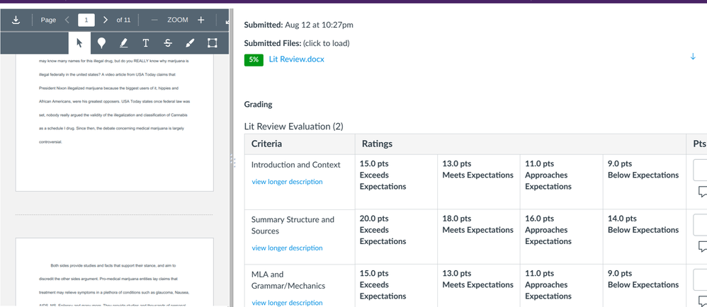
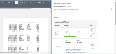
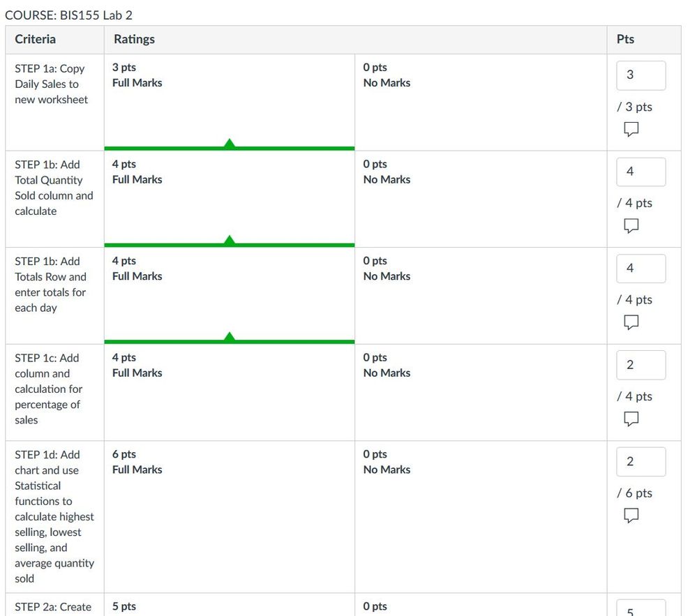
In Speedgrader, is there a way to shrink the size of the rubric? In order to see my entire rubric and the place to leave qualitative remarks, I have to move the rubric screen so far to the left that it shrinks the student submission until it's nearly illegible. Ideally, I'd be able to see both the student submission and the full rubric together. As it is now, the rubric is much bigger than it needs to be for scoring/commenting. Actually, it became worse just today; I assume Canvas made an update to the rubrics, but as a result of the update the rubric scoring is much more unwieldy.
I've included a screenshot to illustrate the problem:
Any insight is much appreciated!
Solved! Go to Solution.
- Mark as New
- Bookmark
- Subscribe
- Mute
- Subscribe to RSS Feed
- Permalink
- Report Inappropriate Content
Well that's troubling.
Our semester hasn't started yet, so I haven't experienced the new layout, which sounds less than ideal. Hopefully someone else has a better idea or solution.
- Mark as New
- Bookmark
- Subscribe
- Mute
- Subscribe to RSS Feed
- Permalink
- Report Inappropriate Content
I have found something that works for me, but it seems a bit finicky. I do this using the Speedgrader feature of Canvas, and Google's Chrome browser.
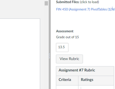
1. In Speedgrader, your screen should look something like this:
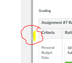
2. Click on "View Rubric" and the screen will change to show the rubrics. Notice that the dark gray dividing line between the opened file and the Grading section now has an additional three dots (highlighted in yellow) to the right:
3. Drag the center dark gray bar that separates the opened file and the Grading section so the Grading section is the width you'd like it to be.
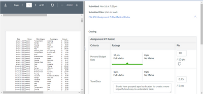
4. Click and HOLD those three dots and drag your mouse to the right and it should resize the rubric section. Here's my "before drag":
and my "after drag."
There seems to be a limit to how narrow it will make the Rubric section, but it definitely makes it narrower. I'm grading on a 13-inch laptop so I need my rubrics to be pretty narrow. It seems to look at the width of the Grading section to decide how narrow to make the rubric section which is why I resize using the dark gray dividing bar BEFORE I click and hold the three dots.
If you tried this and it works, please let me know! Or, if you figure out how to make it less finicky! Sometimes it seems like it doesn't work.
Pamela

