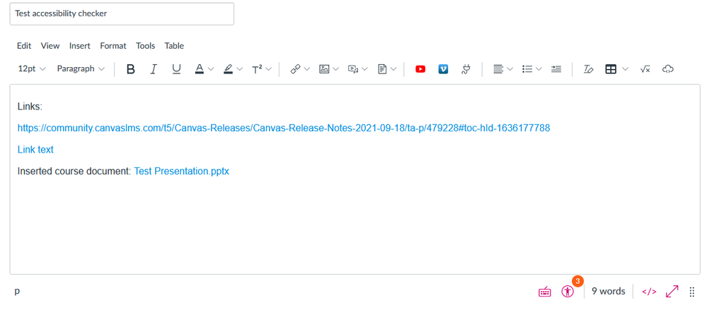
So ... the recent deploy notes (going into Production Feb. 2) say that "The Accessibility Checker color value has been changed from a warning style to an information style." And I am wondering why? The checker flags accessibility errors, and this seems to minimize the importance of them:
When users create content in the Rich Content Editor that includes accessibility concerns, the Accessibility Checker displays in the editor, notifying the user that concerns exist. This icon provides information to the user about how to correct the concerns within the editor.
The Accessibility Checker color value displays as electric blue, #0374B5. Previously it displayed as the Canvas warning color (#FC5E13).
Why are we referring to errors as "concerns" now? This is a huge step backward for accessibility in Canvas.


