Columns Without Tables: code-snippet

G_Petruzella
Community Champion
13
27517

Tables - I really don't like them. I find them unwieldy to manipulate and style, plus they're really not accessibility-friendly as commonly employed. But they've always seemed the only way to solve certain visual alignment problems: for example, creating three aligned columns. I've only recently realized that I don't need a table to create columns! Huzzah!

The key to columns... is the <div> tag.

Example: I want the "header" of my Syllabus page to contain some contact info, divided into two columns, with a 3rd column for a right-aligned graphic. I start just by typing out the fields and inserting the image, so they're stacked vertically:

<p><strong>Instructor:</strong></p>

<p><strong>Class Location:</strong></p>

<p><strong>Class Meeting Times:</strong></p>

<p><strong>Contact Information:</strong></p>

<p><strong>Office Location:</strong></p>

<p><strong>Office Hours:</strong></p>

<img style="float: right;" src="/courses/372229/files/66518610/preview" alt="FYE 2015 logo" width="60%" data-api-endpoint="https://mcla.instructure.com/api/v1/files/66518610" data-api-returntype="File" />

But now, I 'frame' each chunk of content with its own <div>, setting the float attribute so they'll run side-by-side when possible, and setting the width attribute to get the relative sizes I want, as follows:

<div style="float: left; width: 35%;">

<p><strong>Instructor:</strong></p>

<p><strong>Class Location:</strong></p>

<p><strong>Class Meeting Times:</strong></p>

</div>

<div style="float: left; width: 35%;">

<p><strong>Contact Information:</strong></p>

<p><strong>Office Location:</strong></p>

<p><strong>Office Hours:</strong></p>

</div>

<div style="float: right; width: 30%;"><img style="float: right;" src="/courses/372229/files/66518610/preview" alt="FYE 2015 logo" width="60%" data-api-endpoint="https://mcla.instructure.com/api/v1/files/66518610" data-api-returntype="File" /></div>

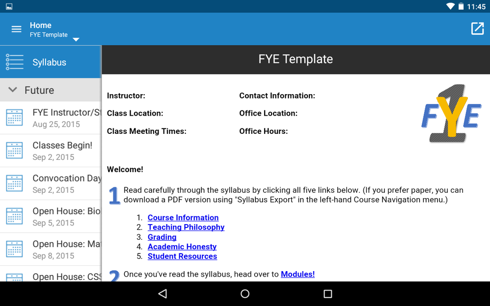
It looks like the screenshots below. (**EDIT 04/24/15: added screenshots from Android tablet, both Canvas App and mobile browser. HT Deactivated user​.)

div-screenshot-cropped.png

tablet_app_horiz.png

tablet_browser_horiz.png

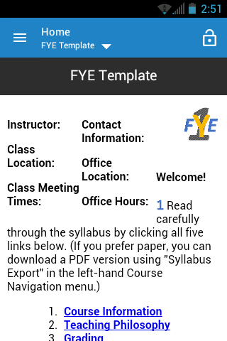
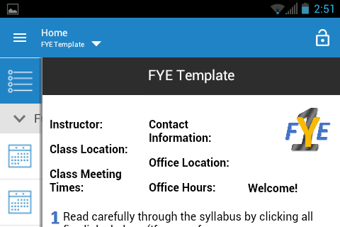
**EDIT 04/27/15: added screenshots (below) from Android phone, both Canvas App and mobile browser (Firefox). Note that the browser view on a phone does reduce text size within <div>s significantly.


Screenshot_2015-04-23-12-45-24.png

Screenshot_2015-04-23-12-45-46.png

Screenshot_2015-04-26-14-51-33.png

Screenshot_2015-04-26-14-51-40.png

13 Comments
rkirkland
Instructure
Instructure

This is great! I have also been using tables to create columnar content, but I will definitely give this a try!

c_t_coltman
Community Contributor

I shall be using this too instead of usig tables - so thank you.

jordan
Instructure Alumni
Instructure Alumni

Great stuff as always Gerol!  You ought to throw in a couple screenshots of how this looks on

  1. a tablet mobile browser
  2. a phone mobile browser
  3. a tablet Canvas app
  4. a phone Canvas app
G_Petruzella
Community Champion
Author

Good point Deactivated user​ - I'll edit the doc when I've grabbed a few of the mobile screenshots.

jordan
Instructure Alumni
Instructure Alumni

Nice!  I wanted to see how it scales and it seems to do so marvelously. How about on a phone!? 😉

scottdennis
Instructure
Instructure

Pretty cool, Gerol!

G_Petruzella
Community Champion
Author

Deactivated user​, Android phone screenshots added, both mobile browser and app! You'll note that the phone/browser combination does reduce text to minuscule levels, which could be a problem for that particular use case. But otherwise it scales well.

jordan
Instructure Alumni
Instructure Alumni

Thank you for adding those shots! I was hoping it would wrap to the next level or something like some responsive websites will do. Always have to consider how things appear on mobile devices.

john_morris
Community Participant

 @G_Petruzella ​, how does this work with screen readers? I know tables create problems on different platforms, but are there any accessibility issues to be aware of using columns?

MattHanes
Community Champion

Another trick I have been using is to use the Canvas Style Guide to see what html styling options I have available.  If you're good at the HTML editing, you can use their implementation of Flexbox Grid to put things into columns.  The benefit of using Flexbox implementation is the items in columns will stack on top of each other on a mobile browser instead of displaying side by side.  It will make your content responsive.  The style guide for using the grid is here:  Canvas LMS

Here are some screenshots of the "stacking" effect.

Full width:

Full-width.jpg

Stacked:

Stacked.png

You can see that the code will cause each column to stack on top of each other.  Here is the code I used for these screenshots:

<div class="content-box">

<div class="grid-row">

<div class="col-xs">

<div class="styleguide-section__grid-demo-element">

<p><strong>Instructor:</strong></p>

<p><strong>Class Location:</strong></p>

<p><strong>Class Meeting Times:</strong></p>

</div>

</div>

<div class="col-xs">

<div class="styleguide-section__grid-demo-element">

<p><strong>Contact Information:</strong></p>

<p><strong>Office Location:</strong></p>

<p><strong>Office Hours:</strong></p>

</div>

</div>

<div class="col-xs">

<div class="styleguide-section__grid-demo-element"><img src="/courses/15423/files/821/preview" alt="fye.jpg" data-api-endpoint="https://mcsd.instructure.com/api/v1/courses/15423/files/821" data-api-returntype="File" /></div>

</div>

</div>

</div>

G_Petruzella
Community Champion
Author

Hi  @john_morris ​ -

I found the following to be a useful intro to tables w/r/t accessibility:

http://webaim.org/techniques/tables/

hburgiel
Community Participant

This is exactly what I was looking for, thank you!

How do you get Canvas to stop working in columns and go back to using the full width of the screen?  I understand that it's a best practice to avoid using tables, but I haven't found a better way to control where everything goes on the page.

mmoore1
Community Contributor

Thanks for the ideas!  I am also finding div tags to be extremely helpful for organizing pages in Canvas and highly recommend them.  Great examples.  More to share with our faculty!