Creating an inviting course home page

Stef_retired
Instructure Alumni
Instructure Alumni
192
102936

The course home page is a critical navigation waypoint for students. As course designers, we can choose from numerous style ideas to make the course home page inviting and intuitive for our students.

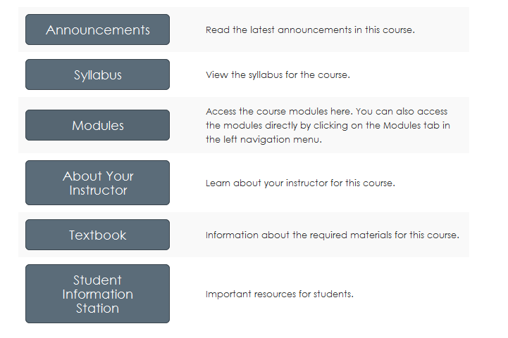
This is a stripped-down version of a course home page I'm currently using.

Buttons-for-home-page.png

I created this home page using a table, and I used the "btn btn-info btn-large" attribute for the buttons.

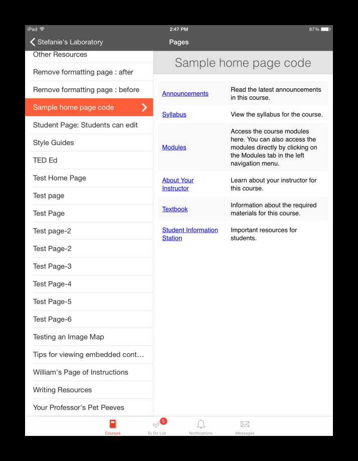
The functionality of this home page style is compatible with mobile devices, but the buttons themselves won't appear in the app. This is how the same home page looks in the Canvas App on an iPad.

Home-page-code-in-Canvas-iOS-app-resized.png

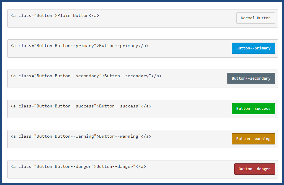
The image below shows examples of other button styles.

button-codes.png

The button code is inherently versatile. For example, using this code:

<p><a class="btn-large btn-block btn btn-danger btn" style="width: 100%;" title="Click here to view the Course Announcements" href="https://community.canvaslms.com/courses/[insert-course-number]/announcements" target="_blank"><strong>Course Announcements</strong></a></p>

...I can create a clickable button across the top of my home page to direct students to announcements:
Button-for-course-announcements.png

At many schools, teachers are tasked with creating their courses and course home pages. I'm currently training a cohort of teachers, and more often than not, when they create their syllabus page, they simply insert a link to their own syllabus file at the top of the page. The result is neither pretty nor inviting--so I've been teaching them the method of having the syllabus file auto-open for inline preview.

How do you create your course home pages? Do you have a standard template that is used across all of the courses at your institution? Do instructional designers create the pages, or are your teachers given instructions on how to create their own, and what they must include on them?

[Note: Need help with HTML? Read snugent​'s awesome blog, Rich Content Editor HTML Cheatsheet]

192 Comments
scottdennis
Instructure
Instructure

 @GideonWilliams ​,  Adding you now.  Cheers.  SD

GideonWilliams
Community Champion

Thanks very much!

bgibson
Community Champion

The Expression Web app aids you in creating one or more web pages and you add images to the pages as you go.  What you do to get it all into Canvas is to zip up all the pages & associated folders  and files and then you Upload and "Unpack" (have Canvas unpack everything and it works).

GideonWilliams
Community Champion

Hi Stef

Been working on some CSS styles for Canvas as a result of a stylesheet file that the amazing Julian Ridden sent me.

Muddled my way through it by trial and error and it is a bit complicated in places.

Not sure where the best place is to share but would like to as I think it gives some nice design touches to Canvas.

I've enclosed a few printscreens by way of example. Any thoughts you have I would welcome...

Gid

canvas1.pngfonts1.jpgcanvas2.jpg

snip2.PNG

bgibson
Community Champion

Scratchpad WordPress Theme (download link on page)

https://wordpress.com/themes/scratchpad/

The iframe settings for the Canvas page are:

iframe-settings-embed-wp-site.png

The Scratchpad Theme is highly responsive, so as you decrease the device display size, it dumbs down really well, especially when embedded in a Canvas course page.  It is just a good looking theme, rife with educational icons.

scratchpad-wp-theme-still.mp4.png

drimmer
Community Contributor

This is great, stefaniesanders. I had simply made the modules list the home page, not realising that you could customise the page entirely - I just thought you could select where the students landed. Another item for my 'to do' list!

esapienza
Community Novice

Hi  @scottdennis ,

Can I get an invite too, please?

scottdennis
Instructure
Instructure

Hi Erin,

Sorry, after so many comments in the forums, they unthread.  Could you remind me what this is about?  What would you like me to invite you to?

Thanks

Stef_retired
Instructure Alumni
Instructure Alumni
Author

For anyone interested in this topic, be sure to RSVP to the CanvasLIVE event Ask Me Anything: Kate McGee, Product Manager, Commons+Content, which is coming up on Thursday, October 20, 2016. Kate is going to be answering questions about Canvas Commons, master courses, templates, and the content authoring tools in Canvas--and, well, anything! Smiley Happy If you’re interested, but your schedule doesn’t allow you to attend in real time, RSVP "no" or "maybe" so you can receive any post-event updates.

Stef_retired
Instructure Alumni
Instructure Alumni
Author

For anyone who wants to get more comfortable with HTML and <iframes> and all that good stuff that helps you build beautiful pages, be sure to RSVP to the CanvasLIVE event Cracking the Code: HTML for Humans! which is coming up this Monday, November 7, 2016. If you're able to attend, RSVP "Yes"--and if you're interested but your schedule doesn’t allow you to attend in real time, RSVP "No" or "Maybe" to receive any post-event updates.

ted_curran
Community Novice

Hi Kate --

The left hand navigation buttons in Canvas vs. Blackboard serve two totally different purposes, so it's best not to confuse them. 

In Bb, the left hand nav serves as a set of "dumb folders" that you can fill with any content you want. By editing that, you can create a course index and direct students to resources according to whatever organization scheme makes sense to you. 

Canvas' left-hand nav directs users to the main features of the course -- these are specific tools with clearly-defined functions, like Modules, Pages, Grades, etc. You can think of them like "apps" on a smartphone -- each with its own specific functions and features. 

If you want to reproduce the "dumb folders" functionality from Bb, you can either set up something similar in the Modules tool, or (what I do) create a series of Pages that interlink to produce the kind of "nested folders" experience from Bb -- guiding students through successive pages of neatly arranged resources. 

The first page might be an "Index" page, with only a few top-level choices like "Week 1", "Week 2" etc. Each choice links to its own Page, where you can then arrange the files you want on its own page. 

Then you can set your Index Page as the course landing page so it's the first thing students see. That way, you can guide their experience Blackboard-style while still providing access to the powerful Canvas tools that are pinned to the left hand nav. 

Bobby2
Community Champion

 @scottdennis ‌ this is gold. Thank you.

Bobby2
Community Champion
Stef_retired
Instructure Alumni
Instructure Alumni
Author

 @Bobby2 , I'm excited to hear it! Yes, that's how I learned too...sandbox, trial and error, rinse, repeat. 😉

When I'm playing in a sandbox, I always keep at least two things handy (apart from coffee, which is a must):

  • A link to W3Schools for all things HTML (don't worry about the tutorials, just search for code).
  • The Canvas HTML Editor whitelist (first stop in case the code I found in W3Schools doesn't work).

And one trick I wish I had known about a long time ago is hiding right in your Chrome browser. Check out msgarcia‌'s tips for creating mobile content at  Verifying Mobile Friendly Web Content .

Bobby2
Community Champion

stefaniesanders‌ I can only like this once!

Thanks a million.

kmeeusen
Community Champion

Hi  @Bobby2 ‌

Like my friend stefaniesanders‌, I am excited to hear that you are going to give it a go! Her suggestions about W3Schools and Canvas HTML Editor Whitelist are spot-on!

I offer a workshops several times a year through various venues on HTML coding in Canvas for non-coders, and have a couple additional tips I hope you will find useful:

  • Join the CanvasHacks Demo Course. This is a space (Canvas classroom) created by Community members to share great HTML hacks anybody can use.
  • Keep your first experiments simple.
  • While experimenting in your sandbox, develop a theme for your hacks - what will I use for a course banner, what colors will I use for visual enhancements, what style elements do I want to consistently use? Then create your own style guide, by copying the HTML code for these hacks (including any custom colors, etc.), and paste these into a clearly labeled Word doc (GoogleDoc, ODT, it don't matter). Then, as you expand out to enhancing your actual Canvas classrooms, keep your personal style guide open and handy so that you can just copy/paste your code quickly and easily where you need it. This will help you develop a consistent look and feel to your online courses which is something that students truly appreciate.  I actually developed several personal style guides for the academic courses I teach, the professional development course, for department and committee spaces I build, etc.

Enjoy your new adventure, and anytime you need help, just come ask. I and many others in this Community are always happy to help.

Agent K

hochmucr
Community Participant

For those who want to just simply add some buttons using html on a page - use this google sheet template I created to quickly create the html code for pasting into your page. Buttons for Canvas - Google Sheets 

Bobby2
Community Champion

 @kmeeusen 

I remember loooong ago, in the 60s, learning algol w and using computer punch cards. Scared the life out of me. You have made the idea of coding for non-coders so accessible. I'm dipping my toe in the water with a little confidence. Thank you!

Dip Your Toe In The Water

scottdennis
Instructure
Instructure

Wow, Bobby,

Thats pretty cool that they taught the pre-schoolers where you were how to program in Algol and use punch cards!

kmeeusen
Community Champion

:smileycool: Nice,  @scottdennis 

Bobby2
Community Champion

ooops I meant the 80s!. I was in my teens. New Zealand wasn't so backward after all.

scottdennis
Instructure
Instructure

I think the first computer I ever saw was in the 80s too.  It was before the Apple IIe but not too far before it.  It was at a computer camp for kids organized by the local high schools.  At my first real job (military) we had one computer that could only be interacted with via manual switches for entering binary.  That was in the early 90s.

kmeeusen
Community Champion

 @scottdennis ‌ and  @Bobby2 


My first was in the mid-70s, and was a hulking monster our Fish and Game office got, and we entered our Summer data using punch cards.

laurakgibbs
Community Champion

When I was in 8th grade, they toted the geekiest kids off to the high school to learn BASIC using punch cards, so that was mid-1970s. I liked the punch cards very much: they looked so weird and cool. I figured if the computer wasn't going to talk to me (like the computers in Star Trek), well, punch cards would have to do. 🙂

rislis
Community Champion

So excited about the new Blueprint option!! @hanmat 

bgibson
Community Champion

I was in college at the same time, and while our punch cards & programs were being run, in batch, some of us were over at the teletype watching others play a game of Star Trek.  That was when  this   +=   equalled the Star Ship Enterprise;-)  And, it took about a minute to print a page, which represented the movement of just 1 space on the board.

Bobby2
Community Champion
k_jagdev
Community Novice

Hey all,

Apologies if this has already been asked, I have just been playing around with the progress bar, does anyone know how (or if you are able) to animate it? I am using it for content on a page:

<div id="progressbar" class="ui-progressbar ui-widget ui-widget-content ui-corner-all animateprogress" style="width: 100%;" role="progressbar" aria-valuemax="50" aria-valuemin="0">
<div class="ui-progressbar-value ui-widget-header ui-corner-left" style="width: 11.1%;"></div>
</div>

Cheers,

Kiren

lph
Community Champion

Hi

How do I manage Course Navigation links? Is a great document on removing the links. Next, consider using the app Redirect Tool to add in new items to the menu. 

Redirect Tool for Canvas: FLC 1.0 App Demonstrations 

Maybe these two two will help you get your course navigation as you desire. 

lph
Community Champion

Ripping the idea from canvas.net, Pinterest, as well as taking suggestions posted in this and other threads,  Here is a screenshot of a design for AP Physics 1, fall 2018.  There are 12 “boards” on the page. The design isn’t finished, but you get the idea. 

It was built with tables and an attempt to only stay in the editor. The backend was used to add the start button. I’ll try another time using straight CSS instead of the table. 

280811_B3F317F9-E24A-404B-8658-320FE0ED7694.jpeg

kritzerjb
Community Novice

Hi, Stephanie. I would love the code to your long home page. Thanks. Jeff

Stef_retired
Instructure Alumni
Instructure Alumni
Author

Hi,  @kritzerjb  Welcome    to the Canvas Community! You'll find the HTML for the home page in the seventh comment under the main post--but if I were to do it over again, I definitely wouldn't use tables. Today, I'd use something that is accessible and compatible with mobile devices, i.e., a version of the code in https://community.canvaslms.com/groups/designers/blog/2015/05/22/sweet-home-pages-without-tables .

rislis
Community Champion

I realize this post is old, but still wondering about Course Navigation. We did move navigation labels on the left side out of the student view because we wanted to have a clean look and they are often confused by the plethora of choices on that side. However, removing those labels from student navigation in course settings means that certain items are not open to them. That's been frustrating for teachers new to Canvas. 

I also do not want teachers to have to use HTML code for a button look. While I find da Button factory, Canva, etc. easy enough to use, it does take more time.

jacobtowne7
Community Novice

Hi  @rislis ‌ 

What about something like this below? we use this for a course as a banner, each element clickable 
(Note - this course is for professional development resources)
291294_pastedImage_1.png

jacobtowne7
Community Novice

Hi stefaniesanders
I know you posted this ages ago but thought you may be interested in this type of homepage. 
I created an image mapped clickable page (each speech bubble below is clickable) and then users can be taken to the corresponding page. 

Something i created just to be a bit different from what i call the linear model in canvas sometimes, let me know if you want to chat further :smileygrin: 

291295_pastedImage_1.png

Stef_retired
Instructure Alumni
Instructure Alumni
Author

 @jacobtowne7 ‌, this is so cool. Would you have a moment to post this as a standalone resource in the Instructional Designers group? I'm sure many people (of which I am one) will be interested in how you built this—not only in terms of the underlying code but also with an eye toward ensuring its accessibility.

If you create a blog post or discussion about this type of home page, please then circle back here and post the link to it. It looks amazing!

jacobtowne7
Community Novice

stefaniesanders 

You got me! 

See the post here Image mapping your home page  

Hope it can help to anyone who is interested.

rislis
Community Champion

I love this!  Very inviting and creative. Thanks so much for sharing!

erikayigzaw
Community Novice

HIPPOing this thread but it popped up in my feed and I wanted to share what we're doing with CIDI tools (aka what was KennethWare) - IMHO it is an amazing tool that everyone should be using (#notsponsored lol) but I can't even imagine how much time it would take to hand code this. The top flags float over the image and we can have up to five based on student and instructor feedback. If the course has an eText we link it here too. The list of modules has dates coded into it and the current week is highlighted. Its pretty cool and helps guide students where they need to go quickly and efficiently - thus reducing friction and decision fatigue. Hope that helps! HED 303 Home page

jknippers
Community Novice

Hi Erika,

Are you all still using CIDI labs and if so, how long have you been using them? With going to a graphically heavy user interface, have you had any problems with images randomly disappearing? We were in the process of redesigning our course pages to a more graphically pleasing interface, but were having too many problems with images disappearing to deploy it.

michelle_steven
Community Participant

Jason, are you still having issues with images disappearing? As long as the images are stored in the current course files or on an external server that does not embed images into a proprietary shell, you shouldn't have any issues. I work for CIDI Labs and all of our front page themes use banner images on the front page without issue.

karen_bowden
Community Contributor

NVMD - Looks like my colors are restricted by some kind of tempalte. Bummer.

I love this but for some reason --primary is now orange. Almost matches --warning. Anybody know how to fix that?