Mobile App Design | Course Evaluation Checklist

lphilips
Instructure Alumni
Instructure Alumni
30
47765

Thanks for the likes, tweets, and feedback regarding the Course Evaluation Checklist! Members of the Content Services team collaborated with Canvas mobile app guru,  @rseilham , to create another go-to resource to help you understand mobile app design considerations.


Why Consider Mobile App Design?

Some students will access your Canvas course and materials from a computer at school or home. Other students will use their mobile device during their lunch break at work, standing in line at a local coffee shop, or (for younger students) in a classroom that is tablet friendly. Students will have a slightly different experience whether accessing Canvas from a browser or using Instructure's free Canvas app. 


About The Checklist

This checklist focuses on design principles for mobile app users. Examples are built directly into the checklist so you can quickly see how incorporating these considerations creates a dramatic difference for students. We hope you'll find this checklist to be a simple and illuminating glimpse into the mobile app.  


Potential Uses

  • Share this checklist with your colleagues
  • Apply the principles to your own course
  • Elevate the quality of your institution’s courses


Preview

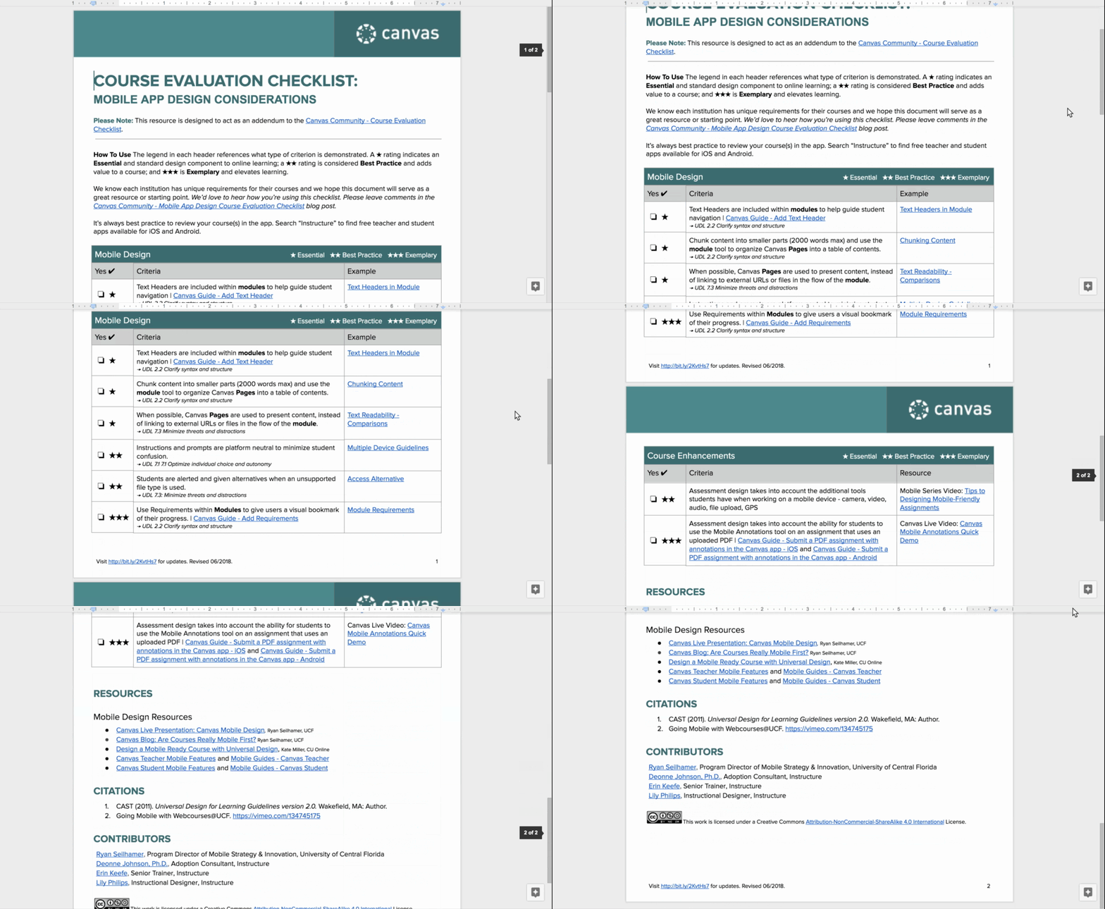
Preview of document via scrolling gif.


Access

This checklist is available via Google Docs "Make a Copy" so you can customize for your institution. Please select the following link for access: Mobile App Design Course Evaluation Checklist Editable


Note: We ask that you maintain our Citation list located at the bottom of the document. 


Please comment below. We’d love to hear from you!


Our Instructional Design team offers full Course Evaluations. Course evaluation services provide insight into best practices. Recommendations will focus on aligning course objectives, accessibility, and overall creation of an enhanced user experience. If you would like to learn more about our services, please contact your CSM or Shauna Vorkink - Content Services Director at svorkink@instructure.com.

30 Comments
kmeeusen
Community Champion

A big shout-out to Deactivated user and  @rseilham ‌!  And, of course, the entire Instructure Education Services Department!

This is the first course evaluation tool I have seen that focuses on Mobile compatibility! You folks ROCK!

Image result for shout out panda

Kelley

kmeeusen
Community Champion

Hi Deactivated user

Obviously I love both the original and the mobile course evaluation checklists your team has produced. However, I just have one criticism - for both documents, neither the PDF nor the Word versions are accessible.

Nuff said,

Kelley

stacy_lambert
Community Contributor

Thanks for sharing Deactivated user‌

Will include something in our Canvas survey  @david_summervi1 ‌ to discuss the use of mobile apps. #callaghancollegewallsendcampus

erin_keefe
Instructure
Instructure

Hi  @kmeeusen ! We appreciate your feedback and are very excited to provide this free and valuable resource to the plethora of Canvas users!

As you know, Canvas is committed to accessibility. Check out these Canvas Community resources:

Both checklists include a link to make a copy of the Google Doc that is editable. This allows the end-user to always have access to the latest and greatest, customize it to the needs of their institution, and increases efficiency (rather than maintain the document as a google doc and other formats). Last night, Deactivated user also added some GIFs of the documents so people can quickly see the incredible value of these resources before making a copy of their own.

In response to your comment, we did a little digging and found a really helpful Google Doc add-on and Chrome extension called GrackleDocs that is a real-time accessibility checker. It tells you potential fixes and allows you to fix on the fly. It’s AMAZING! We’ve run it on both of the checklists and fixed any potential accessibility deficiencies.

We recommend that when users convert from the Google doc to the format of their choosing, they ensure the accessibility features remain intact. These are some of our favorite resources to review regarding accessibility:

Deactivated user,  @deonne_johnson , and I appreciate your feedback! Thanks for making us more awesome!

-Erin

kmeeusen
Community Champion

 @erin_keefe  , you R.O.C.K. in the U.S.A.!

I am aware of all the resources you listed, but perhaps other members are not, so it was great to iterate them here.

Thank you for fixing those docs!

Kelley

mmoore1
Community Contributor

Thanks for a great share!

pdarlingfacio
Community Participant

Thanks for the checklist. We are finding more and more students using mobile devices to view course content and this will be a big help. Has Canvas thought about adding mobile views? For example, other programs have buttons that you can use to see how content will be viewed on a phone in portrait and landscape or how it will be viewed on a table.

The image below reflects the different view options in other applications. Is this something that we can vote to add to Canvas LMS Community Or is it in the works?

281930_pastedImage_1.png

Stef_retired
Instructure Alumni
Instructure Alumni

 @pdarlingfacio , the idea that is currently open for voting is https://community.canvaslms.com/ideas/11268-allow-faculty-to-have-a-mobile-view-like-student-view which is specific to previewing how content would appear in the app. The comments under that idea also provide guidance on how a designer can preview course content as it would appear in mobile browsers across various devices.

ProfessorBeyrer
Community Coach
Community Coach

Yes, this is awesome. Thank you to  @rseilham ‌, Deactivated user‌,  @erin_keefe , and  @deonne_johnson  for making this resource. Having it as a Google Doc opens up plenty of opportunities to spread this awareness. I think I'm going to share this with everyone who attends my Canvas trainings. All I need is to find out how many of our students have mobile devices...

audra_agnelly
Community Champion

Deactivated user‌, this is great! I love the items in the checklist and appreciate that the suggestions are easy to implement without needing to know much about responsive design or UDL.

One issue we notice with mobile app use is that teachers like to use the Redirect Tool to add a course navigation link that points to a specific page inside that course. In the web browser, cliking that link is seamless, but in the mobile view, this link is recognized as another external tool so students are taken out of the app and Canvas is launched in their mobile browser (after they login through SSO). It's a training issue on our end, but I'd love to see functionality to customize course navigation links without using the Redirect Tool when you're pointing to something inside that course.

rseilham
Community Champion

 @audra_agnelly ‌, 

This is true because the mobile app can only support web-based LTIs, but since this is an Instructure specific LTI, I could see some reconfiguring to get this to work. 

I would suggest you create a new idea in Canvas Studio‌ for this new functionality. 

https://community.canvaslms.com/docs/DOC-14903-75187841183 

If you create the idea, please post back so others know to vote on it. Thanks!

rseilham
Community Champion

Hi  @pdarlingfacio ‌, 

I have wanted a mobile preview for the Canvas apps forever. In fact, I tried to create one on a recent hack day. Unfortunately the best way is to preview the content in the application. Even thought stefaniesanders references Verifying Mobile Friendly Web Content, it's only good for content on the web and not the app. The app renders content a little differently than a mobile browser. 

I highly suggest you throw in a vote for this, if you haven't already. Thanks!

rseilham
Community Champion

Hi  @stacy_lambert ‌ and  @david_summervi1 ‌, 

I have been doing Canvas mobile surveys since 2014. If you want to look over our survey for question ideas, please let me know! Also feel free to check out our 2018 results: 2018 UCF Canvas Mobile Apps Survey | Canvas LMS Community 

lphilips
Instructure Alumni
Instructure Alumni
Author

Thank you  @ProfessorBeyrer ! In a comment above, Ryan shared a UCF survey that was distributed to students in order to gauge mobile-app usage. The link has some great sample questions! Perhaps your team could create a custom survey for your students based on some of these questions. 😃

lphilips
Instructure Alumni
Instructure Alumni
Author

Thank you  @audra_agnelly ‌ for your comment and  @rseilham ‌ for the feature request idea! I'd definitely be one of many users to "vote up" the idea. 😃  

stacy_lambert
Community Contributor

Hey  @rseilham ‌, we are starting to survey staff, students and parents on Canvas usage and pedagogy as we are in our second year. Need to evaluate. However we have initial questions on the mobile apps, based on use, access and devices. I will contact you if that is okay once we get the initial data for extra questions for this area. I am keen to pursue data on this with our kids as they always seem to have a phone (no pen, book or device sometimes - but always a phone). Thank you for the generous offer. I love this community!!!  @david_summervi1 ‌

#callaghancollegewallsendcampus

Cheers!

Stacy

dholton
Community Participant

One difference I noted was that if someone hotlinks an image (embedding it in a page, but the image is hosted on a different web server), it shows up fine on the website, but the image will not show at all in the app.  Perhaps that and any other inconsistencies could be worked out to make it more feasible to simulate the mobile experience on a desktop browser.

Tables are another source of problems.  It would almost be better if people were not allowed to drag and resize tables, because the fixed widths that get set almost always end up making the page or resource unreadable in the app.

Really, the whole editor could use an upgrade (RCE.Next).  Allowing for copying and pasting images, etc., and be more like the Google Docs editor (or just use the Google Docs editor or a similar alternative for creating content).  

ProfessorBeyrer
Community Coach
Community Coach

Great ideas  @dholton ‌ and I think adding a little Jive would not be bad — the auto-titling of links is a nifty trick that makes links more accessible and cuts down just a bit on link rot.

rseilham
Community Champion

 @dholton ,

I don't seem to see that issue when hot linking images. In fact, the Flickr photo finder in the RCE is hosting from Flickr as well. Am I missing something?

As for tables, we didn't include these in the document because proper use of tables is just good web design for a course. As for the Canvas mobile apps, if a user is using tables for data (and not design), it will allow the user to scroll the table right and left to view the whole table, even if the user resizes the table on the RCE. Tables for mobile will always be troublesome, but the Canvas app has made improvements over the last few years to make them better.

wwolf
Community Participant

Deactivated user‌ and  @rseilham ‌ thanks for making this checklist available.  This will really help my teachers when they start updating their courses for next school year.

rseilham
Community Champion

Certainly! Even though these are mobile specific, they will make courses better on all platforms. (: 

eddie_bonetdiaz
Community Explorer

With all the changes that occur year to year, has this document been updated recently?

m_koussa
Community Member

Hi Everyone

ltscal2
Community Contributor

Thank you for this!! Again can someone please help me access this without google???

SeanQuallen
Community Explorer

The first two links in the Additional Resources of this document are not functional.

dbreckon
Community Participant

Can you put the full link to the mobile checklist in this conversation, my university limits are ability to view bitly links?


JohnHawes
Community Member

This is a great resource that I incorporated into a checklist we are using to evaluate our online courses.  Thanks for sharing.

dljoyork
Community Participant

@lphilipsLily, Thanks for the resource, but I can't read it or download it. It won't stop scrolling so I can read it. Could you possibly send it in a different format?

I am discovering that our students are having great difficulty with the Canvas Student App, so I am trying to rethink course design in that context.

The biggest problem is with the app not tracking the completion of module requirements, specifically for SCORM assignments. Students often get "stuck" after finishing one of these assignments and can't move forward. Also, we just noticed that students can skip course videos embedded in the SCORM assignments while using the app. A minor point is that in the app, students have to click on "Done" instead of "Next", so we will have to change our navigation instructions for the app.

I am hoping that your checklist will give me some ideas for redesigning our "self-paced" Canvas Catalog courses to work better with the mobile app.

SamOHanlon
Instructure Alumni
Instructure Alumni

@dljoyork The scrolling thing under the "Preview" heading is an animation to show you what the checklist looks like. Below that, under the "Access" heading, there is a link to the actual document. If you click that link, it will make a copy of the checklist for you, and it'll be added to your Google Drive. This is your very own copy, so you can add notes to it, etc.

dljoyork
Community Participant

Thanks SamOHanlon.  That worked! 

However, the Canvas Student app is pretty disappointing.  We are going to stop recommending it.  I tested our course on my Android using Chrome and the experience was much better--nearly perfect.  A video still glitched, but clearning the browser may help.  Now I just have to test it on an iOS phone.