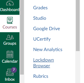
We deal with similar issues here when fielding questions. l agree with all the above sentiments and concerns shared above.
Here is what works for us:
* Canvas is essentially a big webpage, so reloading typically resolves any navigation item appearance issues.
* LTIs that are only used by sub groups should be added at the sub account level so that everyone in the instance isn't burdened with seeing them. This shortens the list and mitigates the issue with visual space.
* Items in navigation that are NEVER visible to students, but ARE visible to teachers, should have their own icon similar to the eyeball icon for hidden from students. This way, I never need to worry about configuring the visibility of these items (like Grade Sync, Edulastic...etc.)

