Discussions Redesign User Group + Early Access

The content in this blog is over six months old, and the comments are closed. For the most recent product updates and discussions, you're encouraged to explore newer posts from Instructure's Product Managers.

Katrina-Hess
Instructure Alumni
Instructure Alumni
21
8422

[2021-06-07 Update] TheDiscussions Redesign project is now available in the beta environment. Please view more details about this project in our Discussions Redesign User Group.


Hello Community! We have many improvements lined up for our Discussions feature in Canvas, as announced in the Canvas Release Notes (2021-06-19)

Why the Changes?

Discussions have proven to be a great way to engage students with course content and each other. Over the years we've received feature requests from you all and we are so excited to start incorporating those requests.

First Design Update

The release notes indicate what you can expect to see in the first round of this feature update. 

Our first release includes:

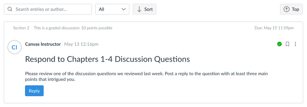
  • freshening up the UI to take better advantage of the space and ensure responsive views
  • moving the toolbar to the top of the page
  • placing newest replies on the top of the first page instead of the bottom of the last page
  • creating a button to sort replies from newest to oldest and oldest to newest
  • allowing posts to be marked as unread/read from the reply menu

These changes will be available in both the beta and production environments on June 19.
Screen Shot 2021-05-17 at 9.56.02 AM.png

Early Access

On June 19, the production and beta environments will both include a feature option at the course level called Discussions Redesign. This feature option will allow Admin and Teacher roles to enable early access to our Discussions improvements, beginning with the first set of features.

We will not be deprecating the current Discussions feature for a while.

The workflow will be:

  1. Admin can turn on the course-level Feature Option in Account Settings—the default setting will be OFF
  2. Teachers and Admins can turn on the Feature Option in Course Settings—the default setting will be OFF

Also beginning June 19, you can also explore the Discussions Redesign functionality in your beta environment. 

Feature Option Changes

If the Discussions Redesign feature option is turned on in a course or for an account, that course and/or account will receive additional updates to Discussions as soon as the updates are released. Our User Group will include updates about the project and the remaining release plans. Plans are subject to change based on your feedback, so subscribe to the group to stay up to date with the latest news.

User Group

Beginning June 19, we will also make available the Discussions Redesign User group, which anyone can join and stay current with the latest development work. We would love to get as much feedback as possible for future designs.

The link to the user group will be updated in this post on June 19, and the link will also be posted in the Beta Features User Groups page.

Thanks for participating in this project with us and we look forward to your feedback.

Best, Katrina

The content in this blog is over six months old, and the comments are closed. For the most recent product updates and discussions, you're encouraged to explore newer posts from Instructure's Product Managers.

21 Comments
cgaudreau
Community Contributor

@Katrina-Hess - thank you for this update, feels like it snuck up on me!

You noted in the article that this is the first design stage. Wondering if future updates will include the ability to "at" or "plus" mention other students in a course to create a deeper sense of community and knowledge transfer.

Katrina-Hess
Instructure Alumni
Instructure Alumni
Author

Yes, the @mentions feature is currently in development! It's not scheduled for the first release but will be available for early access. Please join the user group on June 19th for release updates. User group link will be available here Beta Features User Groups page.

snugent
Community Champion

Based on the screen shots on the Canvas Release: Discussions Redesign (2021-06-19) I have some feedback. 

I like reply option highlighted as button. Students always miss this in the current interface. I never liked the language of "reply" for the student's first post. It would be preferred to use wording "Post" on the button for the first post of a new thread. Reply is good for replies to a thread. I think students find this language confusing. 

I don't like that the grading settings are set in low contrast text. Students will miss this information. It needs to highlighted like the current interface or the text should appear similar to how it appears in assignments. I also don't like that the rubric is hidden to students. 

The edit and delete options should be separated so faculty can choose which options they want student to be able to do. The all or nothing is not helpful.  

Steven_S
Community Champion

@snugent I agree that having a different word for the initial post may help students.  I'm not sure that "post" will be clear enough for some of my students, but it is better.  I have had students that are really confused that they have to click a button at all before they get to a textbox to type a response.  Submit or send will definitely only be appropriate next to the cancel button once the textbox is visible.  Rather than any button, students might be most familiar with a one line text entry field that could expand when clicked, along the lines of what they already see on facebook.  Maybe "Post Response:" or "Reply:" could be next to that sort of one line textbox.

JimAhearne
Community Member

+1 for "Post" for the initial post.

"Reply" for, you guessed it, a "reply."

venitk
Community Champion

Agreed with the above comments about the post/reply language. This has been confusing for our students, and it makes tech support, writing directions, documentation confusing as well, since we have to distinguish between the "initial reply" and "followup" replies.

This is also accurate for my students, who range from undergrads to MBA students: "I have had students that are really confused that they have to click a button at all before they get to a textbox to type a response."

If I had to guess, I'd say at least one motivation behind having the initial post called a reply was to give the illusion that they're engaging in a conversation with the instructor. In practice, though, unless the instructor (and only the instructor) posts a fresh discussion every term so that their name and picture shows in the discussion post, students are engaging in a conversation with an unidentified person (or, worse, with the rando instructional designer who built the course). This is awkward and doesn't feel like a conversation anyway. The benefit of the post/reply language is that it at least makes it less confusing for students and our directions. 

On another note, I was disheartened to see that this change is basically aesthetics. I know you said it paves the way for more changes in the future, but the very structure of Canvas discussions is broken. There are not many things I miss about D2L, but D2L's grid view was 1000% better for organized conversations in an online class. They actually tried moving away from grid view to something like Canvas's discussions (D2L called it "reading view"), but there was such an outcry that they brought grid view back. More info on the comparison: http://blogs.wright.edu/learn/pilotrci/pilot-video-tutorials/discussions-introduction-instructor-2/d...  But even D2L's reading view was less overwhelming than Canvas' discussions because replies to posts weren't auto displayed (you still had to click to open the replies). So it was easier to find an initial post you're interested in reading, and then clicking to open the replies if you want to dive deeper. 

I really hope and my fingers could not be more crossed that the future changes coming to discussions includes better organization, including threads, subject lines, etc. Reading view is great when a conversation is between a very small handful of people, but when you have 40 students in a course and they all have to post once, reply twice? Uffda. 

venitk
Community Champion

One additional comment: I'm not sure we need to know when the discussion prompt was posted, if you're looking to clean up the interface?  At least, that wouldn't be useful for my program, as all of our discussions are posted before the course begins. If you're adding in multiple due dates, I could see it being confusing with a bunch of dates on this view. 

rgibson1
Community Champion

I agree with all the comments. Have these changes/suggestions been run past a usability group?

info12
Community Explorer

Just wondering why the new features aren't available in Beta until June 19 (when they are also available in Production). Usually we get to try things out in Beta before it's pushed to Production. Will the Beta version have the same functionality as the Production version?

Sylvia_Ami
Community Contributor

Just wondering why the new features aren't available in Beta until June 19 (when they are also available in Production). Usually we get to try things out in Beta before it's pushed to Production. Will the Beta version have the same functionality as the Production version?

MichaelLizotte
Community Member

The changes imply we want a simpler tool, but many of us want a more nuanced and complete tool.  I concur that the discussion feature is a failure for courses that ask students to start a thread within their discussion group.  There is an option to let students open new discussion pages, but the controls are too crude in terms of giving the student too much or not enough controls to edit and delete, or for instructors to make corrections and reorganize.

With the currently limited tool, I have to provide a description telling students to imagine they are entering a long hallway.  They start a new discussion at the top (putting a title in large letters), then Canvas will immediately move it down the hallway and stick it on a "wall".  Then we all just hope students will venture down the hallway to find your poster and discuss it with you.  But every class contains students who will just scroll to the bottom (end of the hallway) and respond to the last reply, possibly without reading any original posts or replies.

The new feature to put the last post first will only be helping my least engaged students reduce their involvement.  In my virtual "poster session in a hallway", that feature will hurt the students who started the original posts, as their work will be ignored.

The "poster session" analogy is a pathetic kluge to deal with your 1-dimensional scrolling "hallway".  If you could put starting posts onto a 2-dimensional map (or grid of titles buttons), then students could click to enter a discussion that interests them.  That would be closer to the D2L Discussion Board Listings, but might meet your goal to make this all work on a tiny cellphone screen.

MichaelLizotte
Community Member

In general, I try to teach students to be succinct and direct in their communications. 

It would be helpful to add word/character counters to the typing boxes and to give instructors the ability to set an upper limit on words/characters.

To compress a long scroll of entries, it would also help to have the view only show their top lines, with a "see more" button to read a longer entry.  That feature would help us teach students to make their points upfront (e.g. use a topic statement) instead of wandering towards a punchline or moral to the story.

MichaelLizotte
Community Member

The side button that is green for unread and clear for completed reading -- can that be larger and/or stand out more clearly?  I imagine that speck is frustrating for someone with vision impairment.

MichaelLizotte
Community Member

I looked back at the multi-year discussion thread on this feature (https://community.canvaslms.com/t5/Idea-Conversations/Order-Discussion-Posts-from-Newest-to-Oldest/i... and it is clear there are two (or more) very different uses by instructors. 

One is to set up a discussion board on a very general topic (e.g. homework) and let it run a long time (all term or many years).  They want to be able to sort entries.  It looks like this is the use being addressed by the proposed changes.  The Canvas staff defined their version of Discussion as a communications tool.

But most of the comments above seem to be from a very different user, one that is running a discussion on a narrow topic (e.g. a lesson), for a short while, possibly with small groups, and possibly where the students generate starting posts.  They may be trying to simulate conditions of an in-person discussion, but asynchronously.  They do not see a Discussion tool as merely a communications channel, these instructors use Discussion as pedagogy as critical as other course content delivery systems, e.g. those that simulate lectures. Some of them had success with other software before Canvas, and are still waiting for a Discussion tool that meets their needs.  

l_lucas
Community Participant

Please, please, please - can we have pagination for the discussion forum pages?
The Canvas forums are the only forums that I know that do not have pagination.
We have a course that gets hundreds of posts - and the forums page takes minutes to load - which is a terrible user experience.
This could so easily be fixed by pagination - ie splitting a long forum list over a number of pages.
Is this on the roadmap?

Katrina-Hess
Instructure Alumni
Instructure Alumni
Author

Hi @snugent, @Steven_S@JimAhearne@venitk@rgibson1@MichaelLizotte, @l_lucas... thanks for all of your detailed feedback and feature requests! We are absolutely doing usability tests and our accessibility team is ensuring we meet contrast requirements. Please join the user group on June 19th for release updates and to engage in design/usability conversations. User group link will be available here Beta Features User Groups page.

Just wondering why the new features aren't available in Beta until June 19 (when they are also available in Production). Usually we get to try things out in Beta before it's pushed to Production. Will the Beta version have the same functionality as the Production version?

Hi @info12 and @Sylvia_Ami, we are trying a new approach in delivering features as soon as possible. Early access in the production environment will let you opt-in to see the new features with your production data while giving you the freedom to use the current version if you prefer. Rest assured that this will live behind a feature flag and we are not deprecating the current version of Discussions for a while so you will have time to socialize and test the new features.


venitk
Community Champion

@MichaelLizotte suggestion to only show the first couple of lines of a reply would help a lot. Most of the courses I support are the opposite as Michael's, actually in that the discussions require a MINIMUM word count, so most discussion posts are hundreds of words long. Just imagine scrolling through a discussion topic with 20 students, each 300 words long, and each has at least two substantial responses. 😲

It wouldn't be as helpful for our students as the grid view that I described, but it would help a LOT and would make it more like what people are used to with things like Facebook, IG, etc. 

lettgo583
Community Participant

Would love to see an obvious way for students to find the rubric for a discussion. Right now, they have to know to click on the three little dots menu, to get to the link "show rubric." Can an icon be added to that top area of a discussion page -- so it's obvious that one is attached? This would help both faculty and students. Thank you much!

schafj
Community Participant

Would it be possible to add a feature that shows which students did/didn't post to a discussion? Ideally, this would be a report one could see through a button associated with a discussion.

snugent
Community Champion

I can see the discussion redesign in beta now; however, I noticed with graded discussions the rubric option is missing. Will this be available when this gets to production? 

2021-06-07_13-53-14.png

erinhmcmillan
Instructure Alumni
Instructure Alumni

Hi, all,

The Discussions Redesign project is now available in the beta environment. 

Please remember this feature is currently in development, and some features that are not yet included may be added at a later date. Information about the full project can be found in the User Group:  Discussions Redesign - Canvas Community.

Further questions should be posted in the user group as well.

Thanks,

Erin