The Instructure Product Team is working on implementing a better solution to collect your feedback. Read Shiren's blog for more information.
Turn on suggestions
Auto-suggest helps you quickly narrow down your search results by suggesting possible matches as you type.
- Community
- Canvas
- Canvas Ideas
- Canvas Ideas
- Easier grading for teachers = highlight bar
Options
- Subscribe to RSS Feed
- Mark as New
- Mark as Read
- Bookmark
- Subscribe
- Printer Friendly Page
- Report Inappropriate Content
Easier grading for teachers = highlight bar
Easier grading for teachers = highlight bar
Status:
Completed
Submitted by
richard_ireland
on
10-03-2015
06:05 PM
| This idea has been developed and deployed to Canvas |
| Idea will be open for vote Wed. October 7, 2015 - Wed. January 6, 2016 Learn more about voting... |
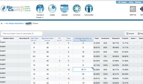
Something that is frustrating is the lack of a highlight bar that shows teachers exactly what student they are entering grades for. When you are trying to put grades in as quickly as possible, it is crucial to make sure you are putting grades in for the correct student. However, on Canvas there isn’t a highlight bar so teachers have to constantly be checking whether or not they are inserting the correct grade for the correct student. It may sound silly, but this does take up time when you’re trying to grade as efficiently as possible because you have to keep looking from one side of the screen to the other, especially if the grade you are entering is on the complete other side of the screen. With a highlight bar, teachers can quickly assure themselves that they are inserting the right grade for the right person. The white and slightly gray alternating shading that Canvas has just doesn’t cut it. It ultimately takes too much time to figure out which student teachers are entering grades for.
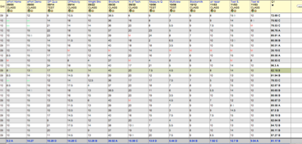
- Please compare the two pictures below. The canvas picture does not have a highlight bar that shows teachers precisely which student they are entering grades for, but the other program below does (next picture).
- Please note how the program below has a yellow highlight bar. It makes grading SO MUCH EASIER since you don't have to keep double checking that you're entering the correct grade for the correct student. This is especially crucial for when you are inputting hundreds of grades that are not alphabetized during one sitting.
| Comments from Instructure |
For more information, please read through the https://community.canvaslms.com/docs/DOC-13339-canvas-production-release-notes-2017-11-18
For additional information about the New Gradebook, please visit New Gradebook Users Group and the Canvas Release: New Gradebook document.
22 Comments
 Community help
To interact with Panda Bot, our automated chatbot, you need to sign up or log in:
Sign inView our top guides and resources:
Find My Canvas URL Help Logging into Canvas Generate a Pairing Code Canvas Browser and Computer Requirements Change Canvas Notification Settings Submit a Peer Review AssignmentTo interact with Panda Bot, our automated chatbot, you need to sign up or log in:
Sign in


