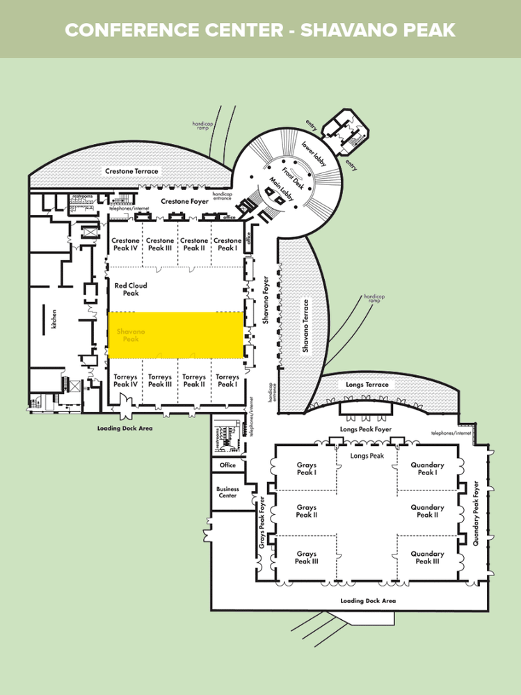
Tap/click map to enlarge
Utah State University - HigherEd
What can Canvas Data and analytics tell us about course design? Do students navigate and access content the way we think they do and in the way we intended when we designed the courses? Is the Home Page the gateway to course content? Come learn what USU discovered by looking at the data.
A colleague of mine did some Canvas data mining and found that not all students started at the home page for their course interactions throughout the semester. What percentage do you think that was?
It caused me to start thinking about how we design courses, and if the homepage is not always the gateway into the course, then are we making other assumptions about how students are navigating courses, and therefore our course design? Interesting stuff for sure. Looking forward to sharing our initial findings with you and also getting your ideas.
Kevin,
I found that it was necessary for all of our courses to be built from a
template that would force the students to all start from the same place.
For faculty that did something outside of using the template in full
created chaos for the students and missed assignments/tasks. Whether this
is the right thing to do for all institutions, it has definitely been the
correct thing to do at our institution. The only downside that I am
finding with the use of a template is courses end up looking like a hodge
podge when faculty go to add something that isn't in the template. Those
are few and far between, as I build almost all courses for all of our
faculty members.
I'm guessing that 35% - 45% of students don't start with the Homepage, if other options exist. This is why I try to encourage faculty to limit the course menu options to their intended/preferred access points and pathways to and through their course content and structure. I also encourage the use of 'prerequisites' and interaction 'requirements' in Canvas. This way, students can't easily bypass the teaching and learning content that is built into their course design, and simply 'cherry pick' the assignments, quizzes and other required interactions. I believe that this is very important for successful online course design, and helps ensure that the full context of course materials is at least presented to the student.
Our faculty would never go for full-on template use, so... guidance, demonstration and education meets with a lot less resistance.
In a lot of ways, I would rather the faculty want more input, but they were
very resistant to the change to Canvas, so we have to build something so
basically their classes could look as close to what they were in our old
system. This seemed to be met with much less resistance. I love hearing
about how others do, so maybe we can move away from the cookie cutter
looking classes.
When we switched from Angel to Canvas it gave us a great opportunity to use a template that primarily focused on utilizing Modules and having Discussions, Assignments, Pages, Files, Quizzes not available for students to access. Modules was set as the homepage and faculty put everything underneath modules in a weekly or topic module. After the transition was over and we were on Canvas for 2 semesters, the template was modified so faculty could go into Navigation and make the unavailable items available to students if they wanted to. We found that the majority of our faculty have kept most of the navigation hidden from students and use the Modules to organize all of the assignments and course materials. I think the template was important during the transition to help emphasize the effectiveness of organizing course assignments and materials in modules.
I can see where that approach would have been a great way to initially implement Canvas. Unfortunately, our faculty leadership didn't embrace that approach, and beyond that, we had to fight to require basic Canvas training (Canvas Essentials). We now have requirements in place, Canvas Essentials, Transitioning to Teaching OnLine (pedagogy and effectiveness), and Applying the QM (Quality Matters) Rubric, for Hybrid or Fully OnLine. It's often a challenge, but I love it! ;>)
At my institution we're just starting to test the use of badges for faculty training. We're working with Canvas Premier Partner - Badgr, and we're just in the initial building and testing phase. Our hope is that badges and gamifying faculty training will incentivize (at least emotionally) our faculty to move through the training. 6 months from now I'll be interested to look at what the data tells us about how successful this endeavor is.
Dale, our institution just switched in SP16 from ANGEL to Canvas, our first full semester. We are currently in transition phase and we are doing the same thing that you mention. When we were piloting Canvas, we tried various methods, one was having all of the navigation components turned on, and that was more confusing for students, as there were so many ways that they could get to one item. We have adopted a list of best practices, and one includes which navigational components should be turned on (although if a faculty member found it beneficial to turn other options on that was up to them to decide based on their pedagogical needs).
Thanks for the shoutout, A00015317. In our session, Gimme S'more Learning Choices we'll be discussing one of the courses that Kevin will be presenting data on. One of our topics is the influence of due dates on student behavior in the course. We're also mining data on assignment access points.
Is this students who just click on the course and never use the "Coming Up" or "To Do List" links?
For the course that sparked my interest on this it was higher than 45%. I will share details in the presentation.
Hi Susan,
For the course I referenced that sparked my interest, we mined the canvas data and looked at every time students clicked into the course. This has now led us to look into this further. For example, we are looking at 4 courses in canvas now. The very first time a student logs in, what is their navigation path, where do they go first, then next etc. Is there a pattern. Are they navigation courses the way we designed them , or think we designed them for navigation? We are also looking at some random times they entered the course throughout the semester. The goal is to look at student behaviours (student identities anonymized) and see how that correlates to our course design.
Teaser for todays session at 10:55 AM in Shavano Peak.
In my own course, only 50% of students entered the class via the home page the very first time they entered the course for the semester.
When we look at every time they entered the class throughout the semester, that drops to 45%.
What can these student behaviors tell us about our course design, or help guide us as we design courses?
Does it really matter?
Looking forward to sharing with you and your thoughts and discussion on this topic.
Missed it at the start - what data visualization tool are you using to consume the Canvas Data csv?
D3.js
Sent from my iPhone
Some technical information from the session.
I will post a video later next week showing the graphs and going into more detail than I was able to in the session.
---
Data for 4 course in canvas was pulled. This data was pulled through the Canvas data portal as flat files. How do I use the Canvas Data Portal for an account? | Canvas Admin Guide | Canvas Guides
The data was then extracted from multiple tables and meshed as needed then stored in a new SQL database. The visual graphs shown in the presentation were created using the D3.js library. https://d3js.org/
The following is information from Meghan Lewis, the Data Analyst and Programmer who extracted the data and produced the interactive visuals.
------ ----- ----- -----
The student path data is primarily from the requests table.
Other tables were used to supplement the data – for example, I used other tables to:
Pull information about enrollments, which I used to filter the data and only show users who are enrolled as a Student
Pull information about content items (assignments, discussions, etc.), so I could show the name of the items rather than the ID
For the project I used all of the tables listed below, but the actual data about the students path is in the requests table.
requests
course_dim
enrollment_dim
enrollment_fact
assignment_dim
assignment_fact
discussion_topic_dim
discussion_topic_fact
external_tool_activation_dim
external_tool_activation_fact
file_dim
file_fact
quiz_dim
quiz_fact
wiki_page_dim
wiki_page_fact
---------
As John Louviere mentioned, we are now working on figuring how we take this mainstream and provide access to more courses for analysis. We have also recently signed a contract with CIVITAS for their Illume, Inspire for Advisors, and Datamart products and hope to be able to work with them to produce some predictive analytics with this data.
More to come soon,
Kevin
VIDEO of live interactive visuals. I created a short video that is a brief look at what I presented at the conference. In it you can see the live interactive graphs, and see how students navigated in a course.
Video link here: Canvas Analytics - YouTube
Thank you for taking the time to share this.
I am still new to Canvas and very interested in digging deeper into the data.
It's great to hear what people are doing with the data they are collection.